The James M. Johnson IV Gallery
This gallery is named for a fictional benefactor who donated $500,000 to the proprietor of this museum, because his name sounds impressive. Naturally, if a real person were to make such a grant, Mr. Johnson, however regal-sounding his name is, would become part of fictional history. In the absence of such a person, Mr. Johnson will suffice. His is a very interesting story that would fill a book that has not yet been written, and any attempt to summarize his fascinating life would not do him justice, so we won't even attempt to cover the many wonderful things he has accomplished in his illustrious career, and to attempt to answer questions about him would raise only further questions. That said, we'll move on to the exhibits at hand. These came from a sketch book in which one sketch is dated early 1972, and the style is consistent with that of the March 1972 book found elsewhere in this museum. As is our custom, an experienced art critic has been enlisted to assist with the descriptions of the works in this gallery.
Well. I am deeply honored to have drawn the short straw in the world of artistic criticism. I really tried to get out of this, but I lost a bet with the artist, and so I am pressed into service. Besides, all the Michelangelos and Botticellis and Rembrandts and even the Picassos have already been reviewed multiple times (you can, of course, view those works elsewhere on Internet or in a physical museum), so this is about all that is left to review.
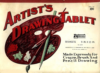
Here we see the cover of this sketch book. It actually looks interesting in its own right, particularly as an artifact of the once-proud but now lost to history Woolworth chain along with its larger-format department store sibling Woolco. As we will see shortly, the artist will violate the regulations printed on the cover by using a ball-point pen for some of the sketches. More-expensive sketch books probably had built-in self-destruction tools if someone did something so offensive, but at only 49 cents, this one probably just grumbled to itself as it was being misused.
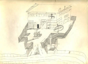
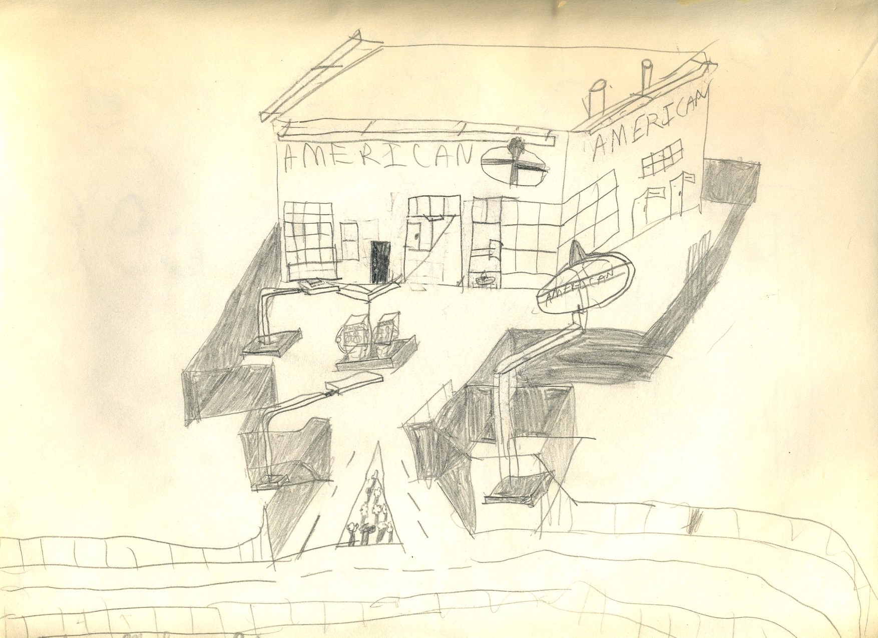
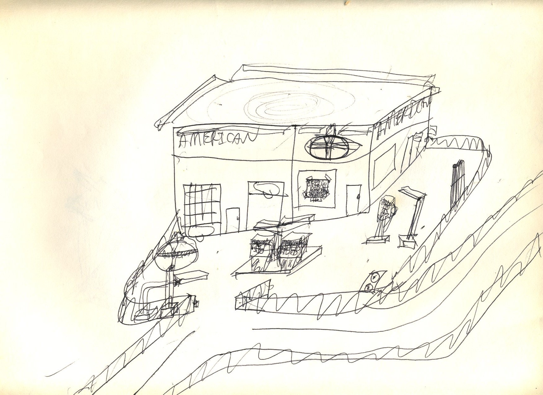
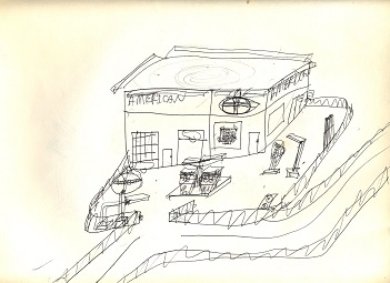
This is a fair rendering of an American Oil Company outlet. Note the attention to detail; the roof has two small vent stacks for the plumbing underneath, and we also see vent pipes for the underground storage tanks, though the large American sign post is missing the smaller sign that read, "As You Travel Ask Us." Another curious habit of this artist in his early days is that everything seems to have a fence around it. This fence is particularly prominent.
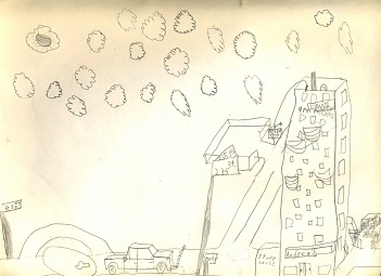
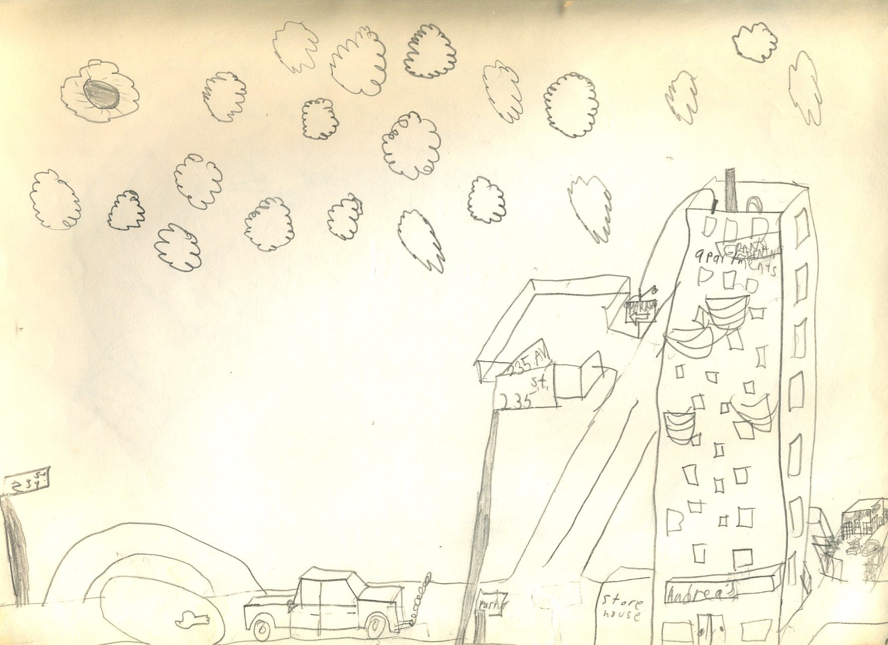
This sketch appears to be a joint effort with an unidentified co-conspirator. The lettering is not indicative of the usual style. Note the seven- or eight-story high blade sign; the automobile is also disproportionate to the building. A tiny Esso station sneaks into the lower right corner for consistency.
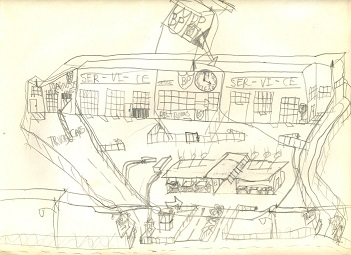
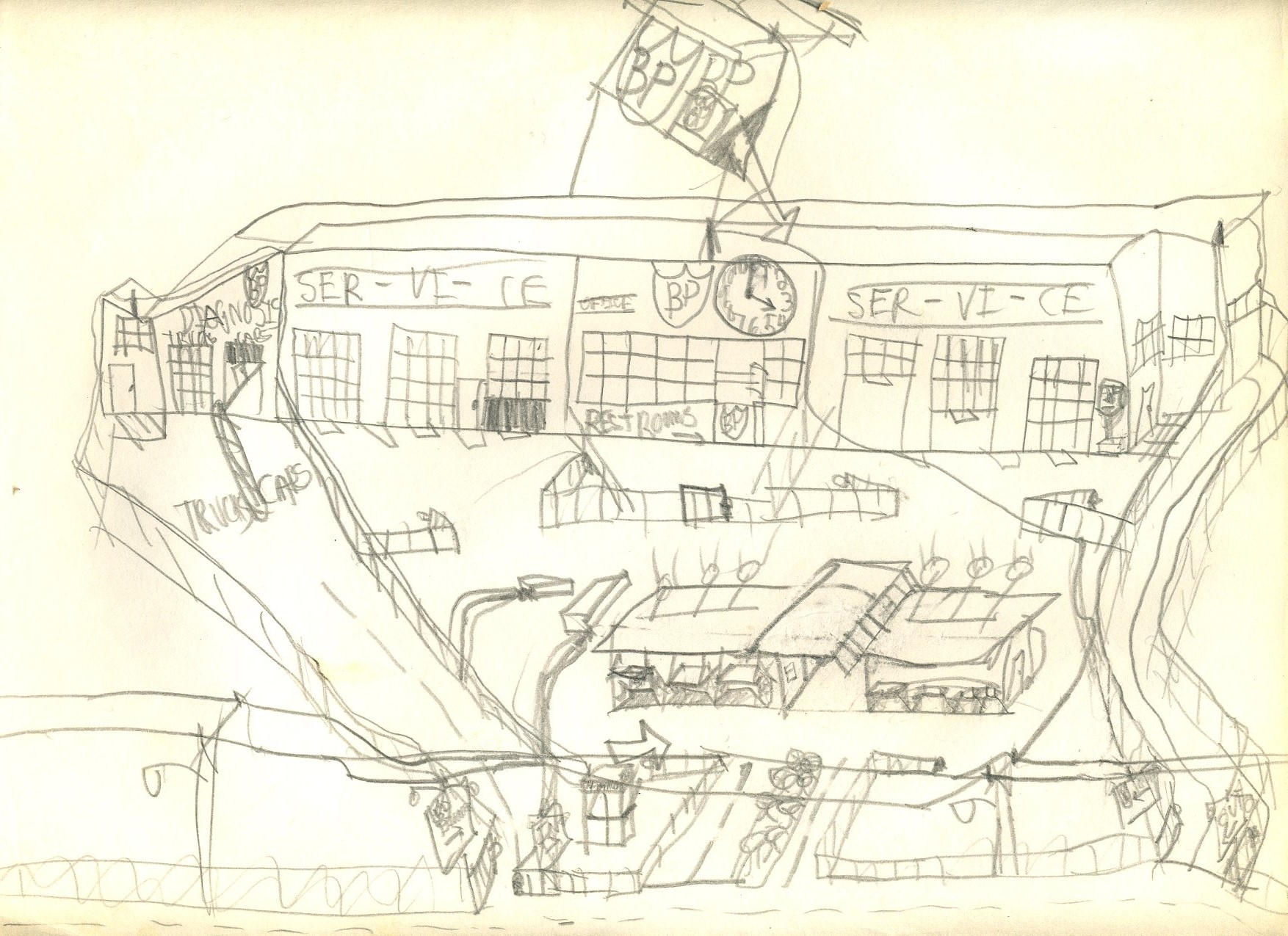
This is a very busy BP station. Note the fences even internal to the BP property. The hyphenated "Ser-vi-ce" bays are odd.
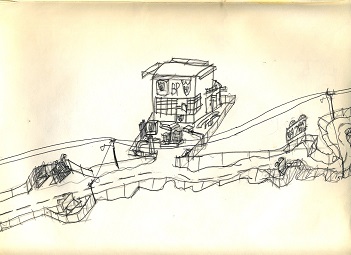
This considerably more modest BP station sports an outdoor lift. It is strange inasmuch as the original pencil sketch has been overdrawn in ball-point pen. Why the straight road at the left turns into a jagged, twisted jumble at the right is a mystery.
On the outskirts of the City of Bent Neck lies another BP station. For those wondering why BP was such a favorite, it was the brand of gasoline used in Matchbox car stations. The two restrooms are labelled "Farm" and "Modern." Most people would probably choose "Modern." We also see here another outdoor lift. The gasoline pumps appear to be in a cage of some sort, perhaps to keep them from wandering off on their own. At the right appears to be a gated community.
Once again, we see a very complicated, multi-level BP station with lots of intricate internal fencing. Why the gasoline pumps need to be in an enclosed building is anyone's guess. The workers here probably have BP logos tattooed on their foreheads based on what we see in the rest of the sketch.
This one got so complicated towards the middle that the artist must have fainted before he could finish it.
The artist's head must have still been pounding from the previous sketch, resulting in a second unfinished sketch.
Sketch number eight must have still been weighing heavily on the artist's mind, or perhaps his arm or hand was still exhausted from that one.
A little bit of rest, a change of gasoline brand, and some less lofty goals resulted in a better, finished sketch.
Once again, a simpler concept saves the day. The roof looks as though a tornado or possibly a low-pressure system is forming over it.
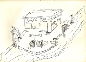
Here we have a reasonable attempt to render a Sunoco station, though by this time ranch-style Sunoco stations were becoming more common.
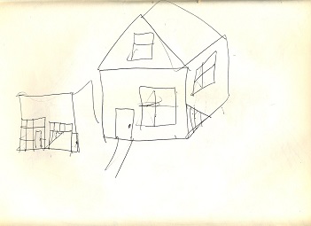
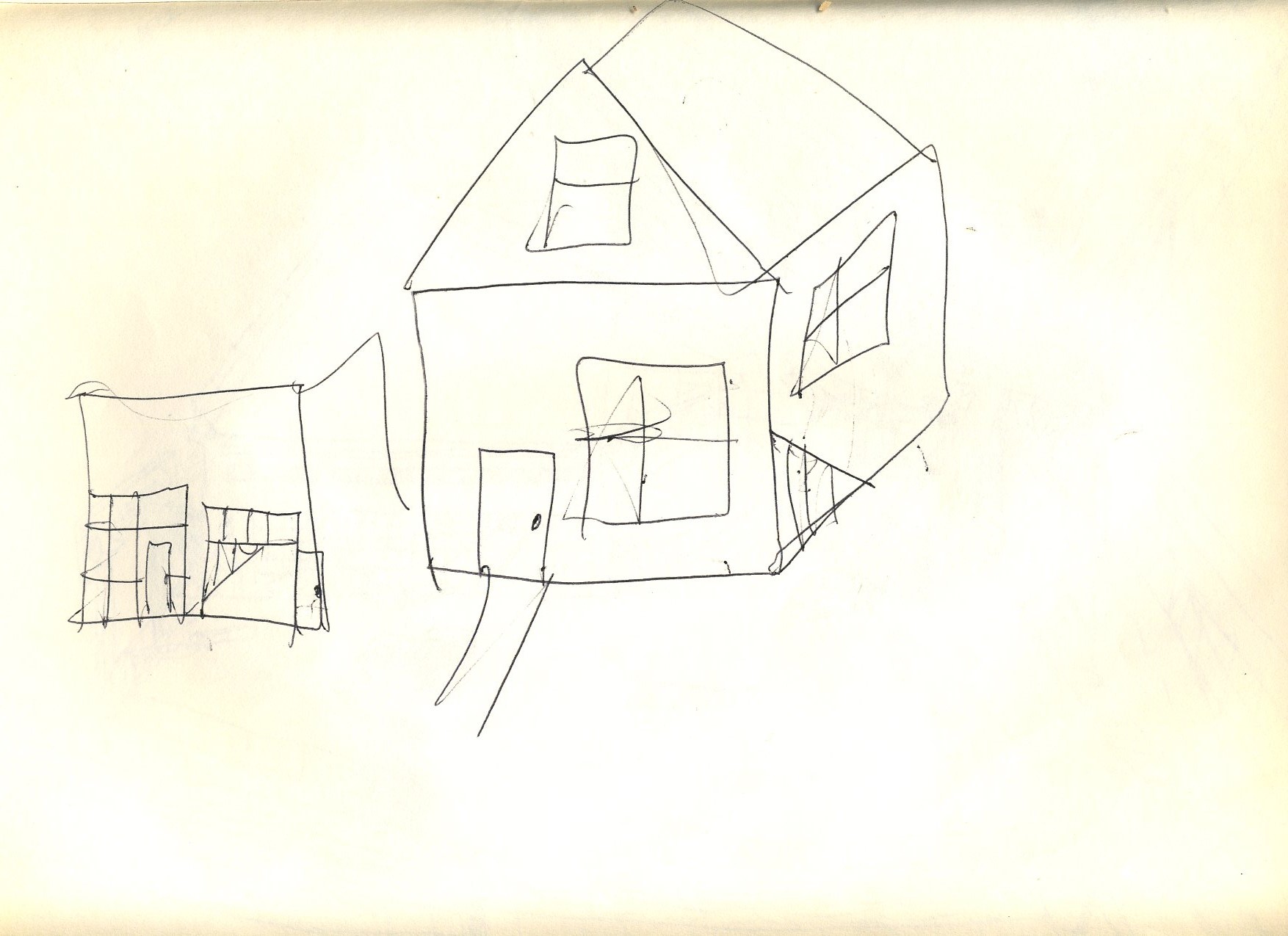
The house is okay, and it looks as though a small gasoline station was under construction to the left, but once again the artist could not muster the ability to complete the task at hand.
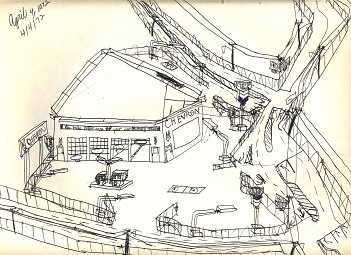
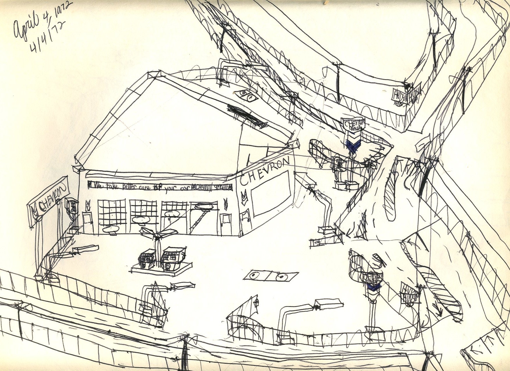
This Chevron station is one of the better ones, though one is hard-pressed to understand why one Chevron sign has the bottom V-panel colored while the other one has the upper V-panel colored.

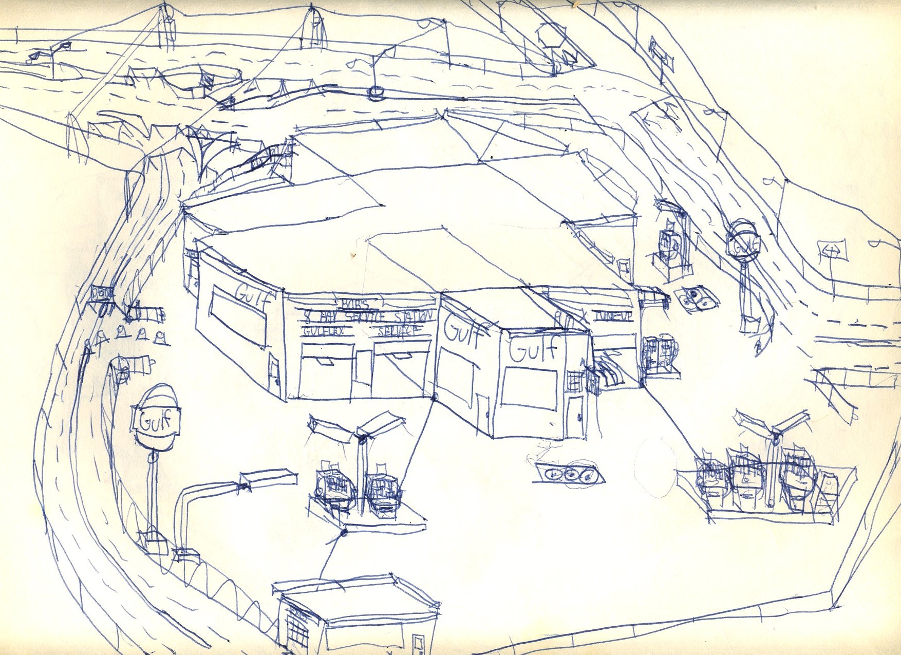
This Gulf station looks okay, but the traffic signal at the upper left probably is not finished because the artist was still learning to draw them.

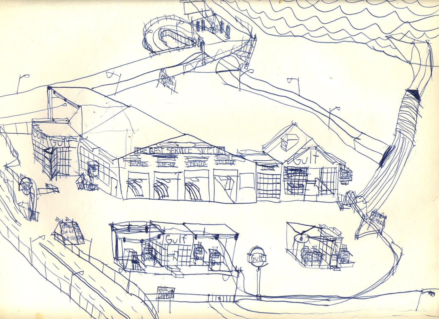
This Gulf station looks even better than the previous one, but a real gasoline station would be unlikely to have its own entrance to a public tunnel, and the tunnel itself is simply wrong.
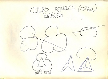
Yes, the Cities Service logo at the lower left is pretty good.
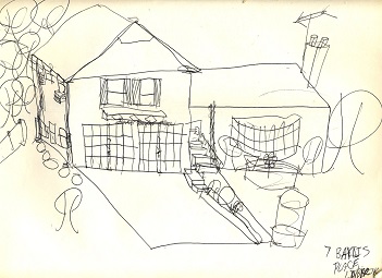
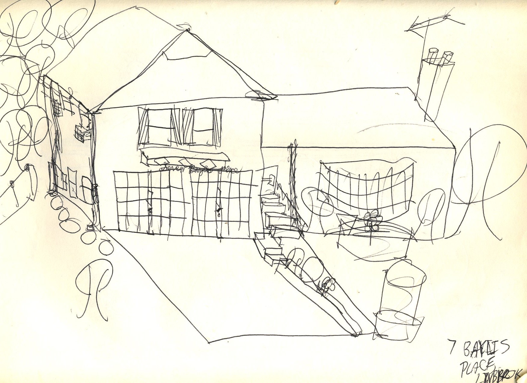
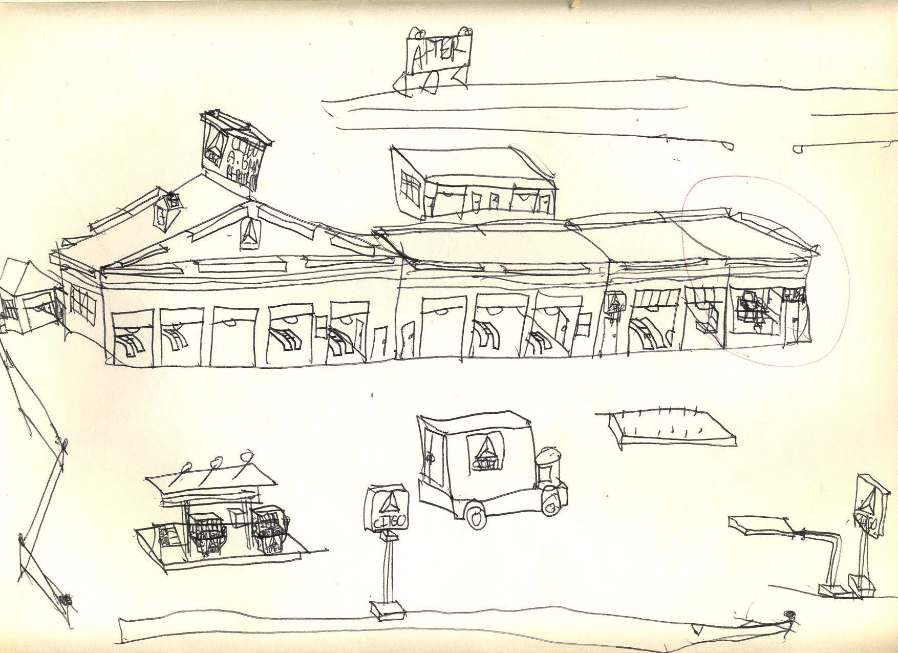
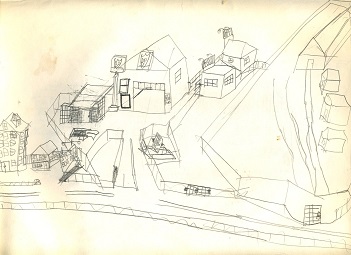
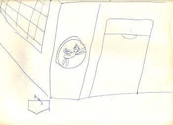
One might wonder how 7 Baylis Place in Lynbrook, New York looks today, but this appears to be a reasonable approximation of how it looked in 1972.
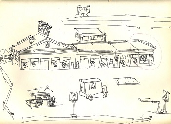
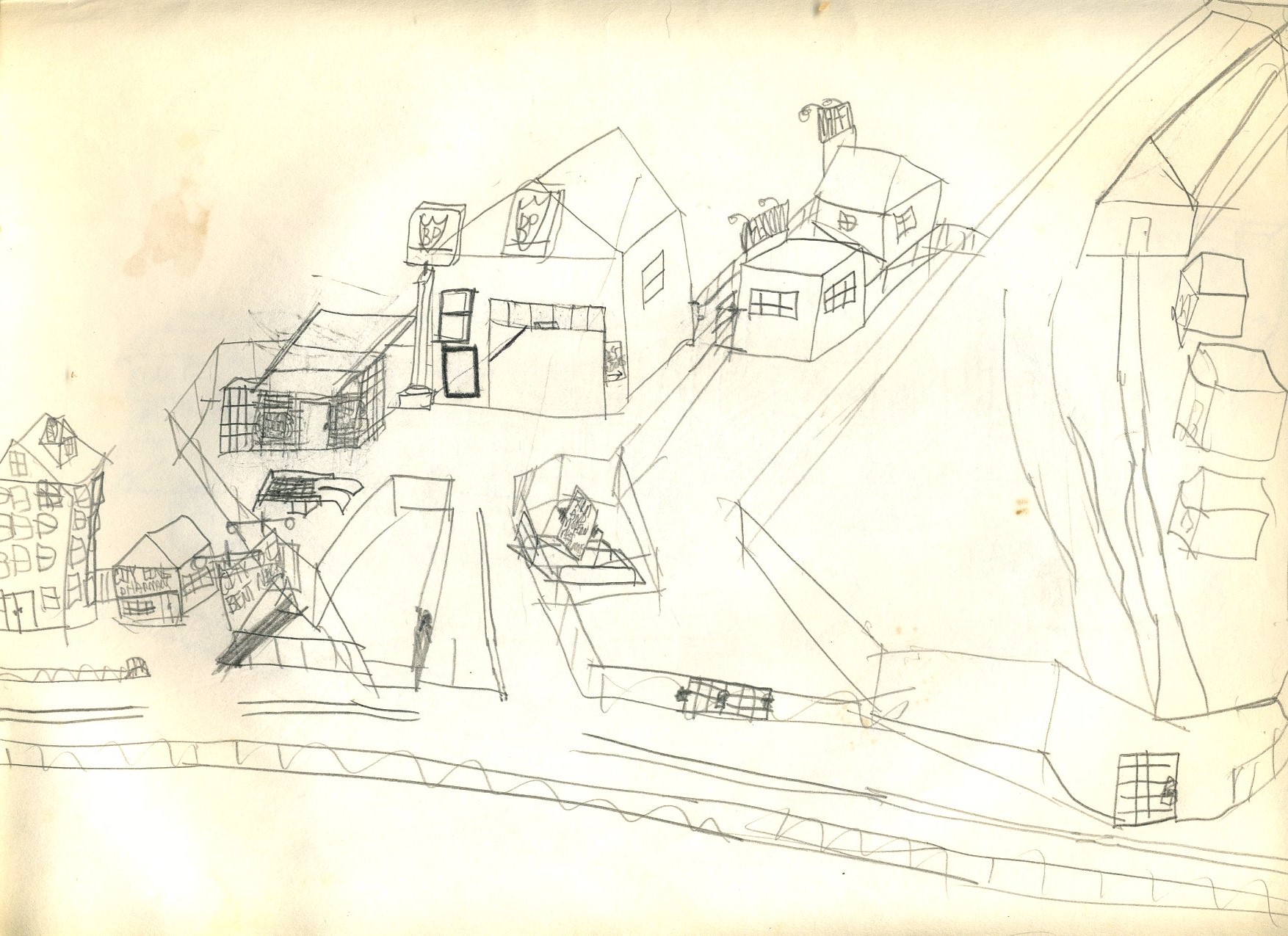
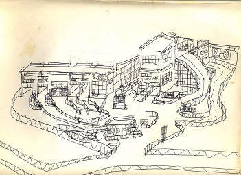
After what is hard to tell, but a ten-bay service station was rather unusual back then. The reason for the circled office is unclear as well.
This appears to be a drain stop and clearly does not belong with the rest of these sketches.

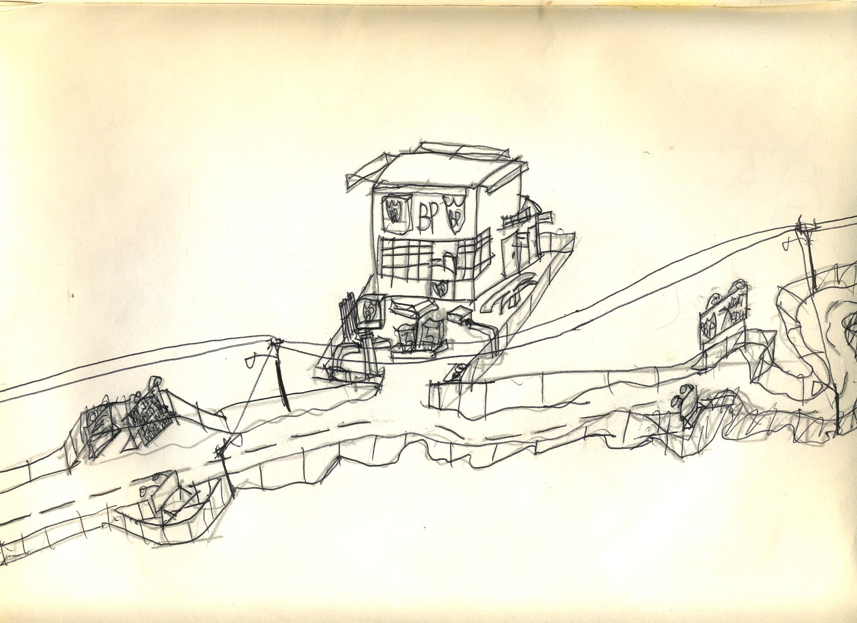
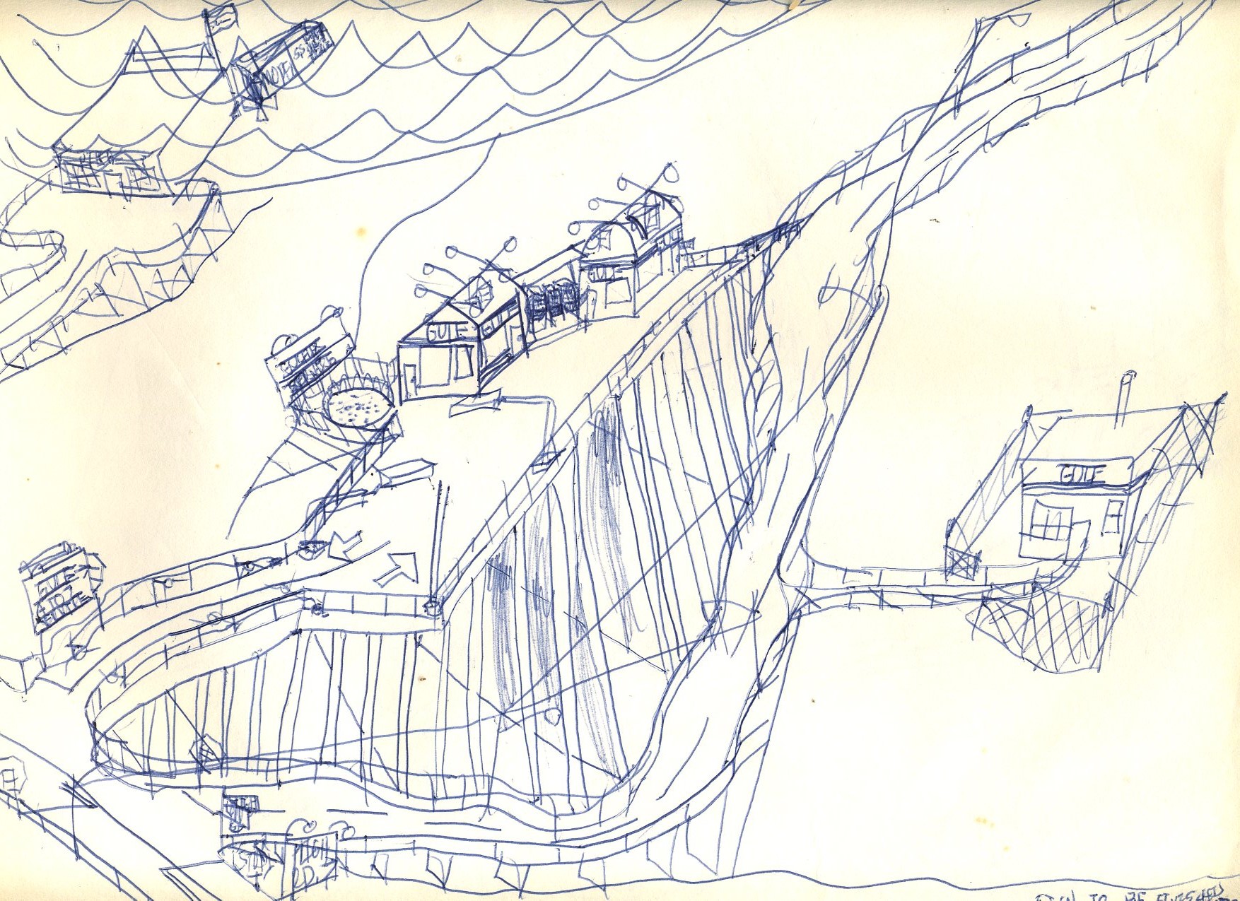
Depicted here is another completely impractical service station elevated on immense pillars for no apparent reason apart from indulging the artist's wild imagination, unless that is a flood zone.
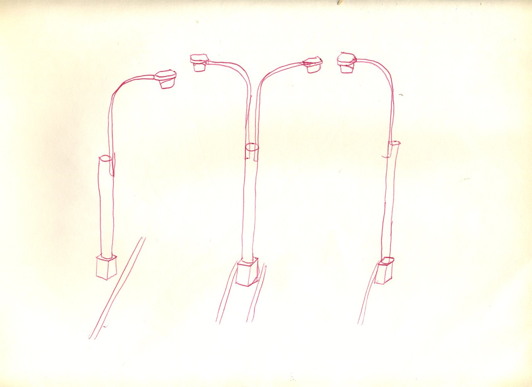
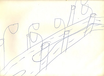
This rural scene sports non-rural Deskey lamp posts.
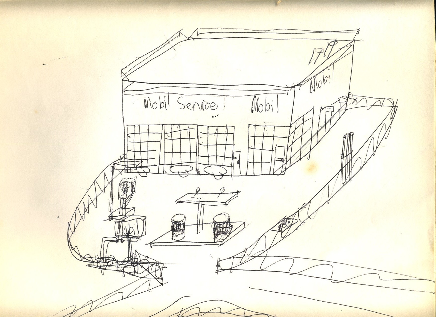
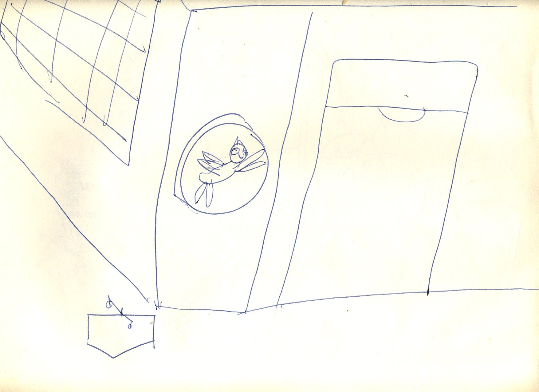
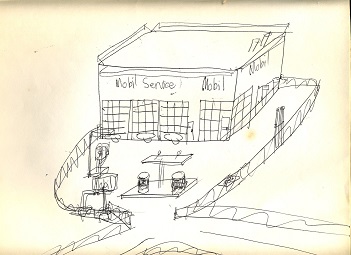
Here we see an attempt to draw the Mobil Pegasus logo that fell so flat that the artist did not even bother to try to put it on the 1950's-shaped main sign.
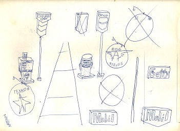
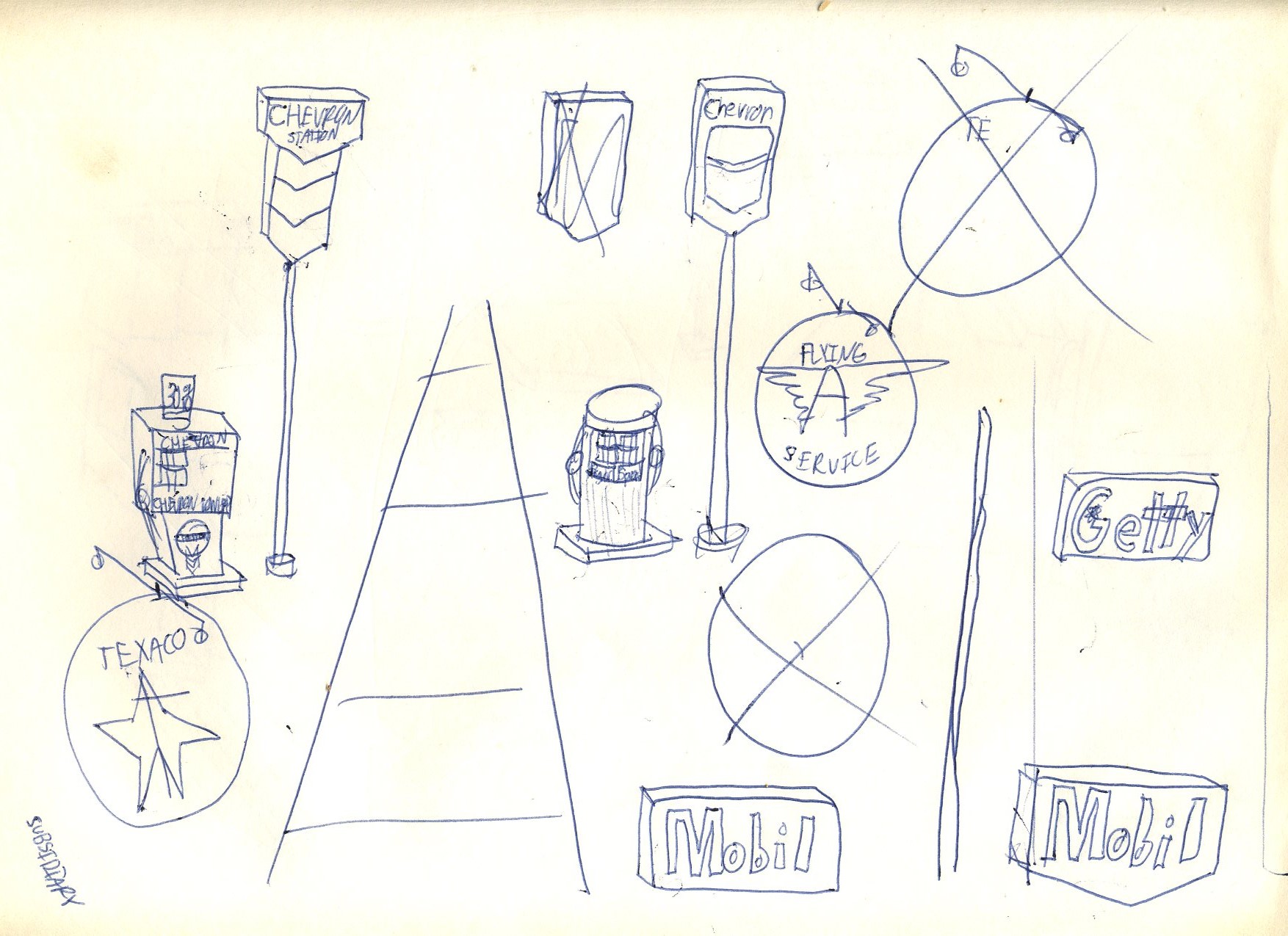
A group of doodles of various gasoline signs.
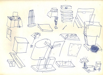
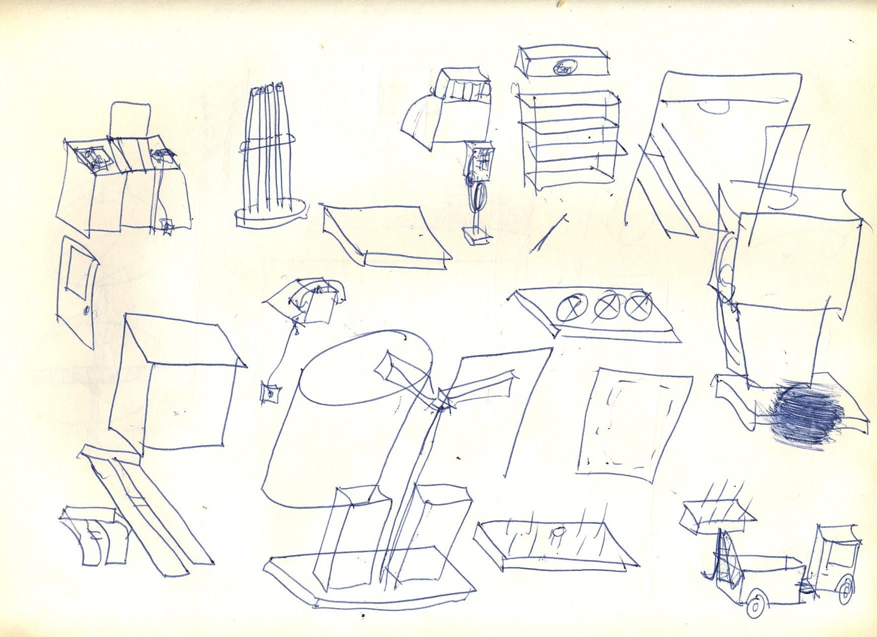
This group of doodles constitutes the various elements of a typical gasoline station.
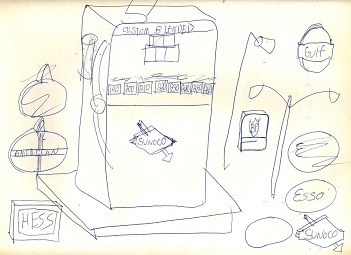
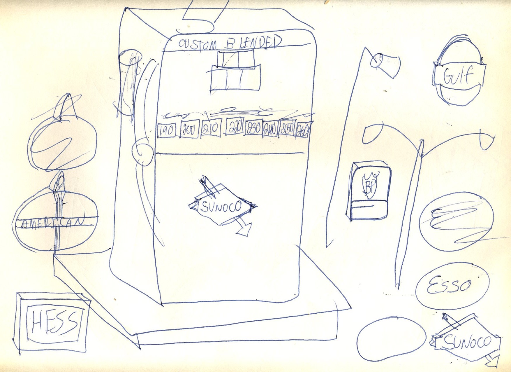
A giant Sunoco Custom-Blended pump and more gasoline signs of the era.
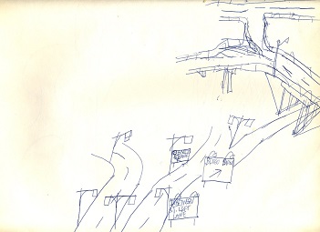
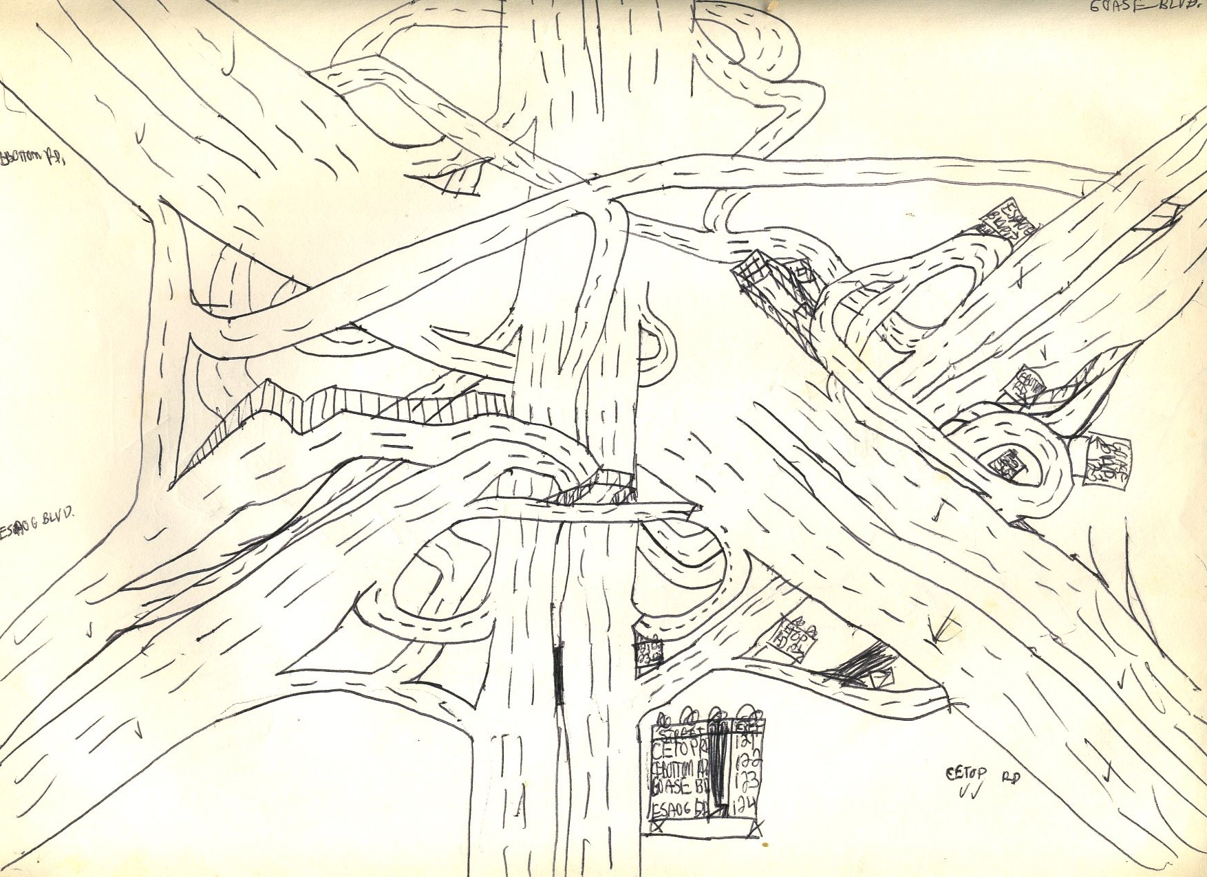
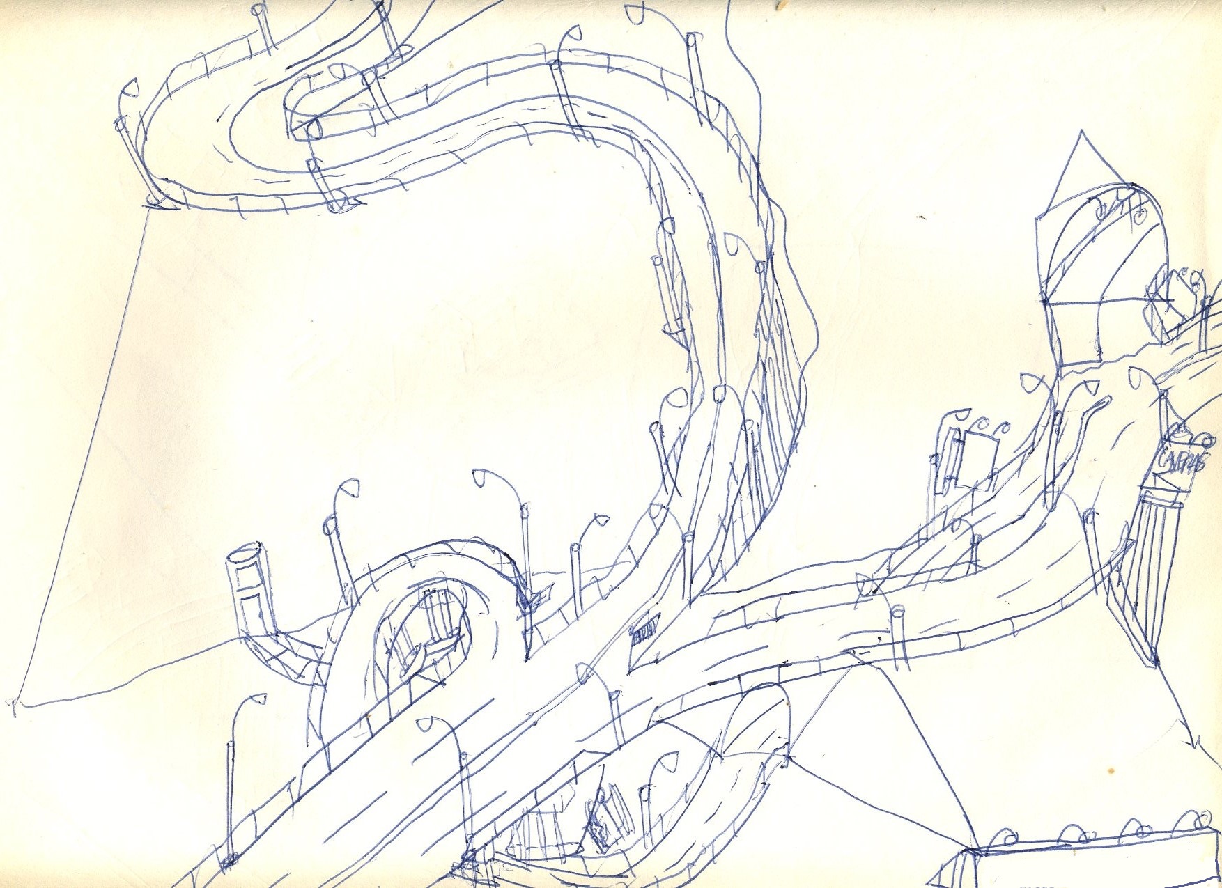
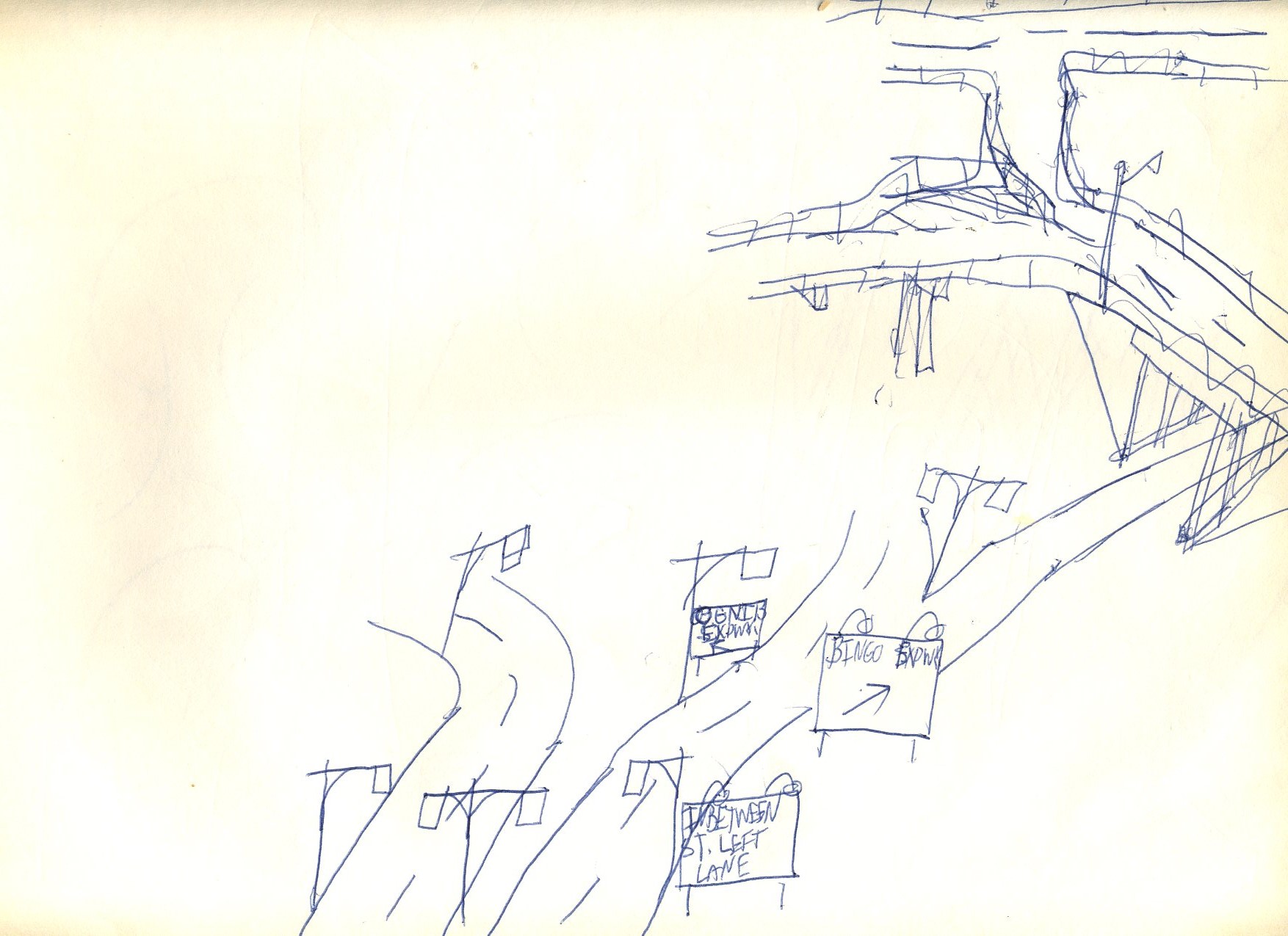
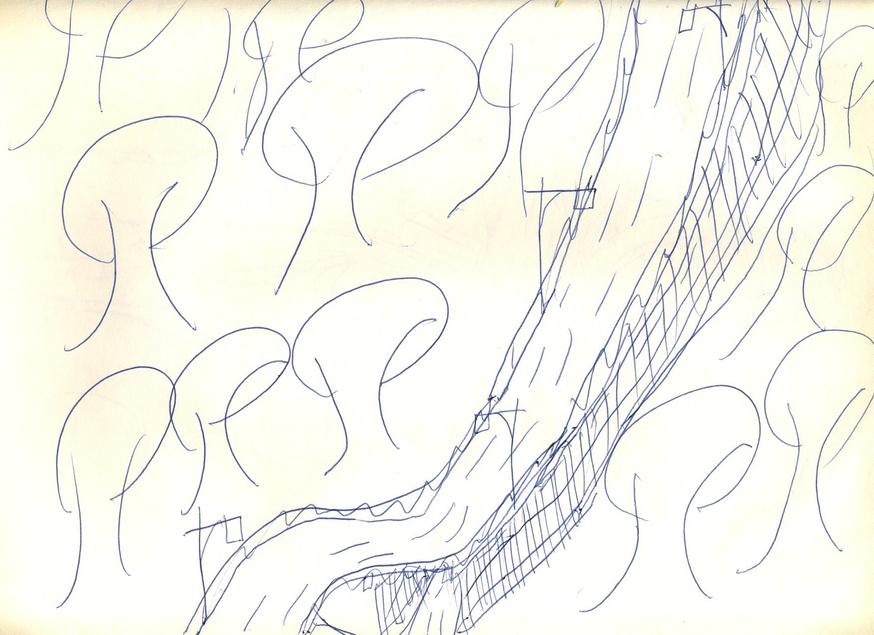
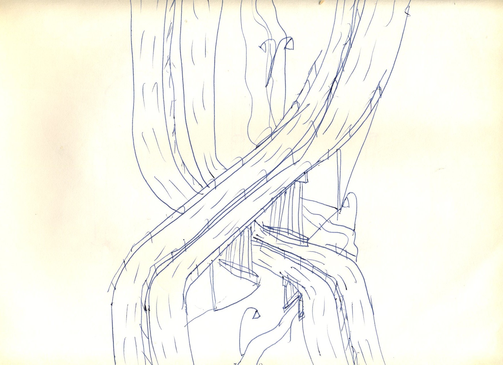
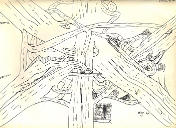
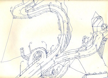
Another parkway whose funding ran out before completion.
This double-deck parkway no doubt saved on the cost of acquiring its right-of-way.
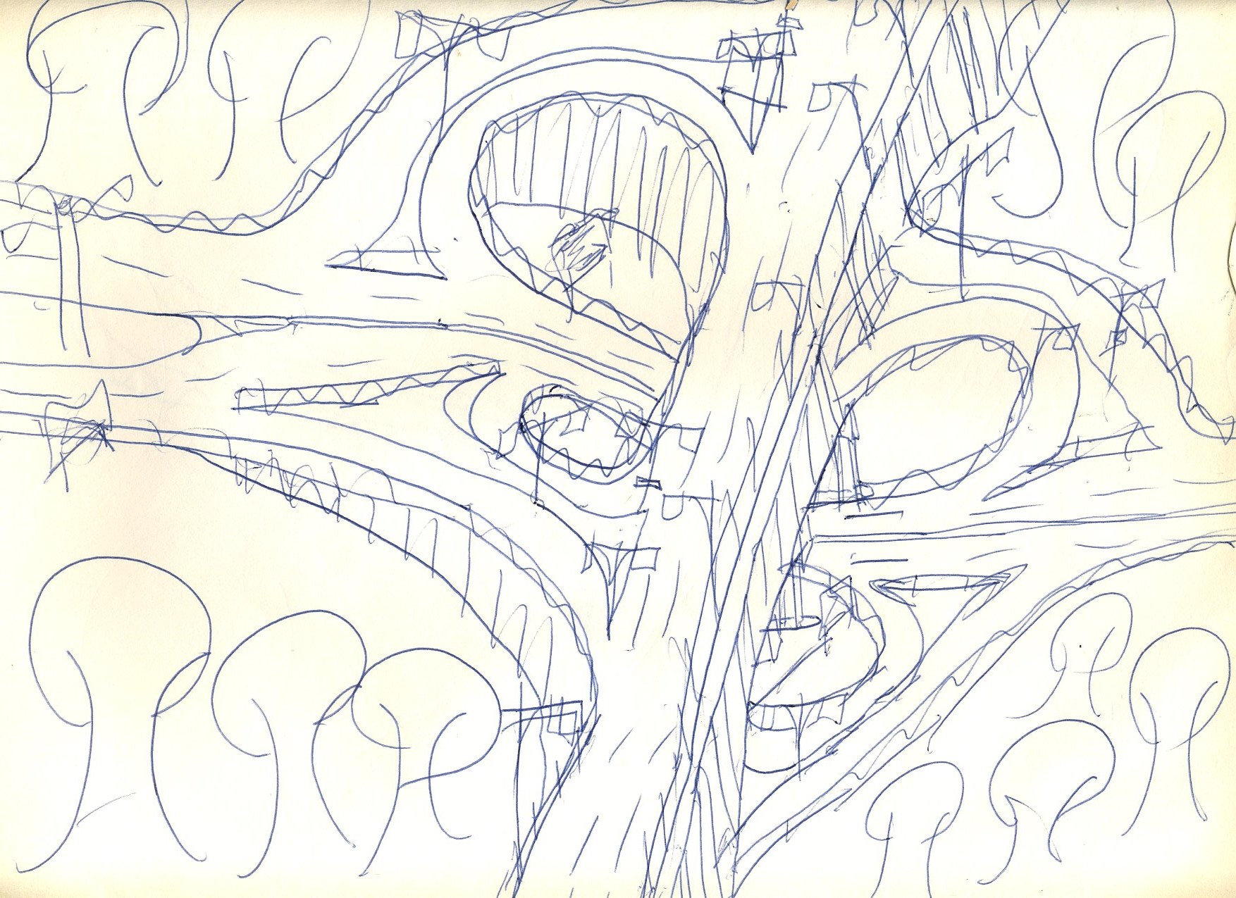
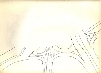
Even more money is saved in what appears to be a continuation of the previous sketch.

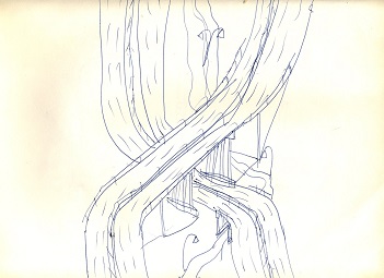
Right-of-way costs must have gone down sharply as the two levels not only end, but the two carriageways separate with an extremely wide median.

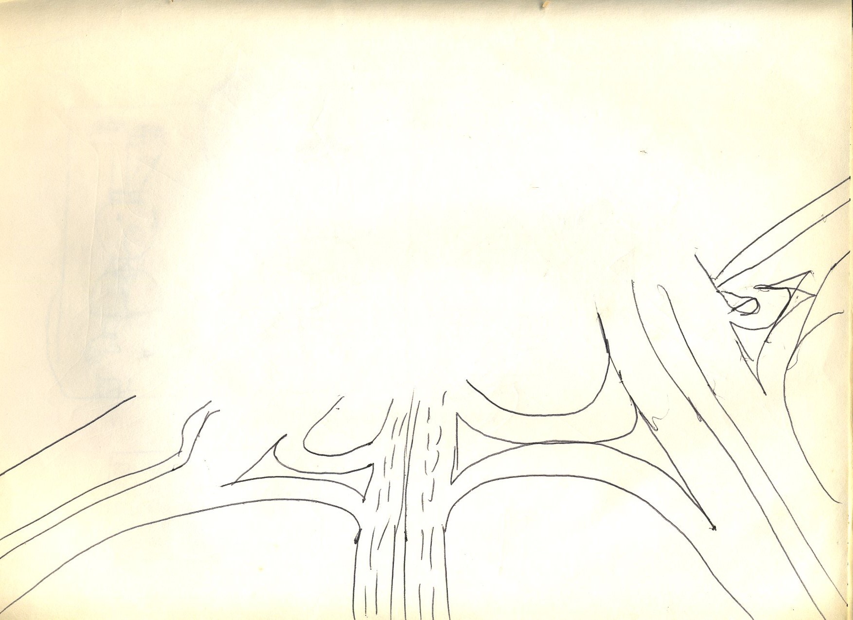
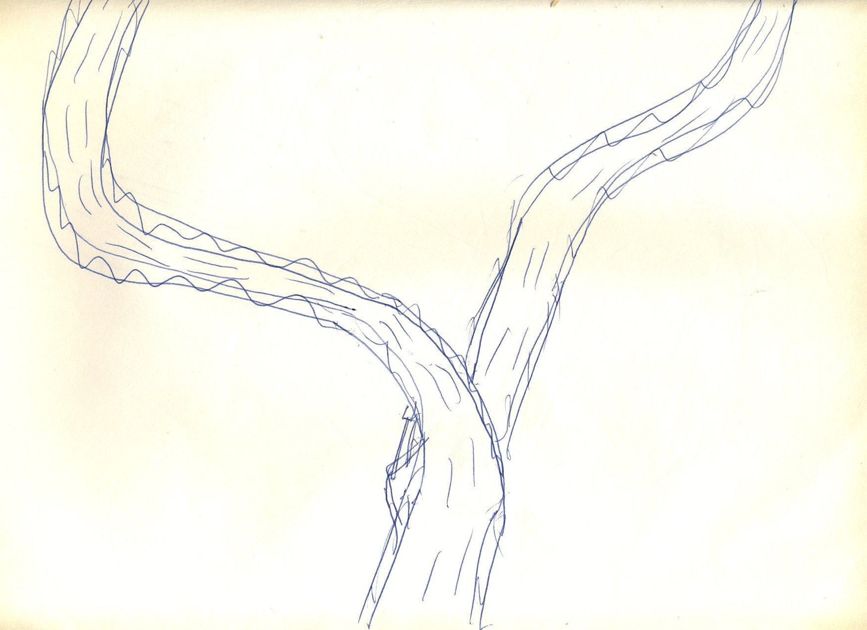
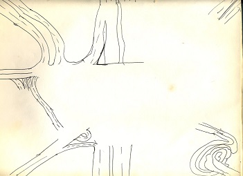
Once again, the inspiration evaporated prior to the completion of this sketch.
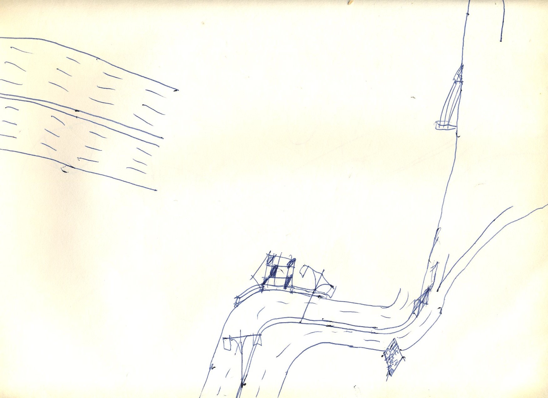
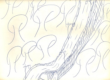
At least this sketch of rudimentary Deskey lamp posts appears to be completed, despite not amounting to much, even for Deskey fans.
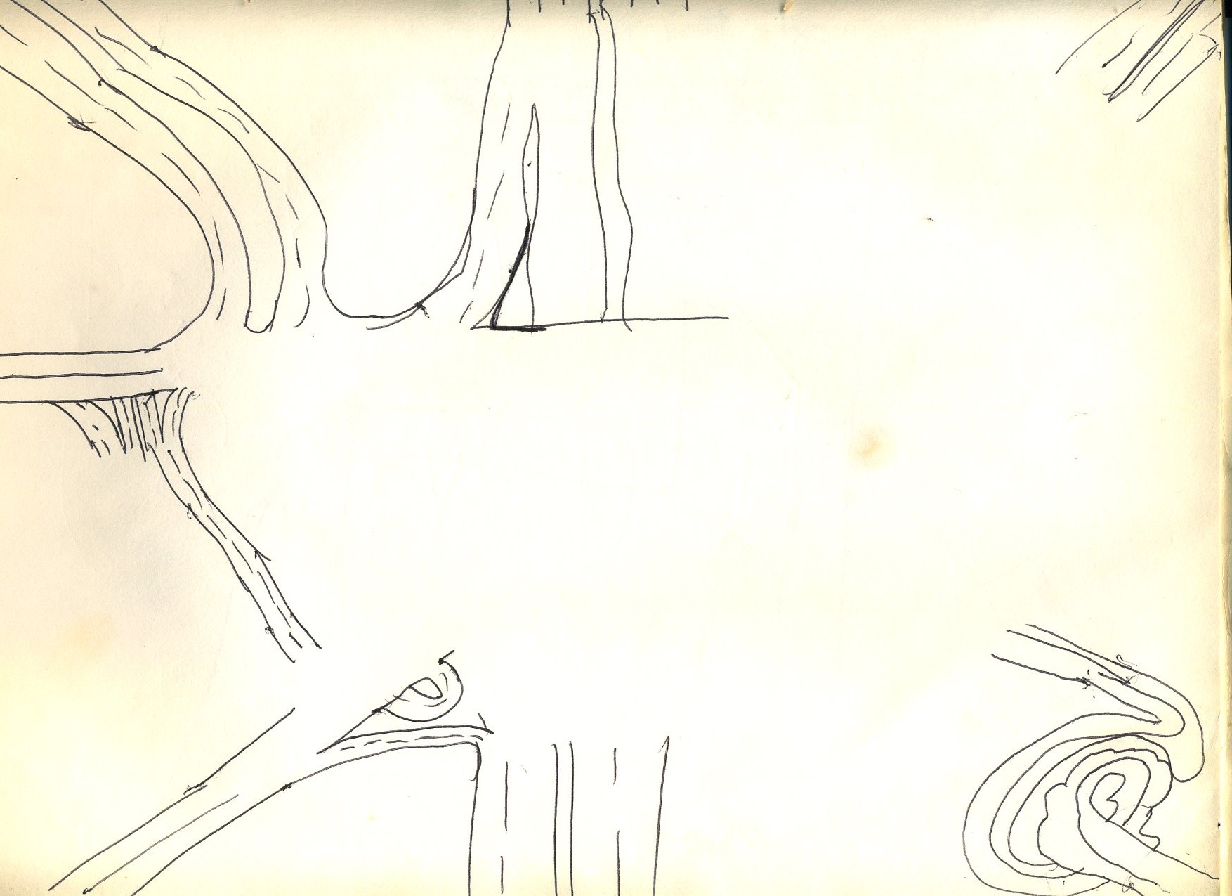
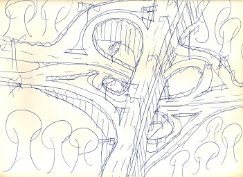
Some budding depth is apparent here in this grade-separated crossroads; this will emerge more in the other galleries in the museum.
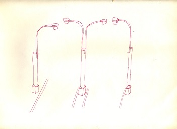
This sketch is clearly a later addition to the sketch book as it is less a caricature of Deskey lamp posts and more of an actual drawing that does them some justice. It provides a reasonable conclusion to this gallery.