The Green Box
The Green Box yielded another hundred and six sketches, enough to construct another wing of this museum of fine art. These were drawn in 1972 and, while they show early attempts at the same subjects that dominate the other galleries in the museum, we see some evolution in technique, as well as some experimentation with novel concepts and drawing implements other than the hallowed ball-point pen. Once again, we invite an unbiased individual outstanding in his field to write the commentary for each sketch.
I'd like to introduce myself. My name is Townsend Phillipson. I'm here today to warn you not to do what I did so that you don't get into trouble the way I did. I was called for jury duty recently, and, like most folks who are called, I tried to get out of it. I didn't really have a legitimate excuse, so I made one up. I lied to the judge and to my fellow citizens and did harm not only to them, but to the parties in the civil suit that was being tried. The judge saw through this and tried to verify my excuse right at the bench. It didn't work for me and it won't work for you. Don't ever mess with a judge. He held me in contempt of court and sentenced me to two days in jail or two hours of community service. The two hours sounded like a good deal as opposed to two days in jail, but I had no idea what sort of service he had in mind. So, instead of working my usual job as the holder of the Warren G. Harding Chair, Distinguished Professor of Economics at the River City College, I was sentenced to write the commentary for these sketches. Please, remember: Don't lie to the judge. Cooperate when called for jury duty and serve willingly and you won't have to go down the path that I did.

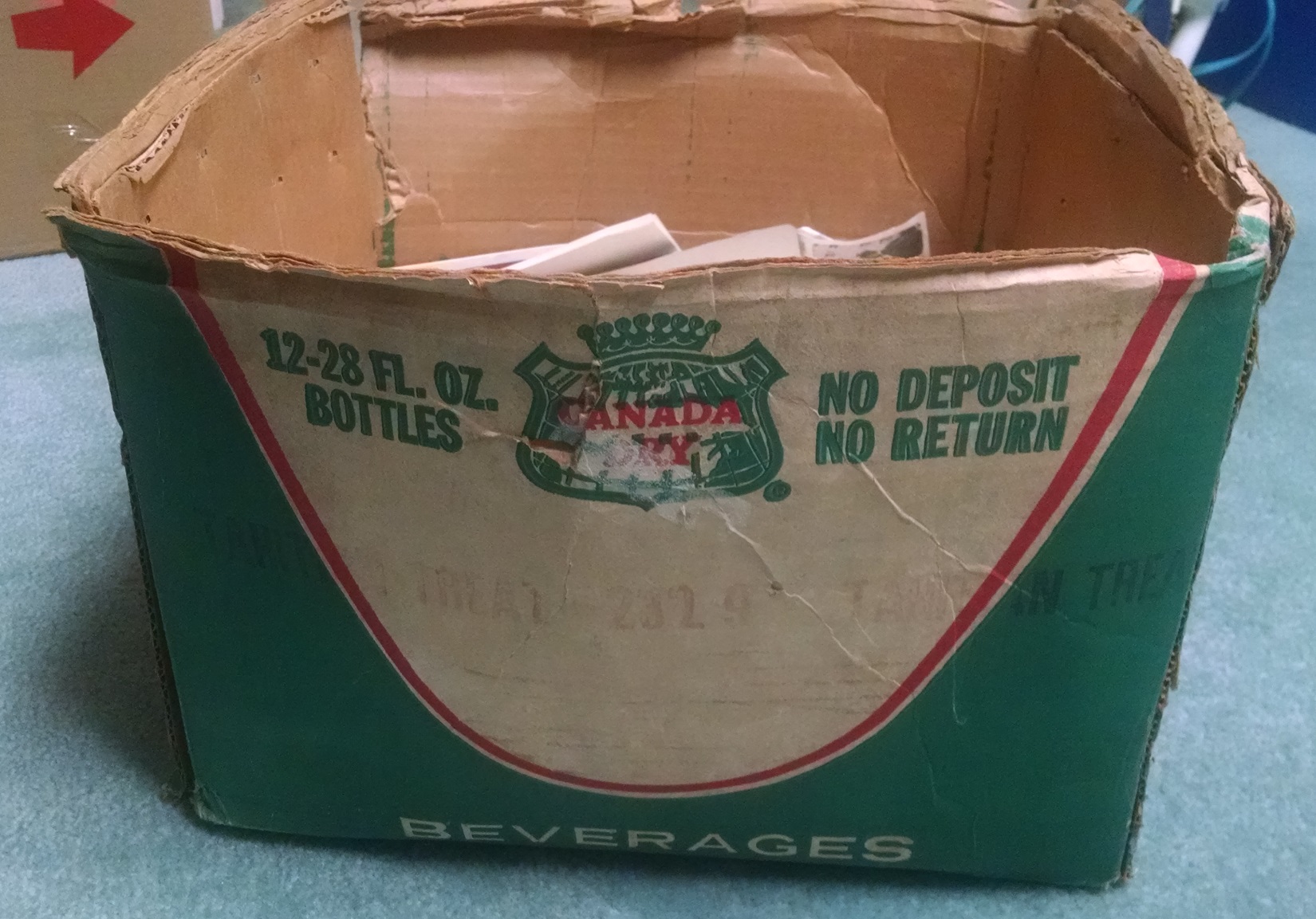
First, we have what appears to be a picture of the box that held the sketches. Great, that was easy, only 104 to go.

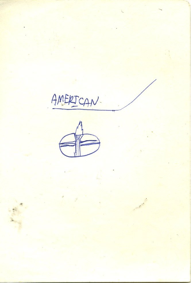
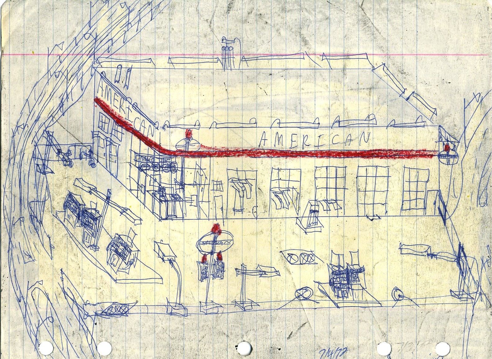
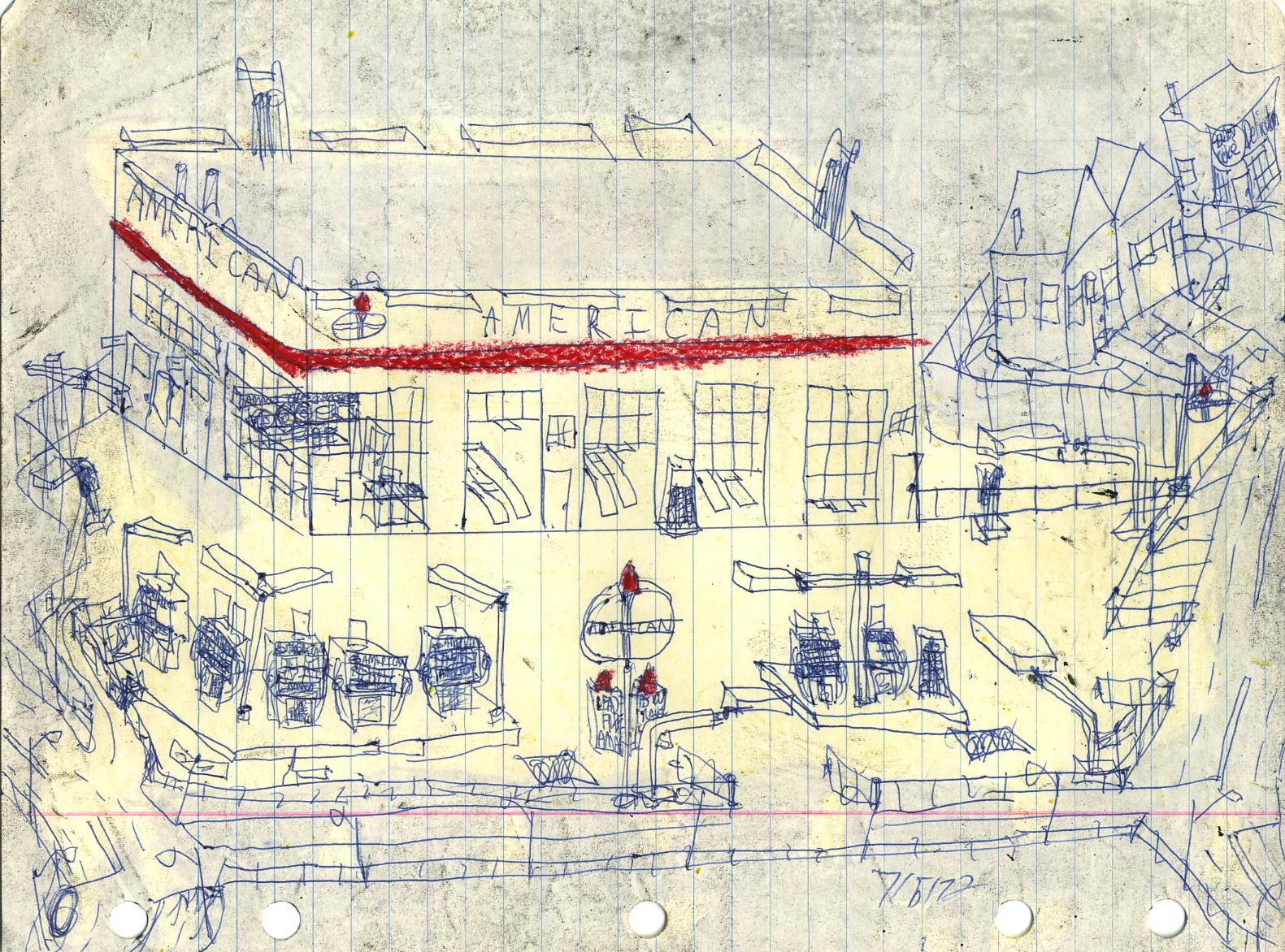
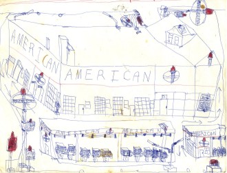
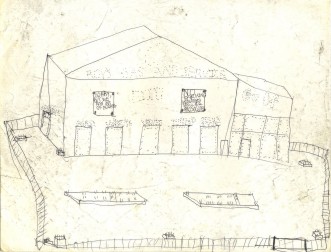
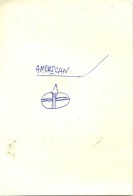
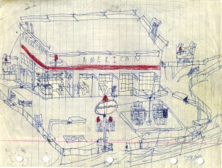
A recognizable sketch of an American Oil Company station. It's hard not to see that considering how many times the torch and oval appears.
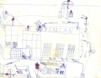
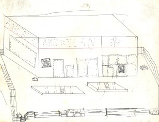
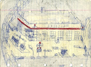
Another American Oil station. The sideways sign at the top is an unusual twist that we will see repeated and shows some confusion on the part of the artist.
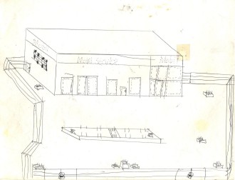
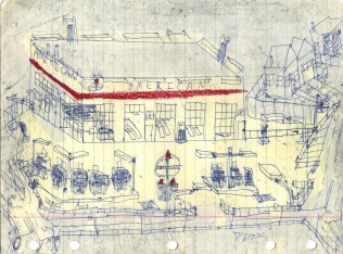
Like the previous American Oil station sketch, the office bears the number "13." It can't be too unlucky as the sketch has survived 48 years.
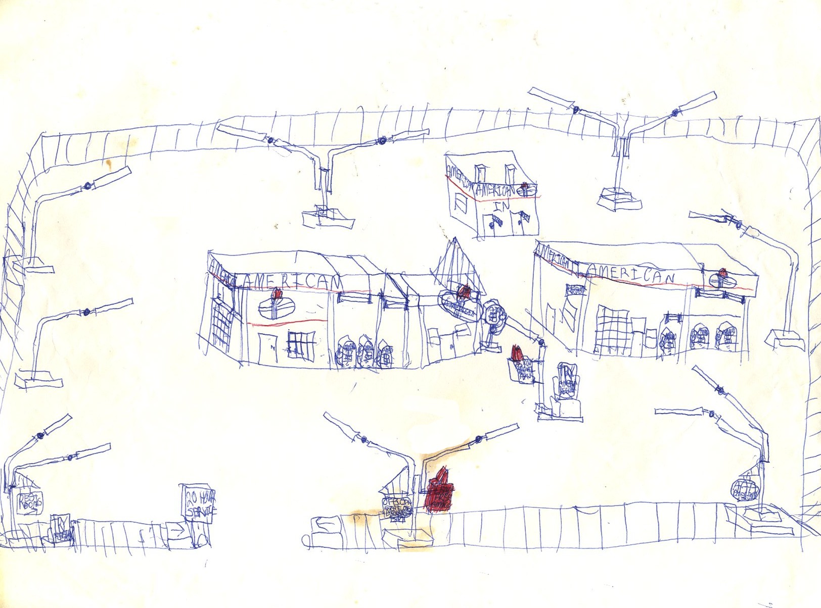
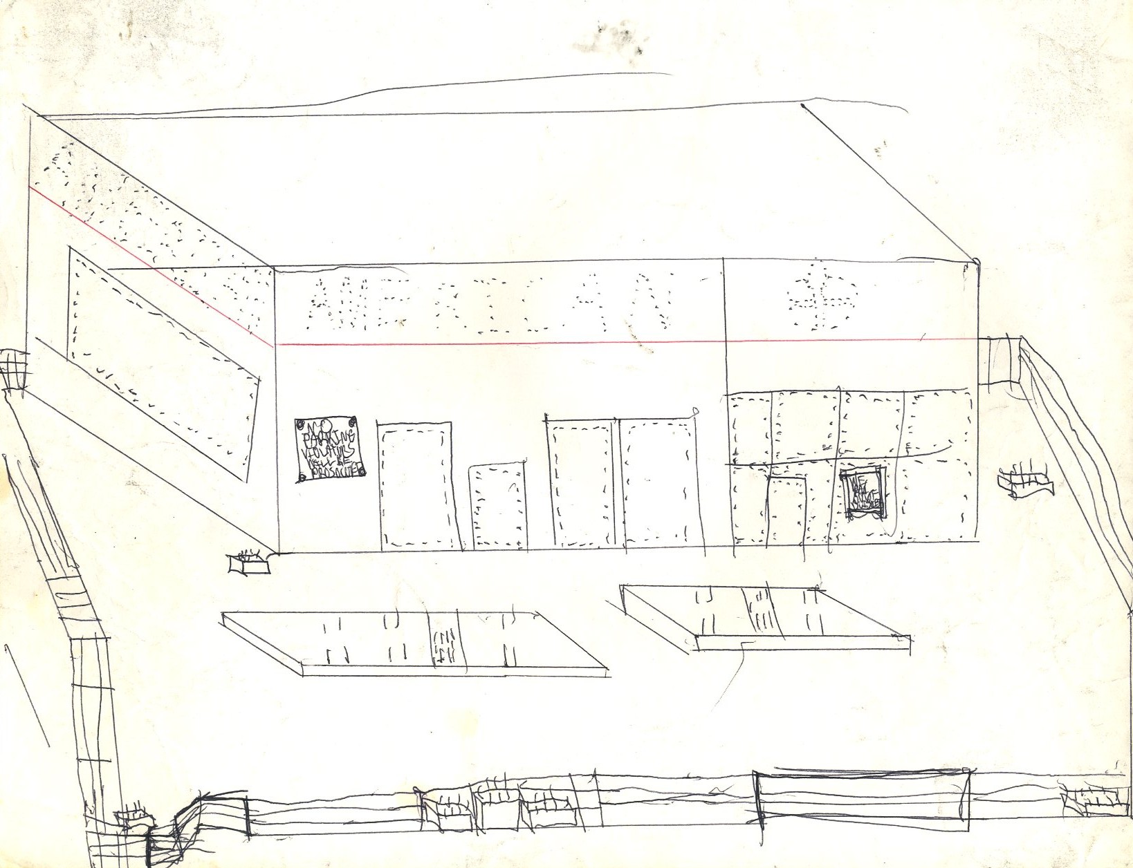
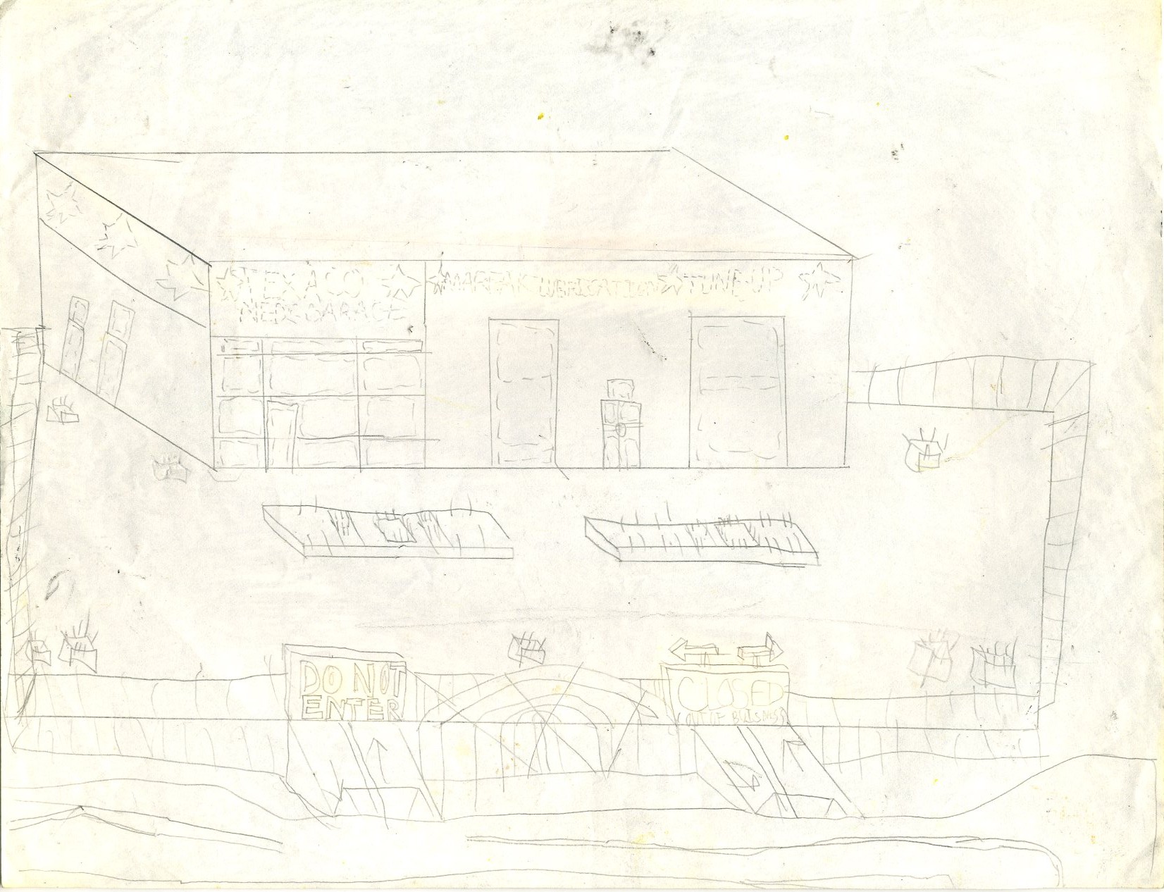
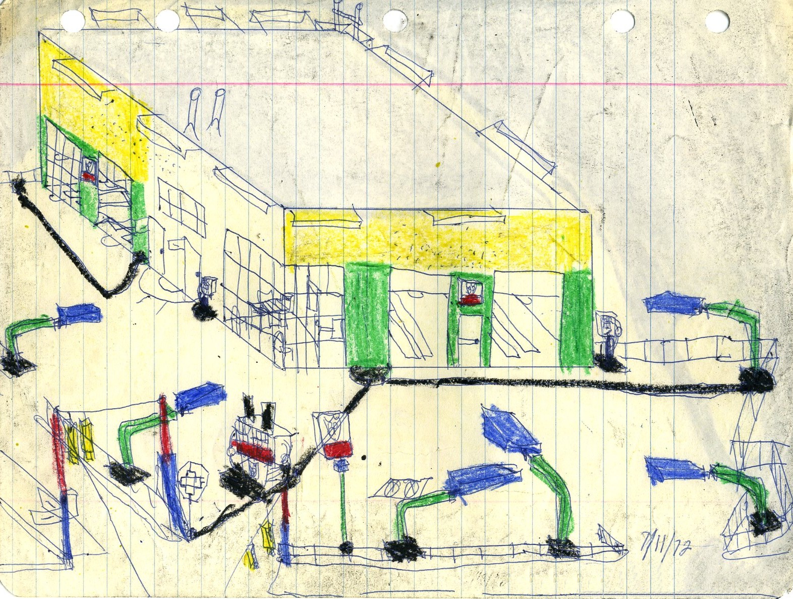
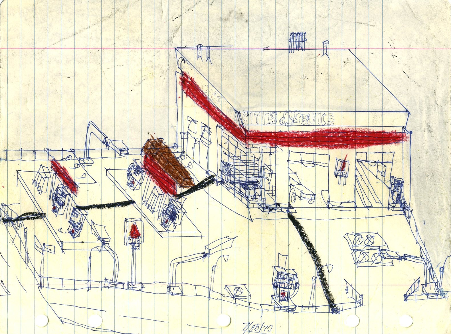
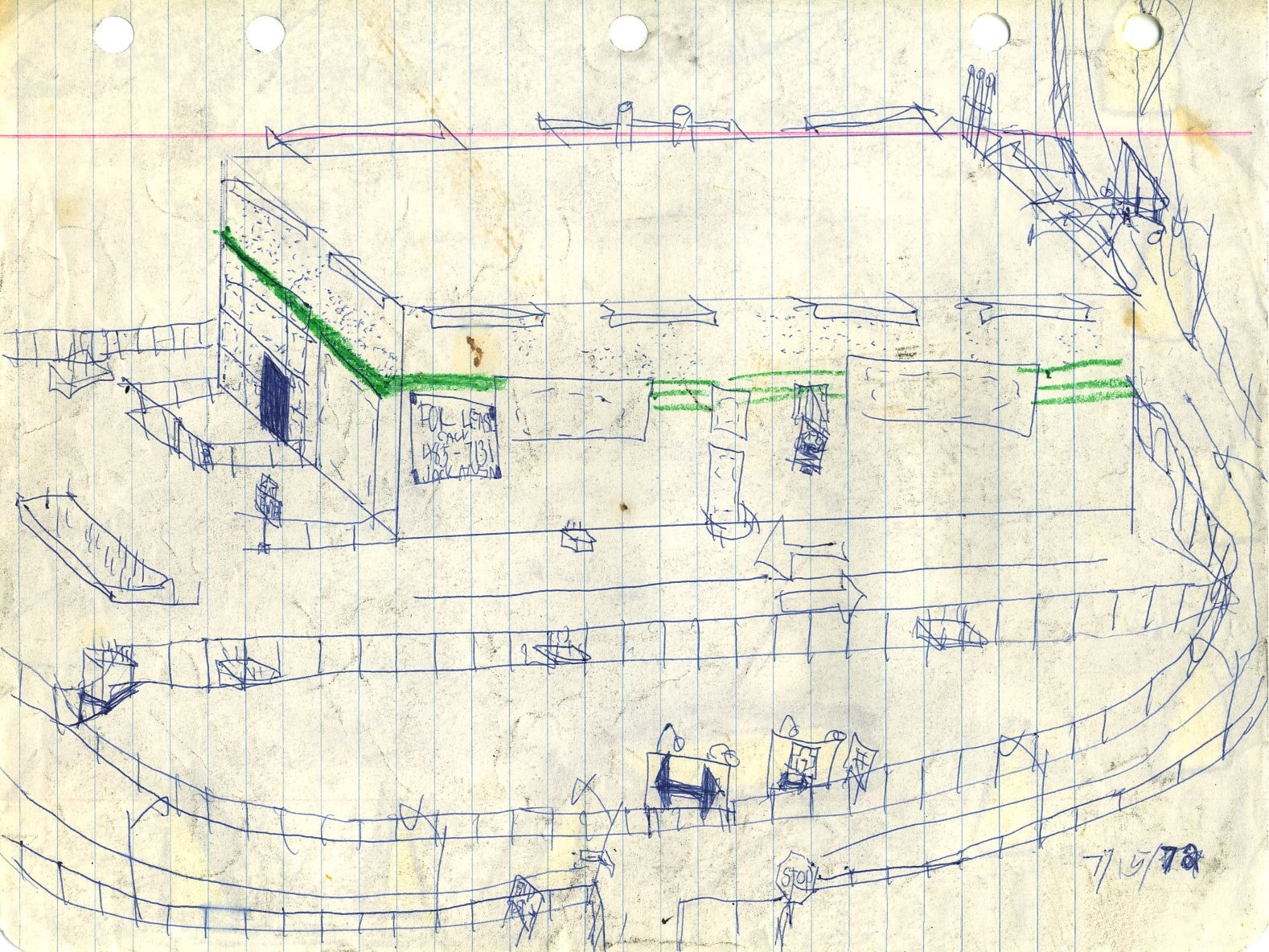
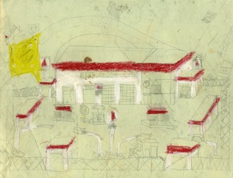
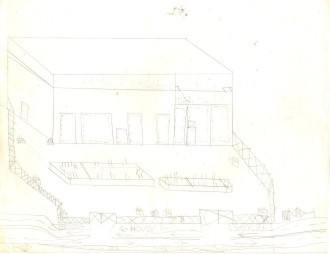
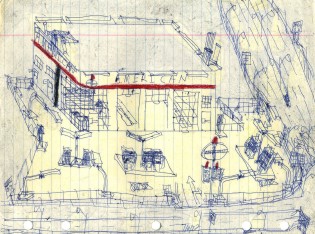
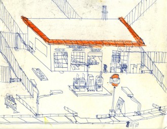
This is kind of an odd setup, particularly with the detached rest rooms at the rear, but definitely American.
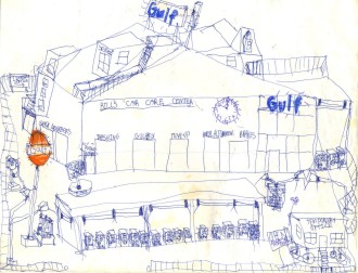
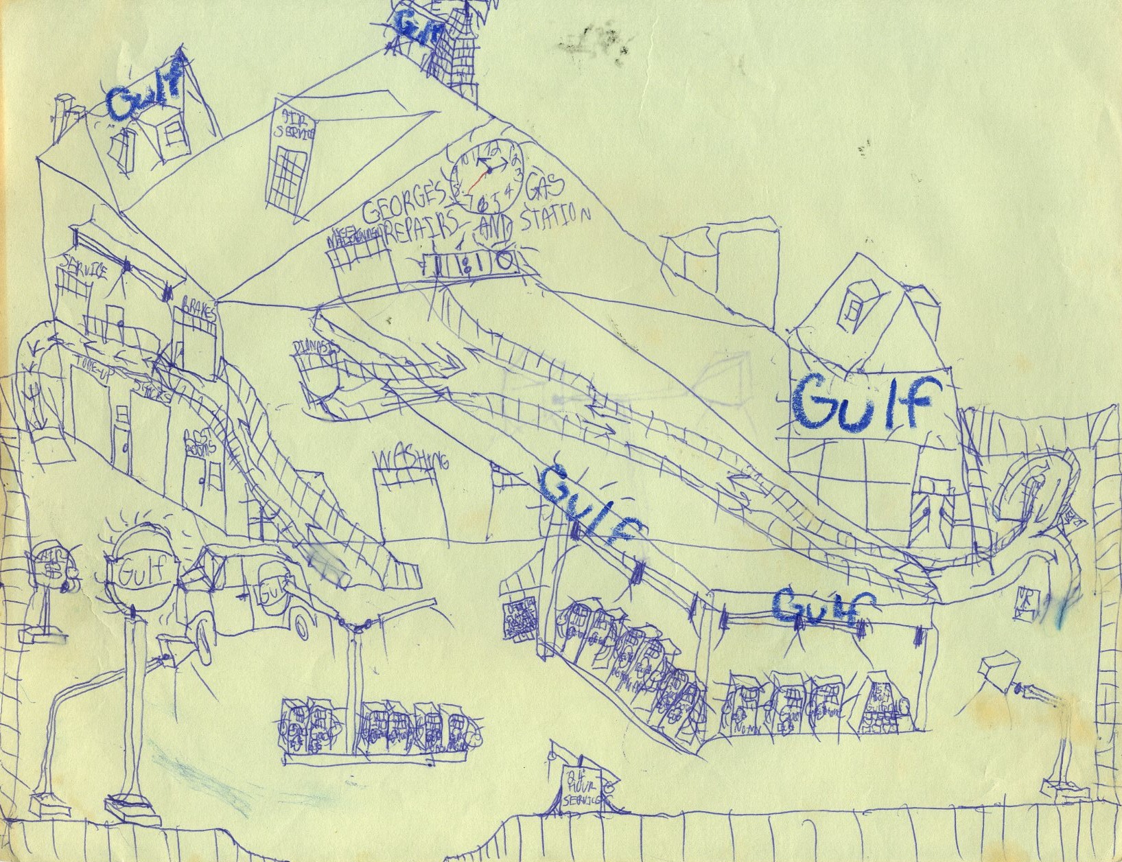
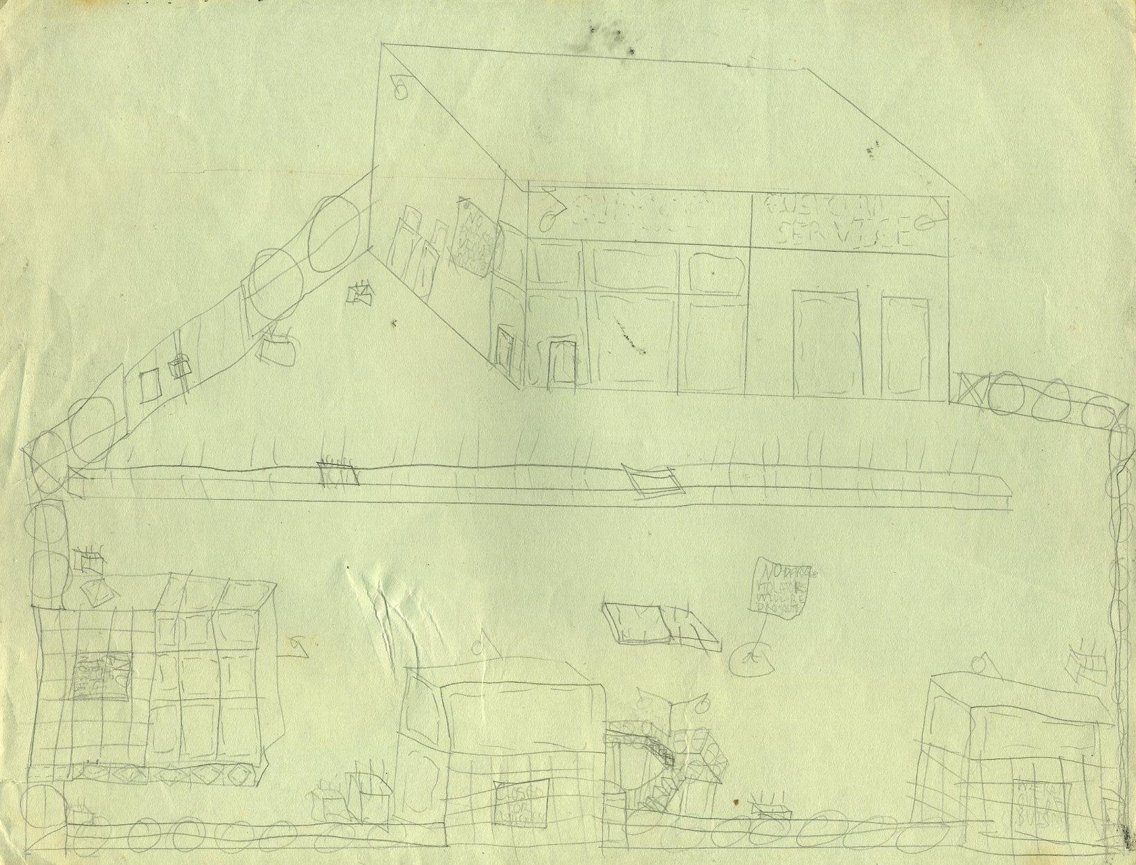
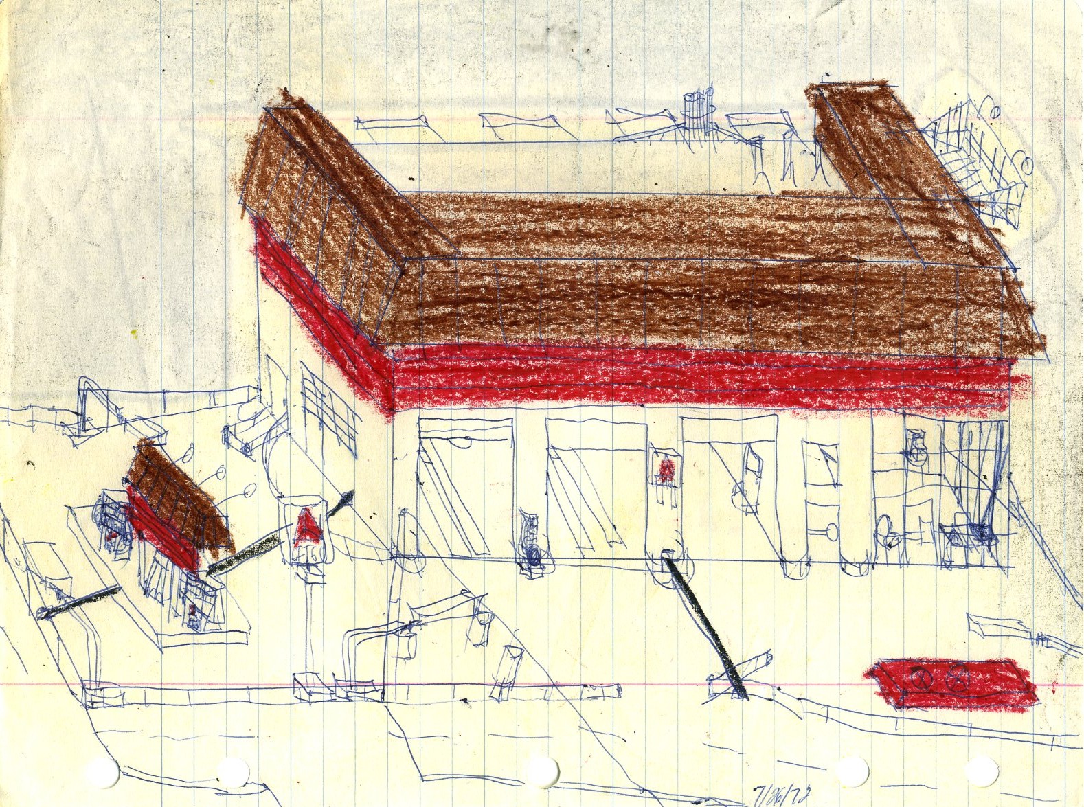
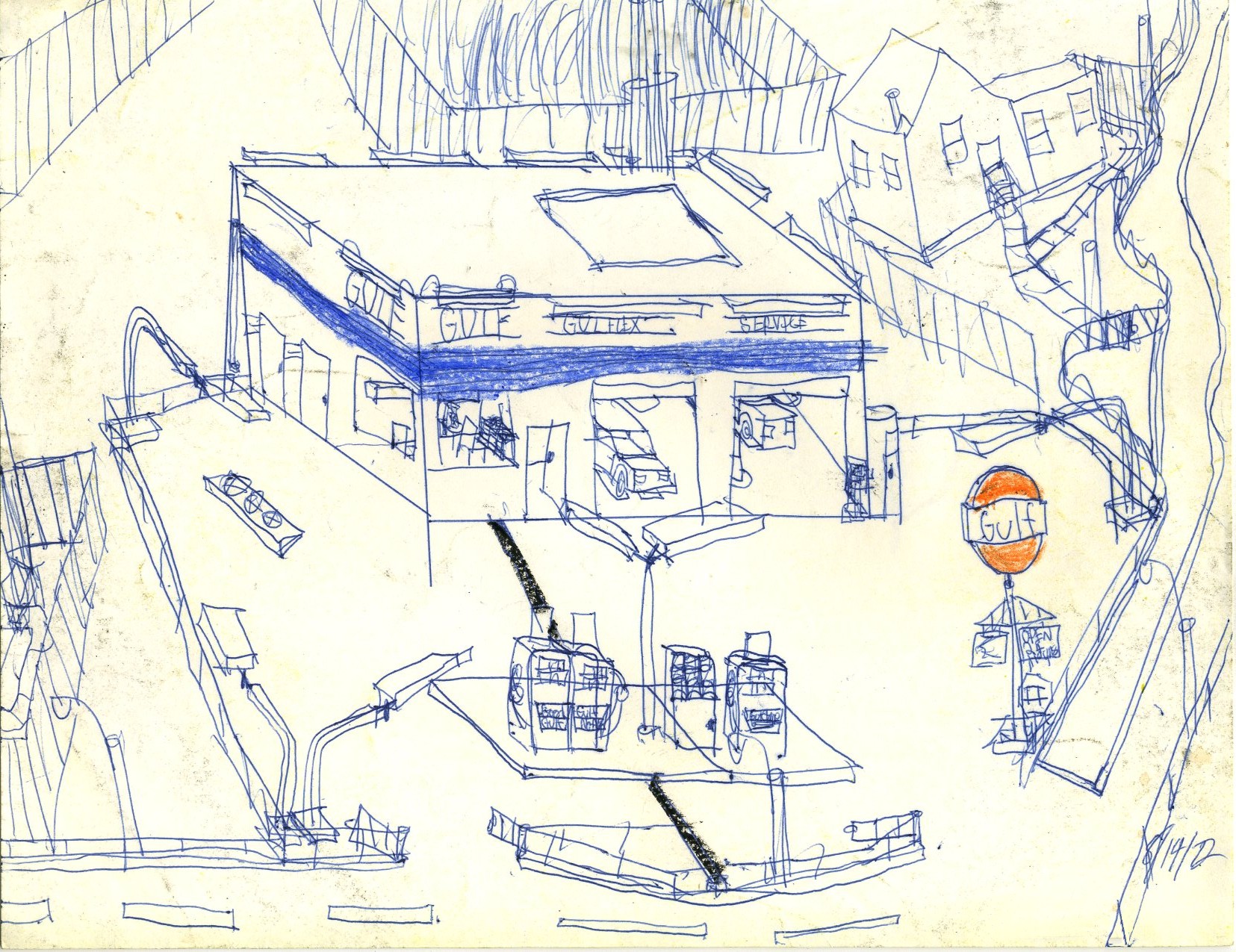
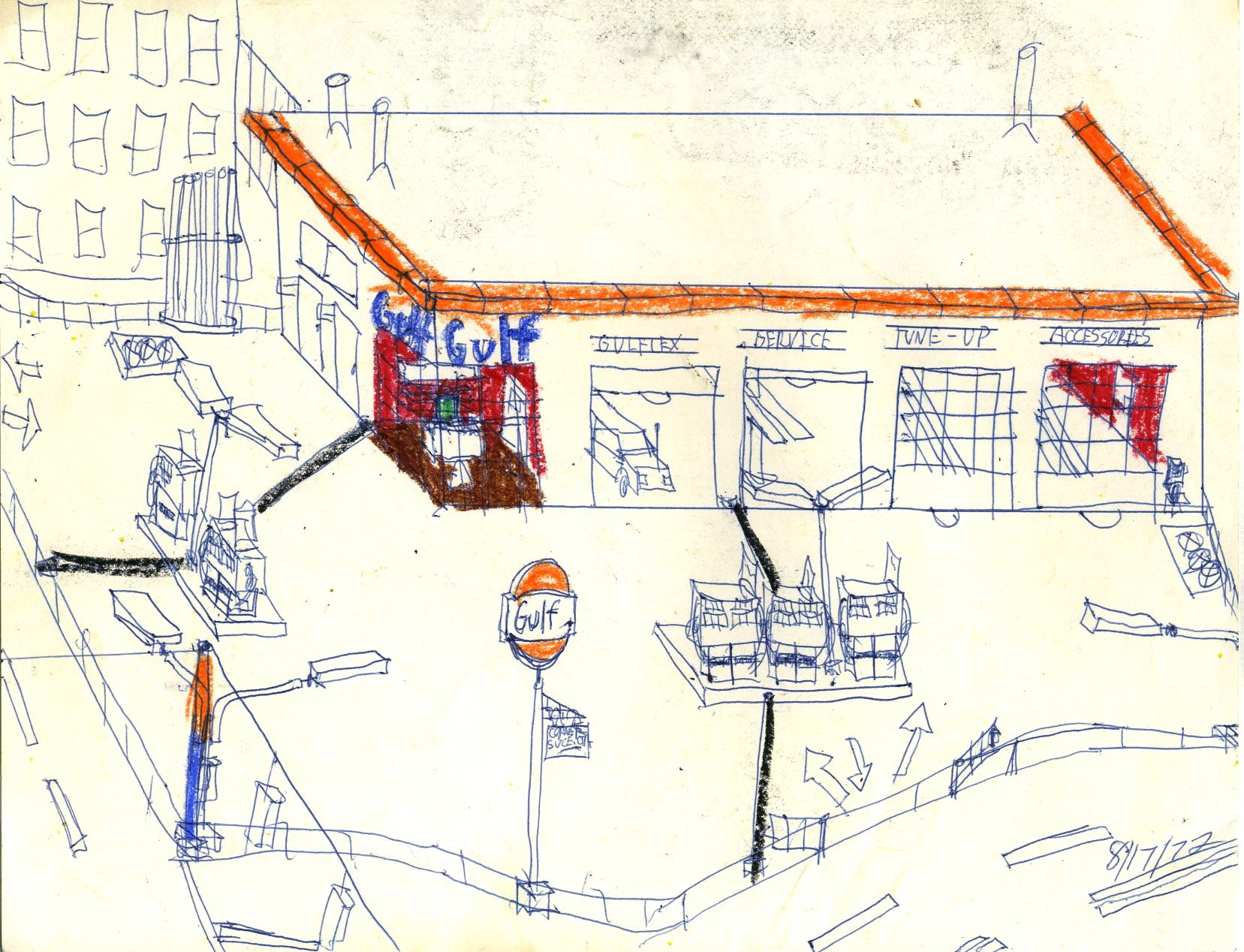
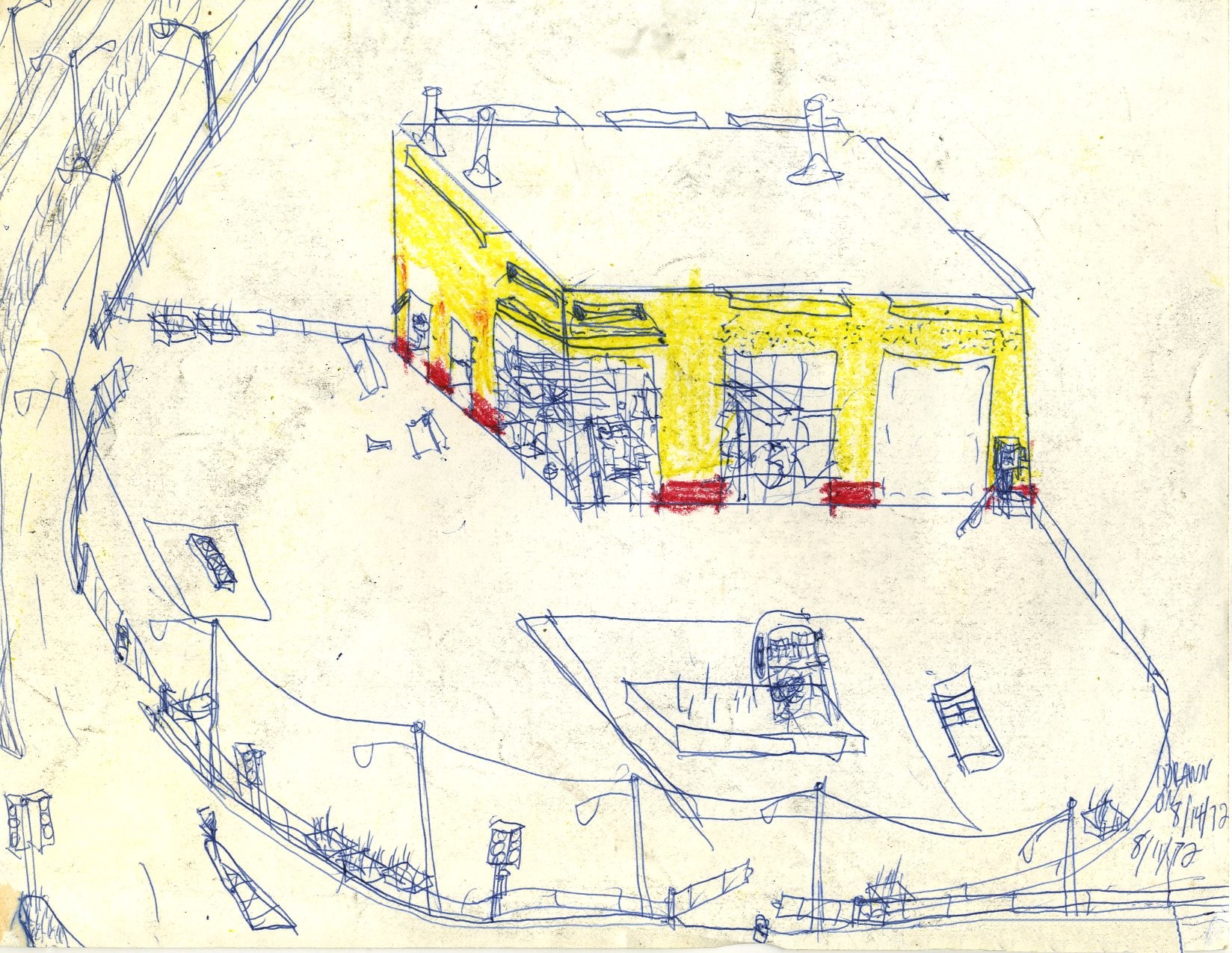
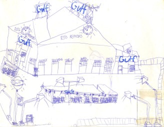
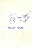
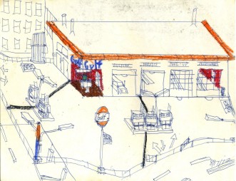
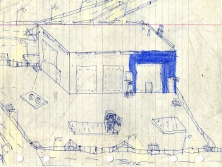
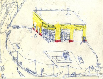
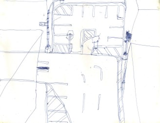
It looks as though a brand new Gulf Oil station is being constructed, perhaps in front of an older building. The Air Service bay on the roof is particularly intriguing-- the sort of thing that attenuates the severity of this sentence.
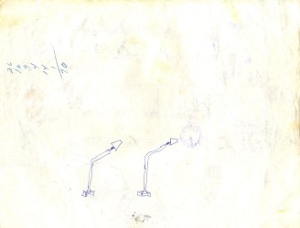
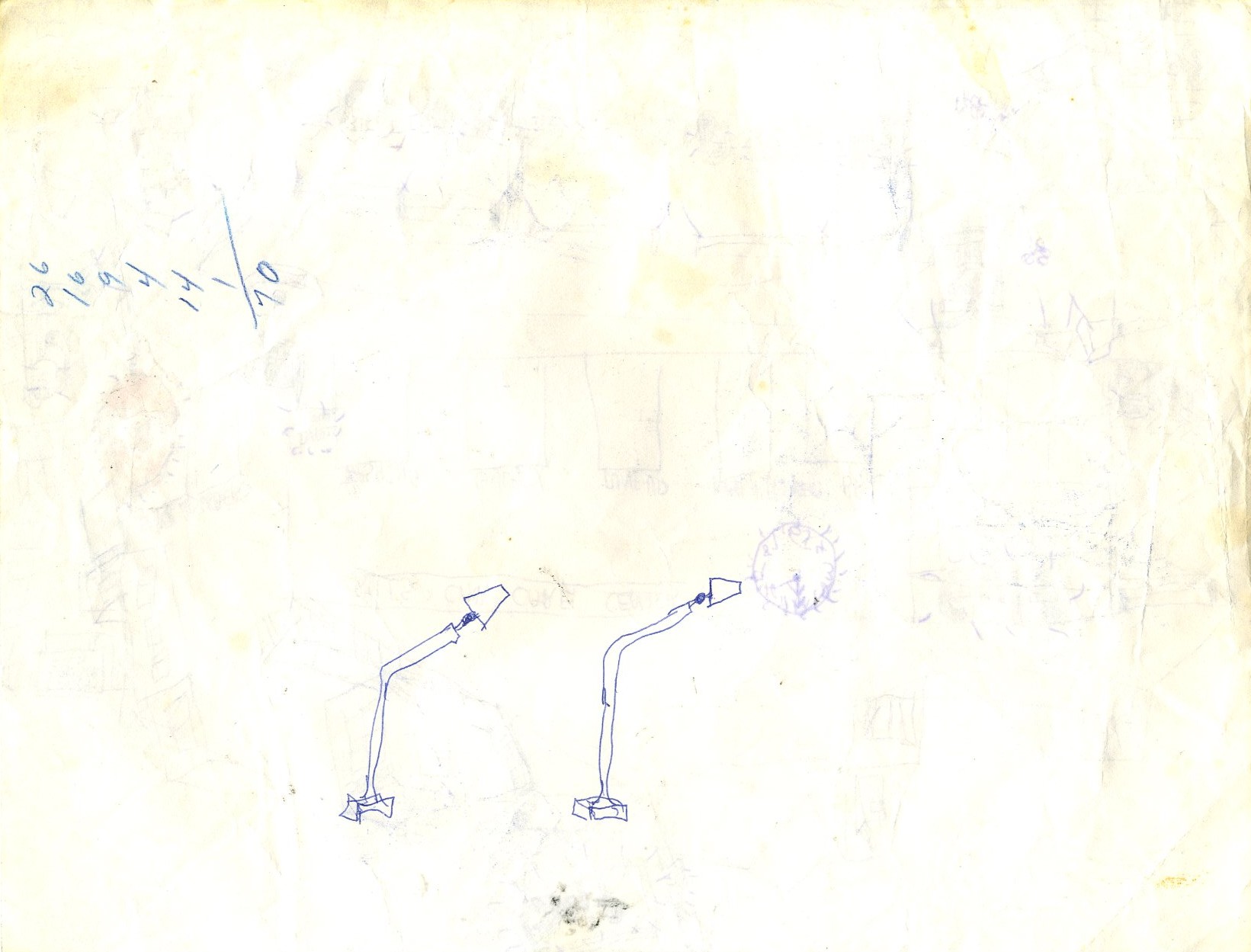
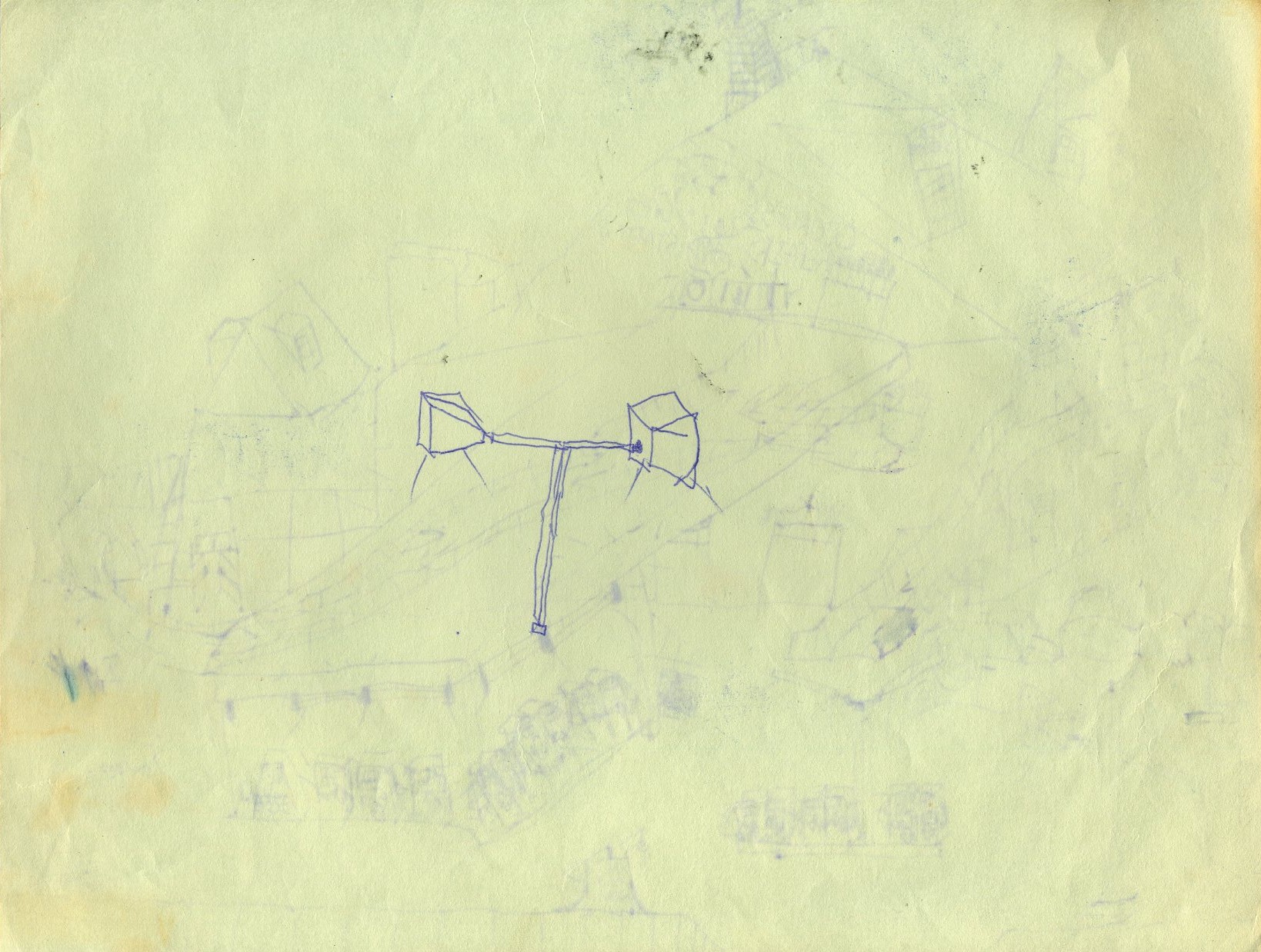
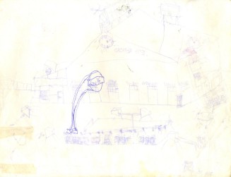
These are a couple of doodles of gasoline station lamp standards.

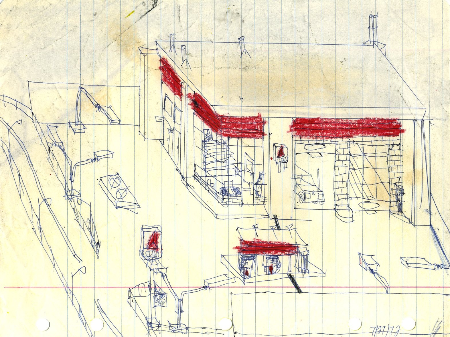
For some reason, the Gulf sign was removed from the sketch. The "Air Service" bay makes a repeat appearance.

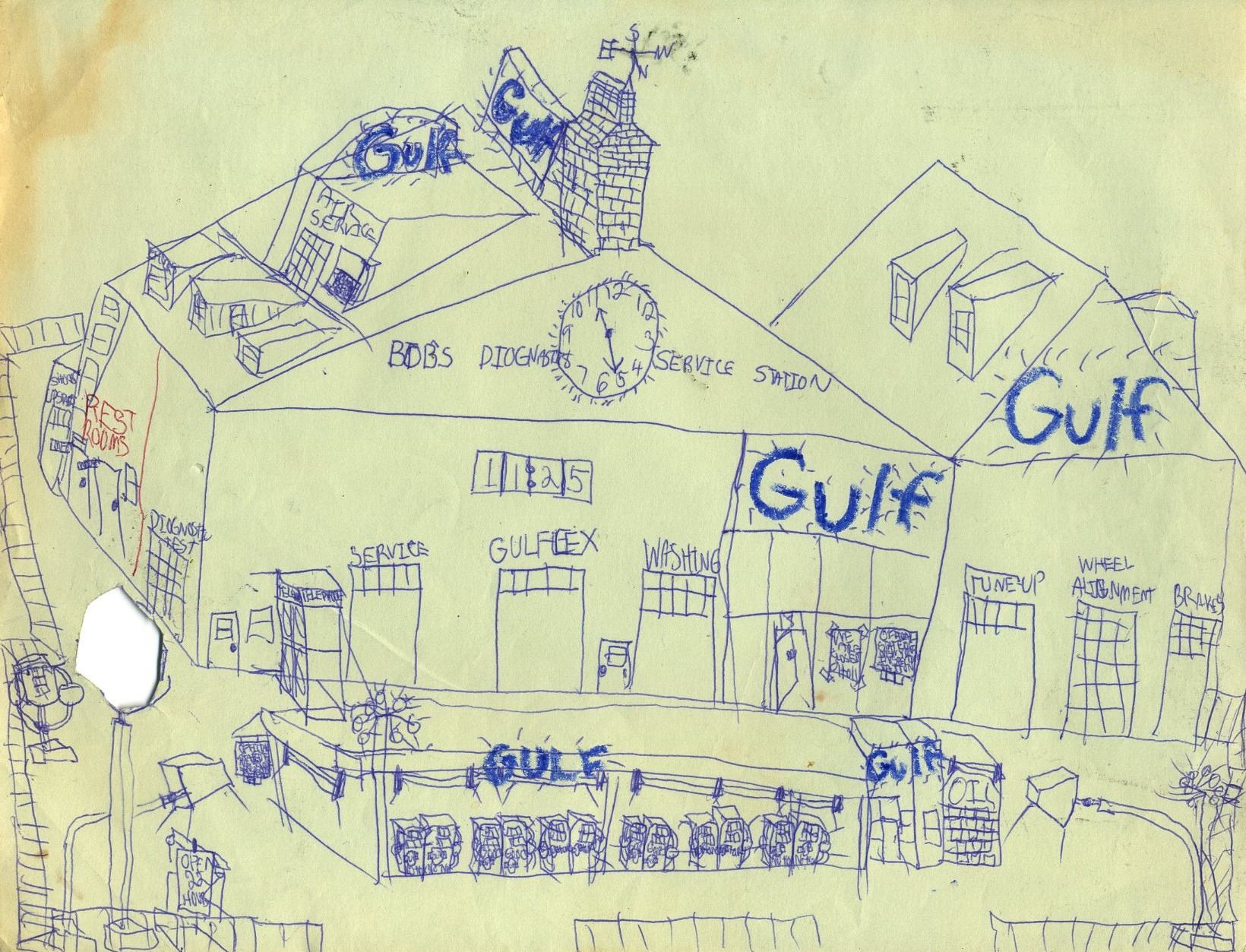
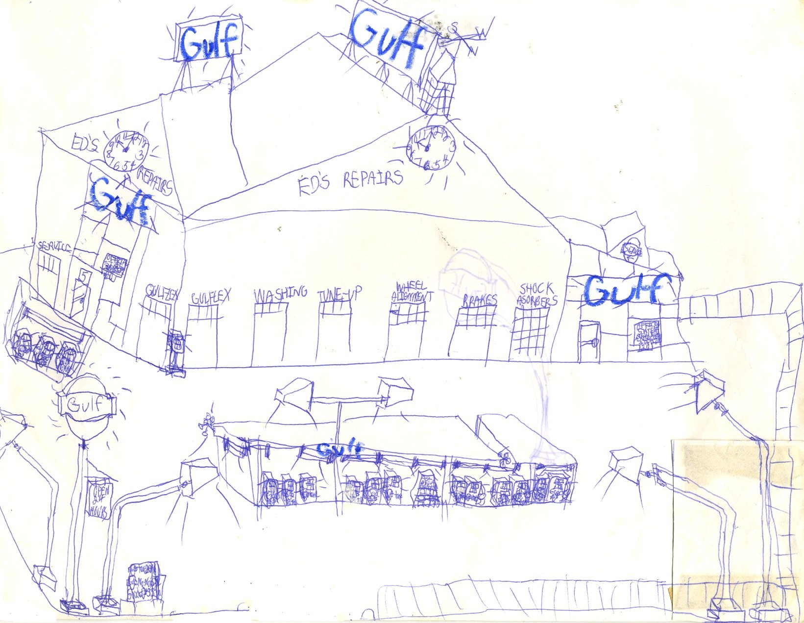
Another really complicated Gulf station with Air Service.
A lone gasoline lamp standard.
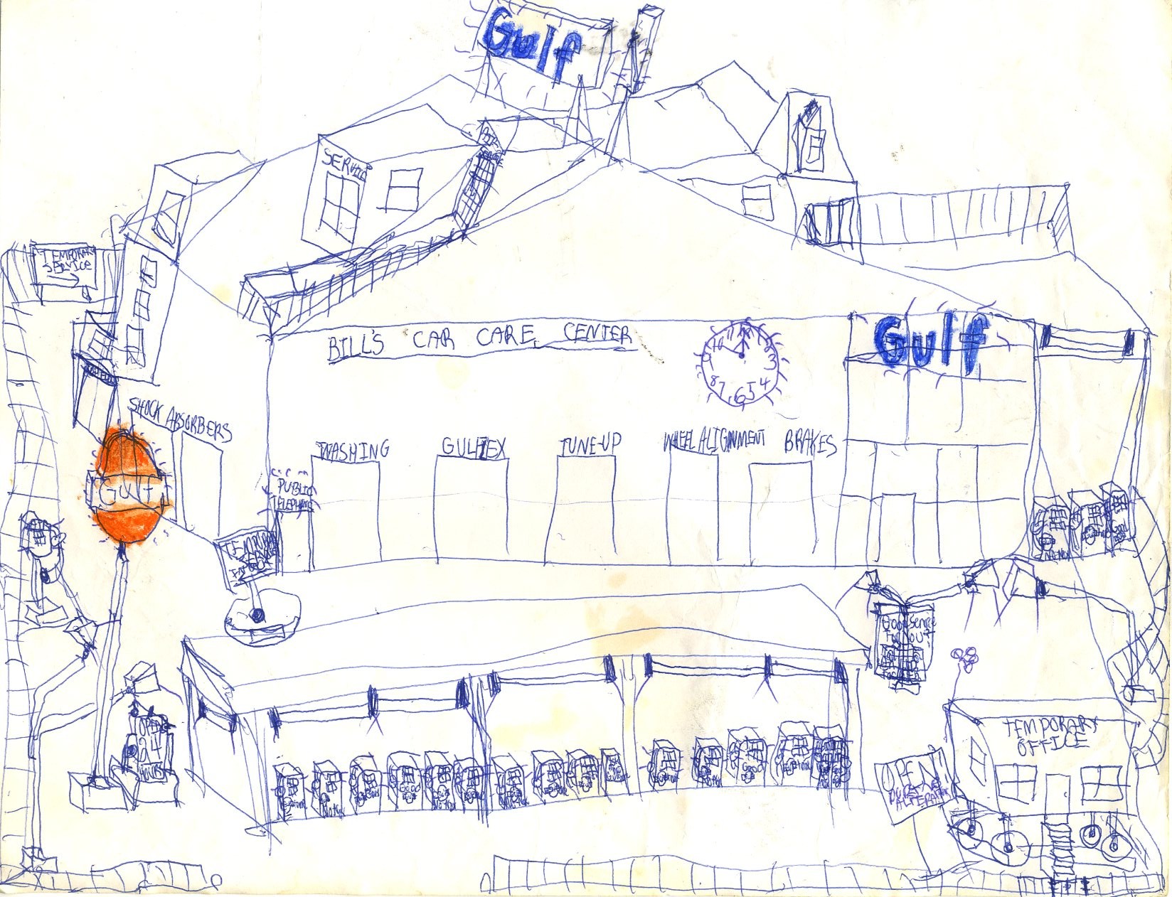
The lower right corner of this sketch of a Gulf Oil station appears to have been removed and replaced; this may have been an effort to find an alternative to the blackouts that are common in other galleries in this museum.
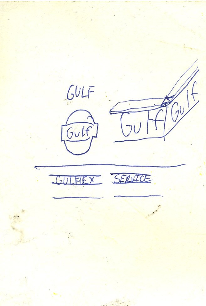
Side-mounted Gulf signs didn't quite look like this one, which looks as though it ought to hold a Texaco sign instead.

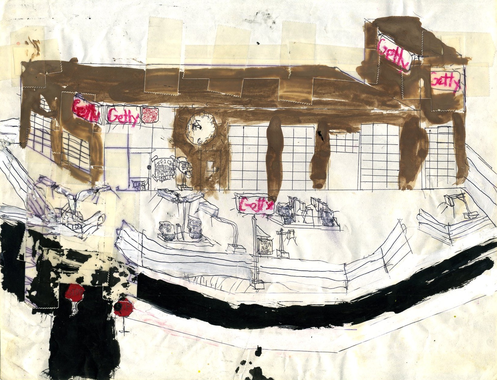
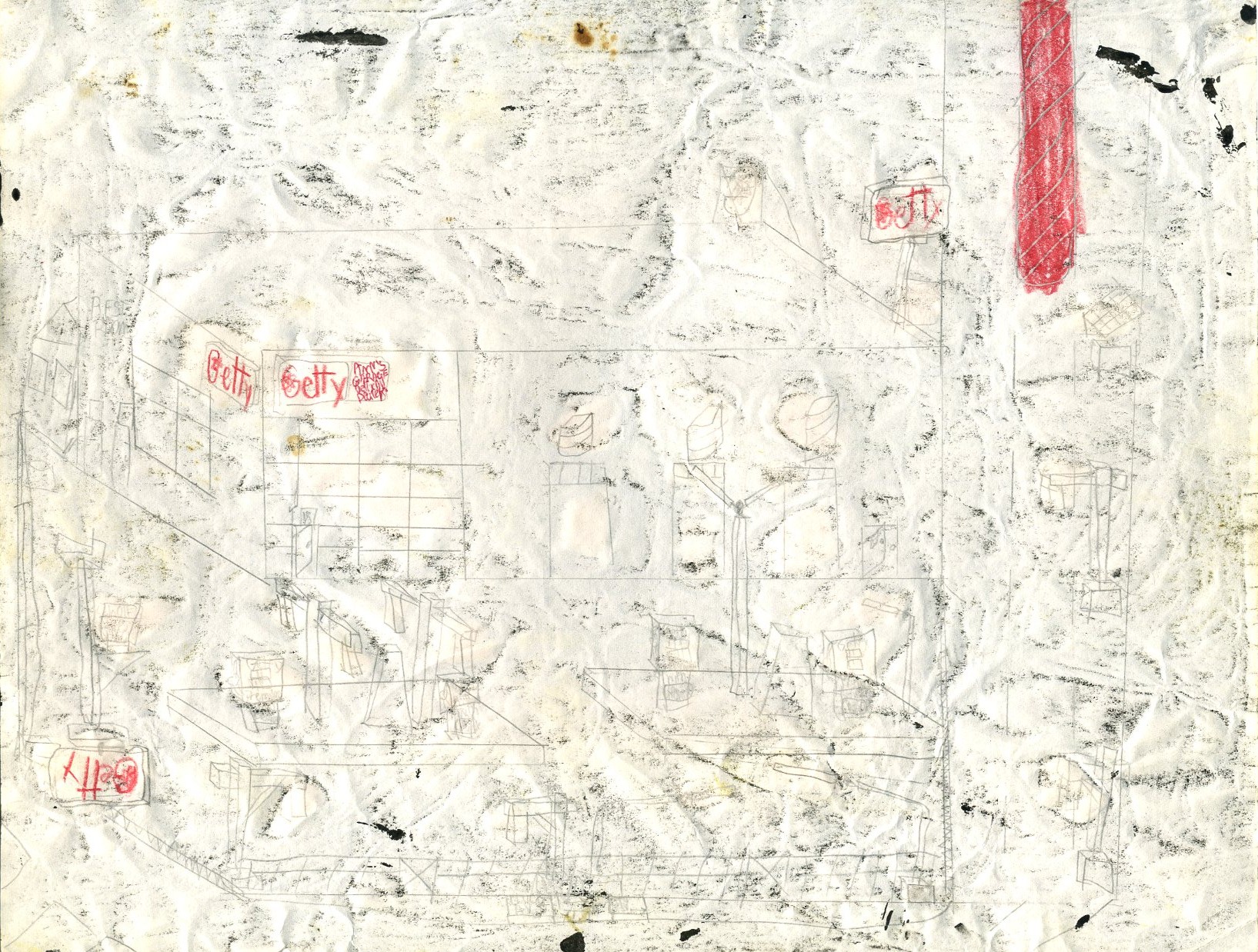
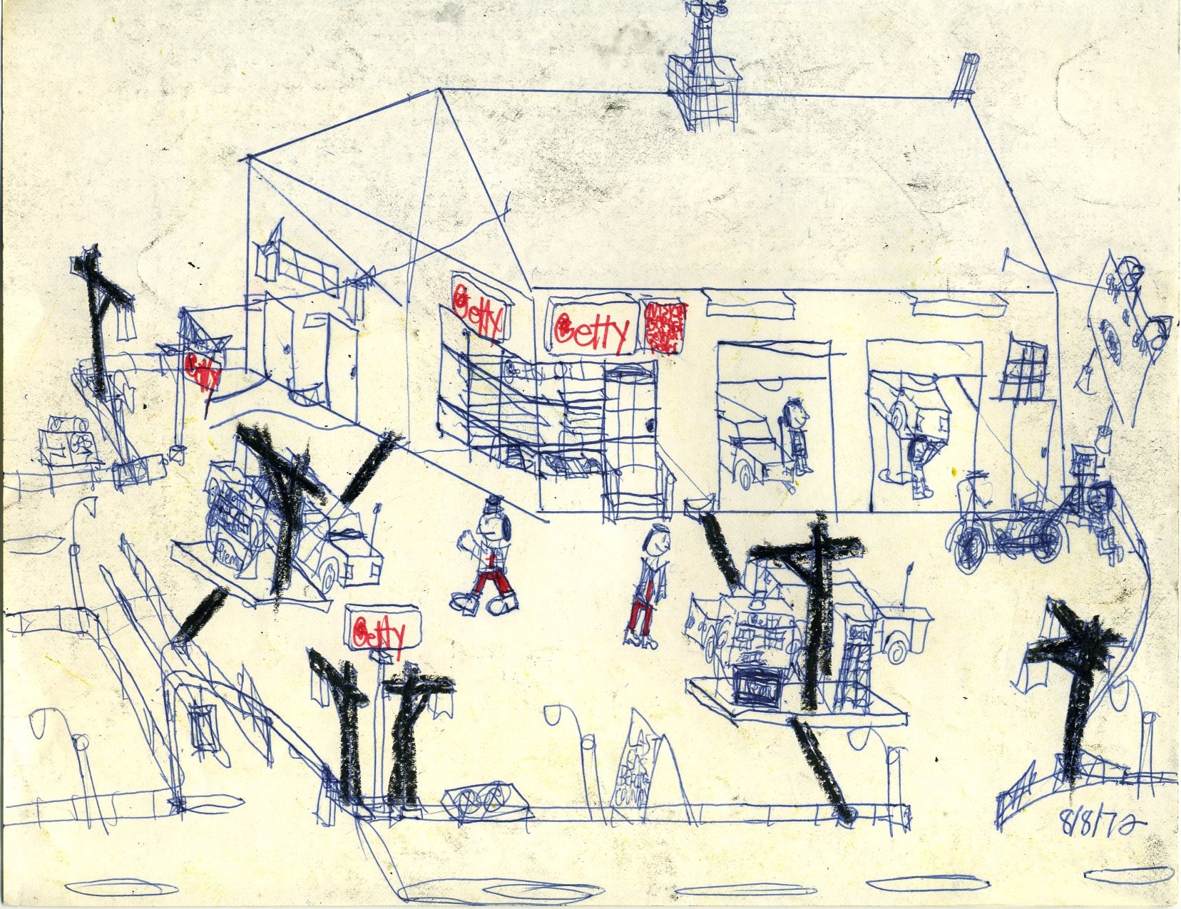
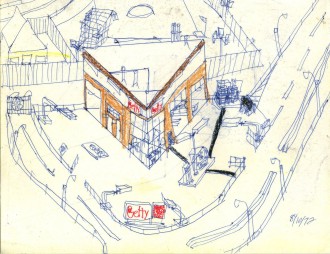
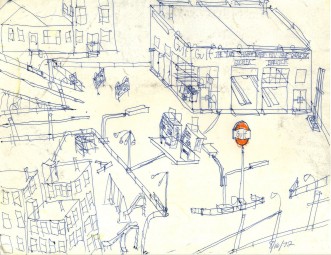
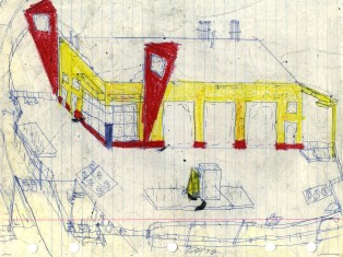
This Getty station probably would have looked better without the paint and tape. Note that this is the first time we see a station drawn with a ruler. Later, we'll see better-executed drawings using the ruler to give them some class.

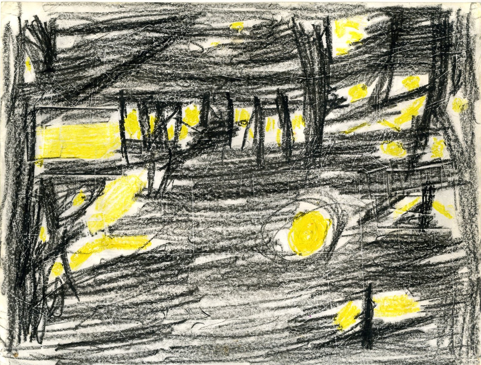
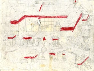
This Getty station shows the signs of being in a stack with other sketches that had lots of black and yellow crayon on the reverse. The idea was that by looking at it normally, one could see how the station looked in daylight, but by holding the picture in front of a light, it would demonstrate how the scene would look at night. It sort of works, but we can't quite do it justice here. Instead, many of the pictures are simply dirty or show the lighted background because a lighted scanner brings out the back of the paper as well.
This is the back of the sketch, which explains a lot and kept the manufacturers of black and yellow crayons in business a while longer while diminishing the economic prospects of the manufacturers of other colors of crayons as well as anything that was not a piece of paper or a crayon.
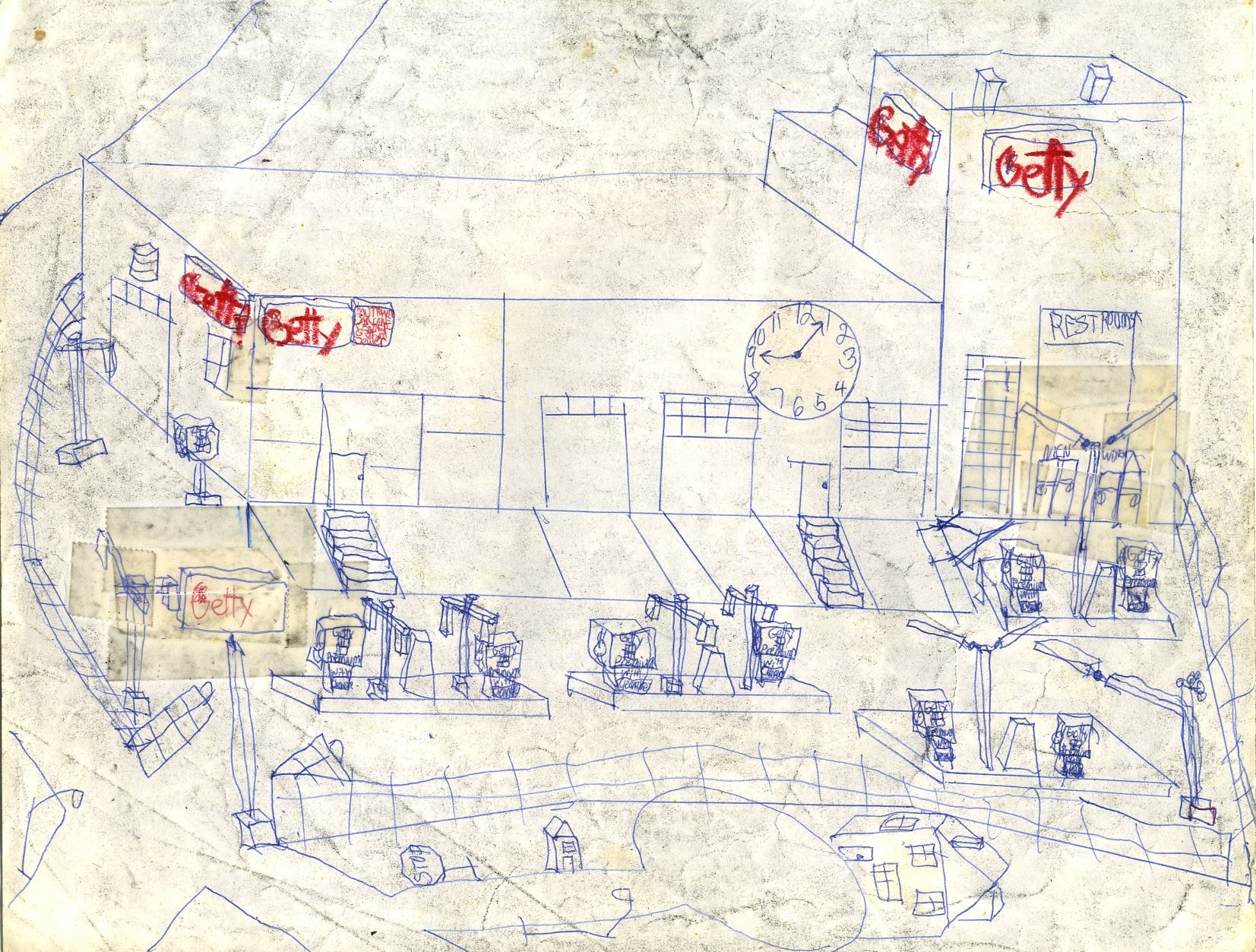
Despite the crayon that rubbed onto the top of this sketch of a Getty station, we can see two upside-down main Getty signs. Perhaps one day this sketch can be restored to its proper dignity.
Beneath the accumulated grime is another upside-down Getty sign.
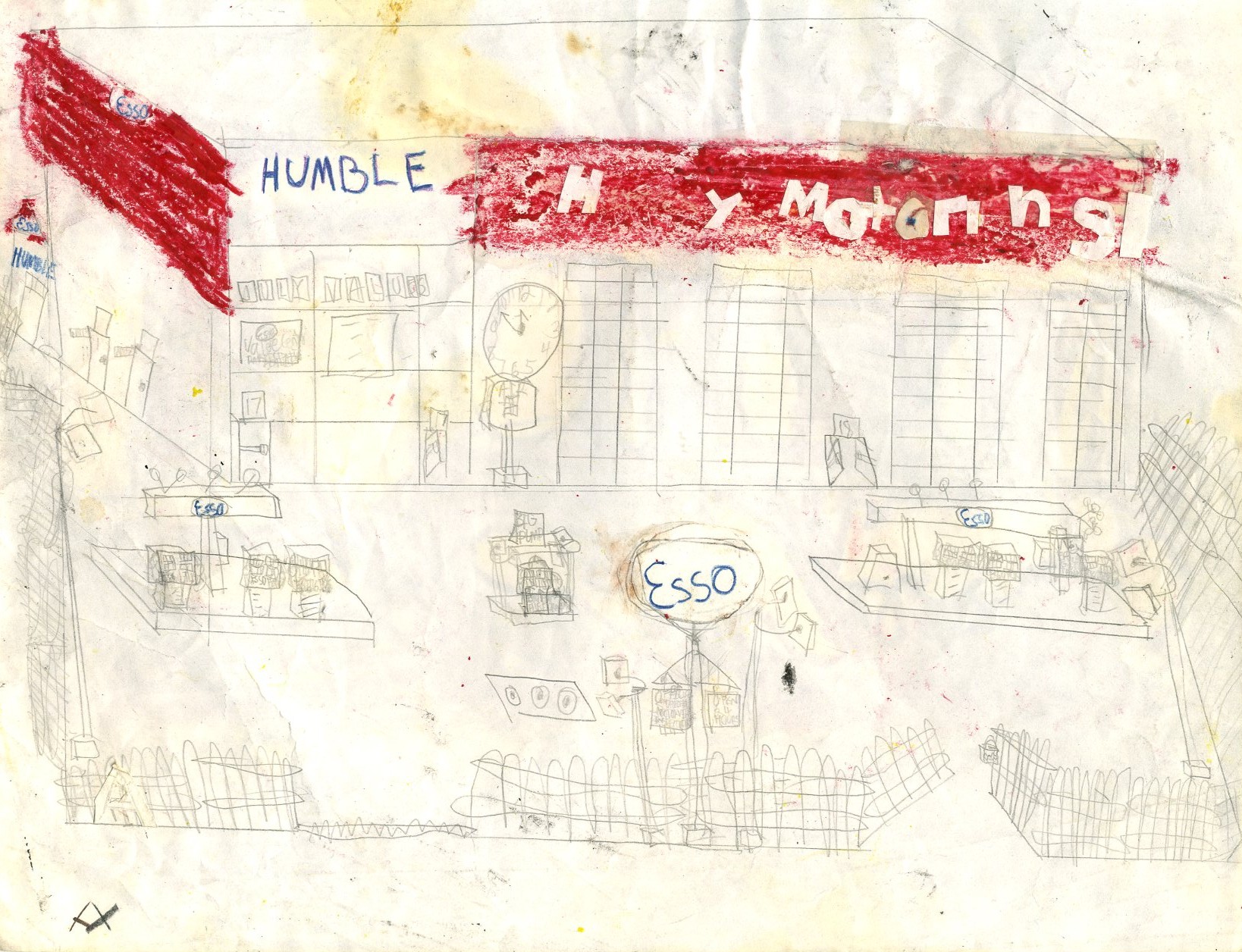
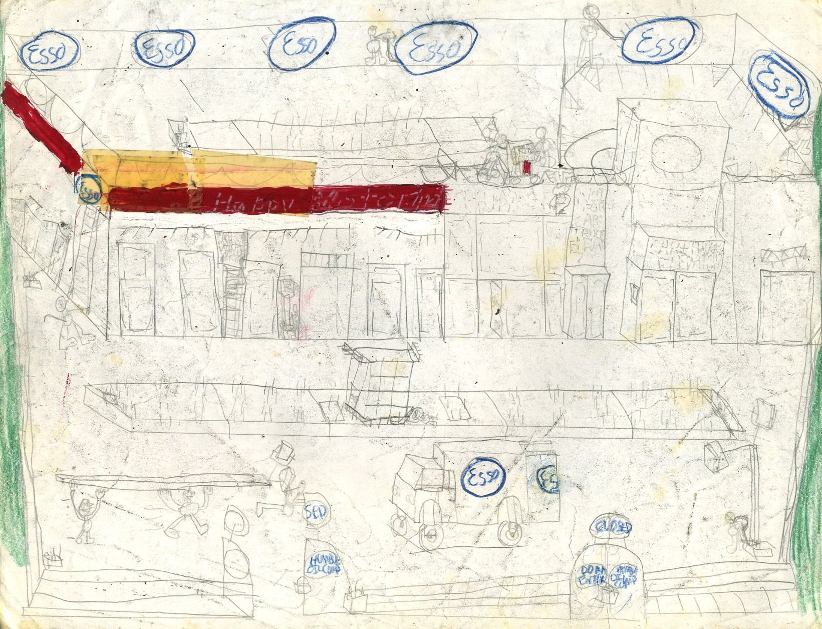
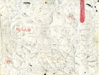
The experimental technique of pasting cut-out lettering over the red background apparently failed to produce the desired effect on this Esso station and would not be repeated.
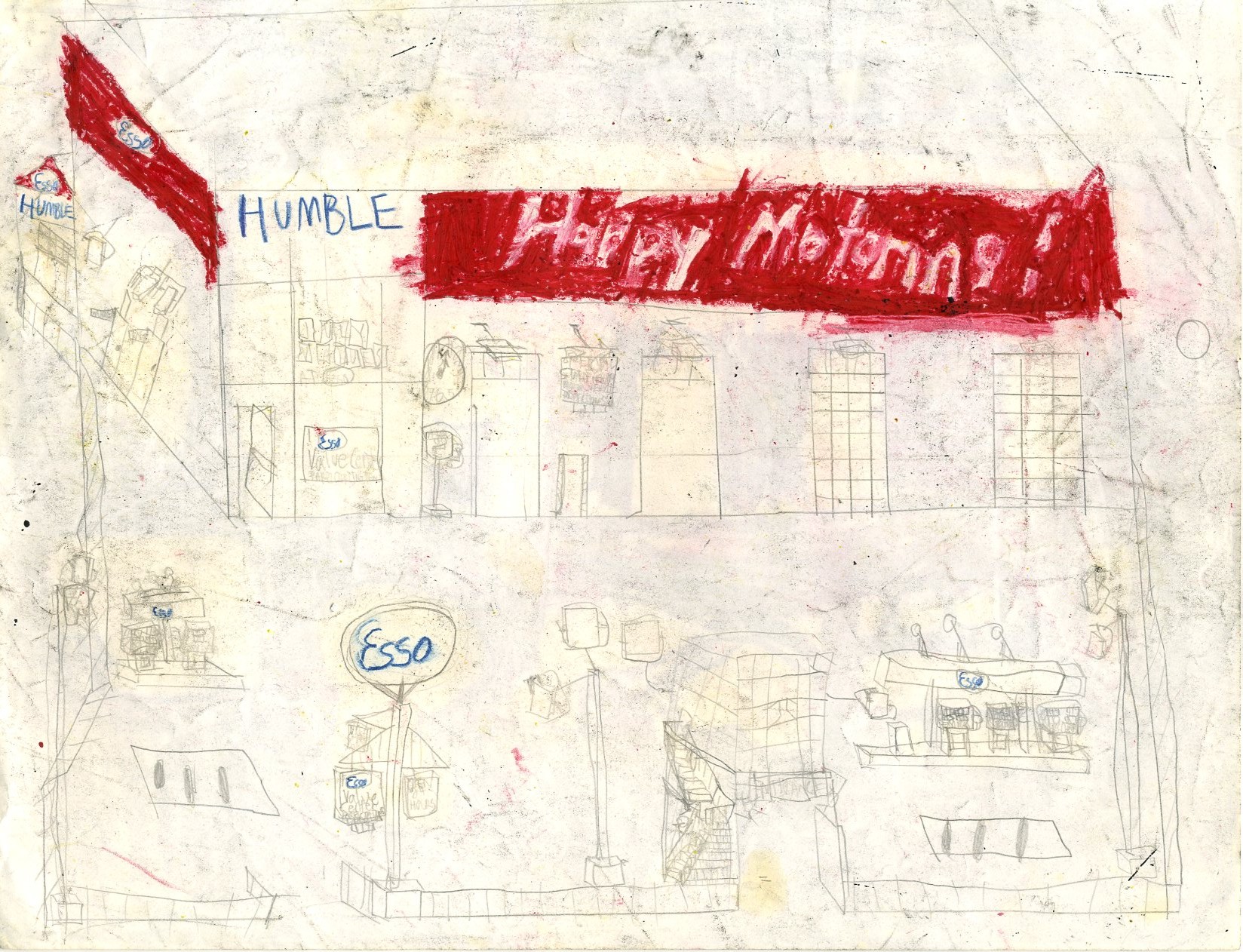
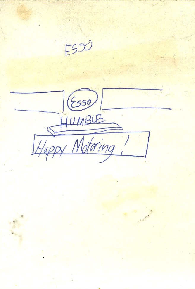
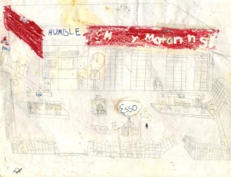
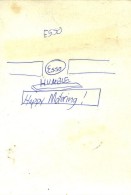
This one looks as though an attempt was made to use white crayon over red, or possibly coloring the red crayon around the outline of white letters. It almost looks better by just writing "Happy Motoring!" in ball-point pen over the white background.
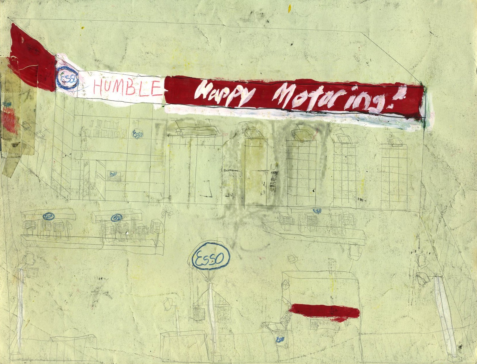
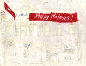
This try with "Happy Motoring!" in white paint over red paint almost works.

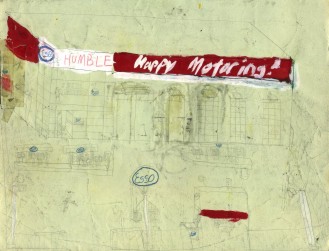
As Count Basie said, "One more time!"
This Citgo outlet isn't too bad, but the red and white crayon doesn't really help it.
The Citgo sign between the bays was inexplicably removed, but this otherwise isn't too bad despite the crayon. The entrance structures are over the top.
This fortress-like Citgo does a good job of protecting the pumps, though from what is not obvious.
A more conventional Citgo with fewer artistic and structural frills changes the pace here.
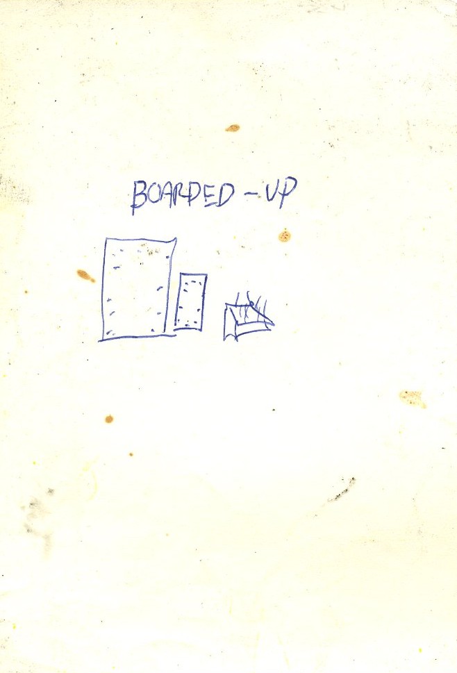
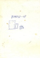
A boarded-up Gulf begins a short series.
This is a very standard, well-executed boarded-up American Oil station.
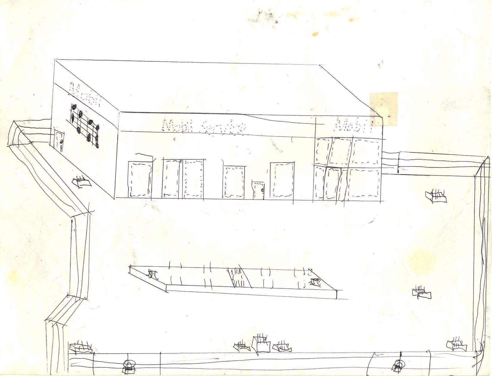
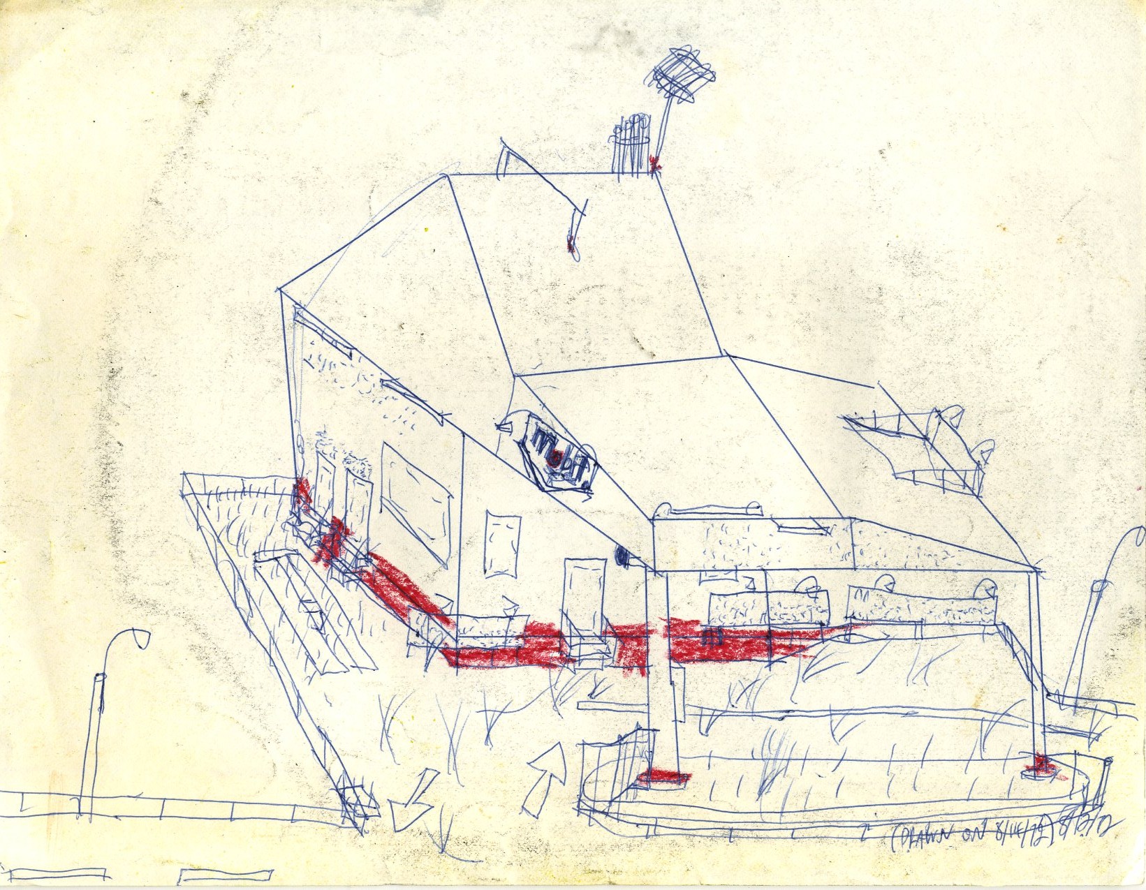
Here we have an equally well-executed, simple closed Mobil Oil station.

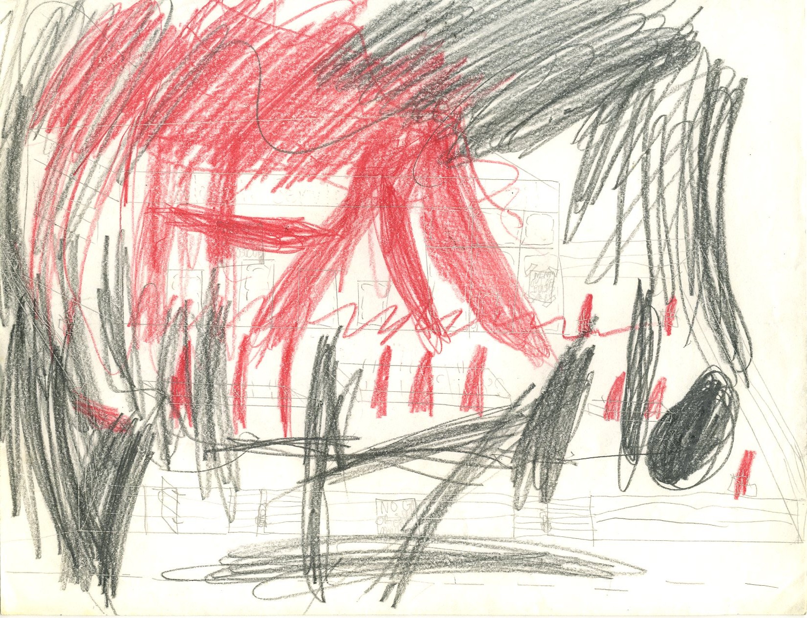
Apparently, this closed, abandoned gasoline station is on fire, with thick, black smoke.
This is not obviously a closed Shell station until one looks carefully at the outlines of the removed lettering.
The ghost Texaco lettering is somewhat more apparent in this simple sketch.
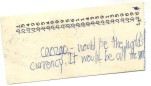
Allow a distinguished professor of economics to comment on this non-sketch. What we see here is a young liberal globalist who hadn't grown up yet. "A conservative is a liberal who grew up." Fortunately, canzgo never made it as a global currency, and if the euro is any indication, a global currency may never survive. Back to sketches.
Before us here is a simple, closed Getty station.
This closed Sunoco station also had elaborate entrance structures.
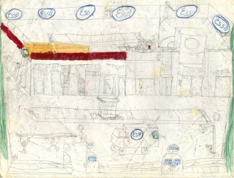
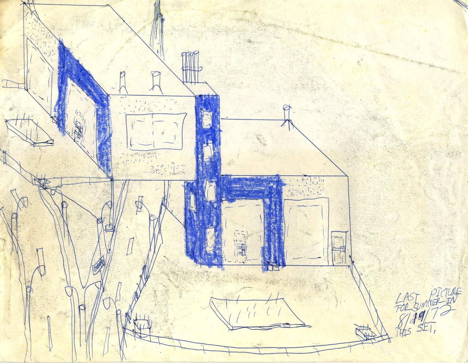
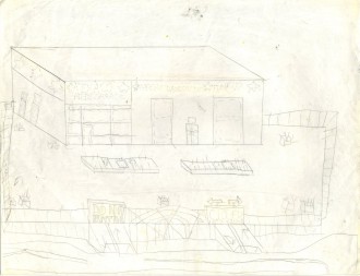
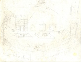
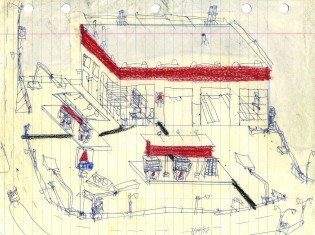
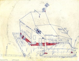
Workers are apparently just finishing the process of closing and de-branding this elaborate two-level Esso station.
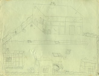
An unusual design wasn't enough to keep this station from closing.
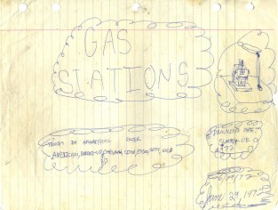
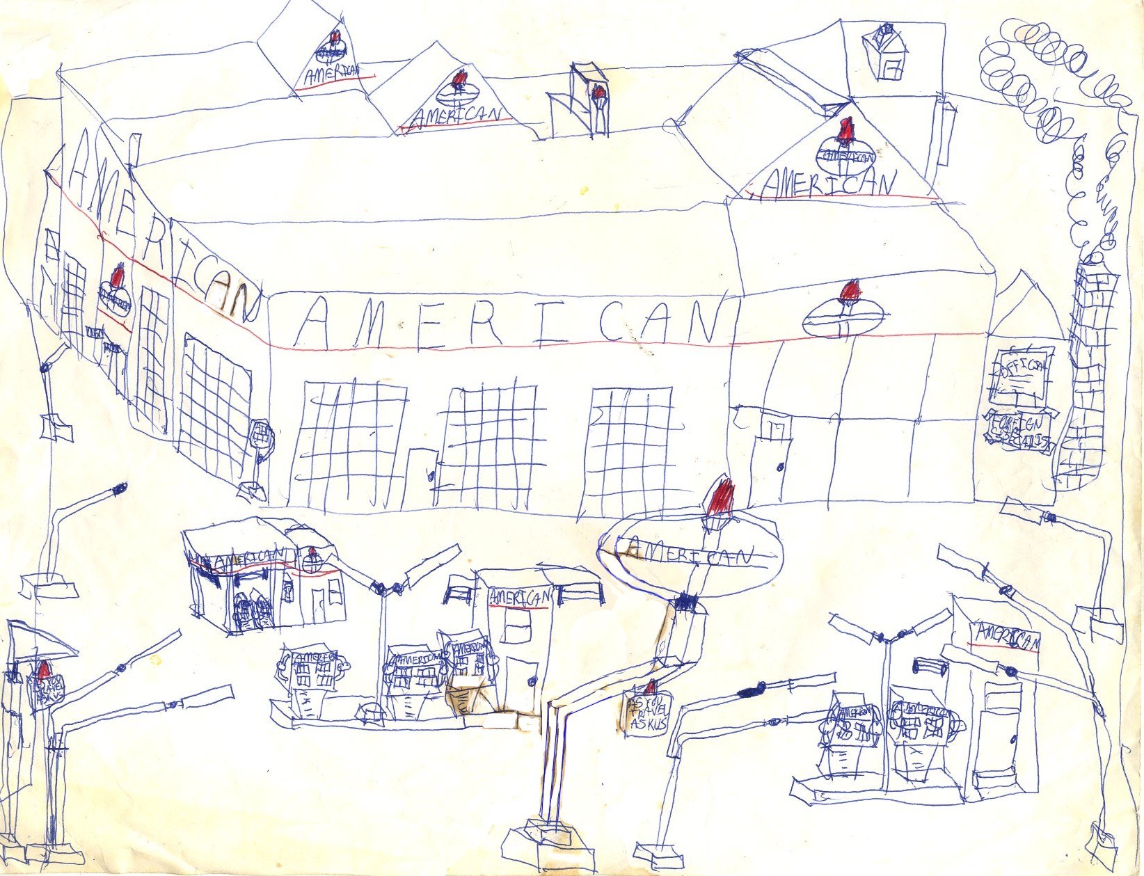
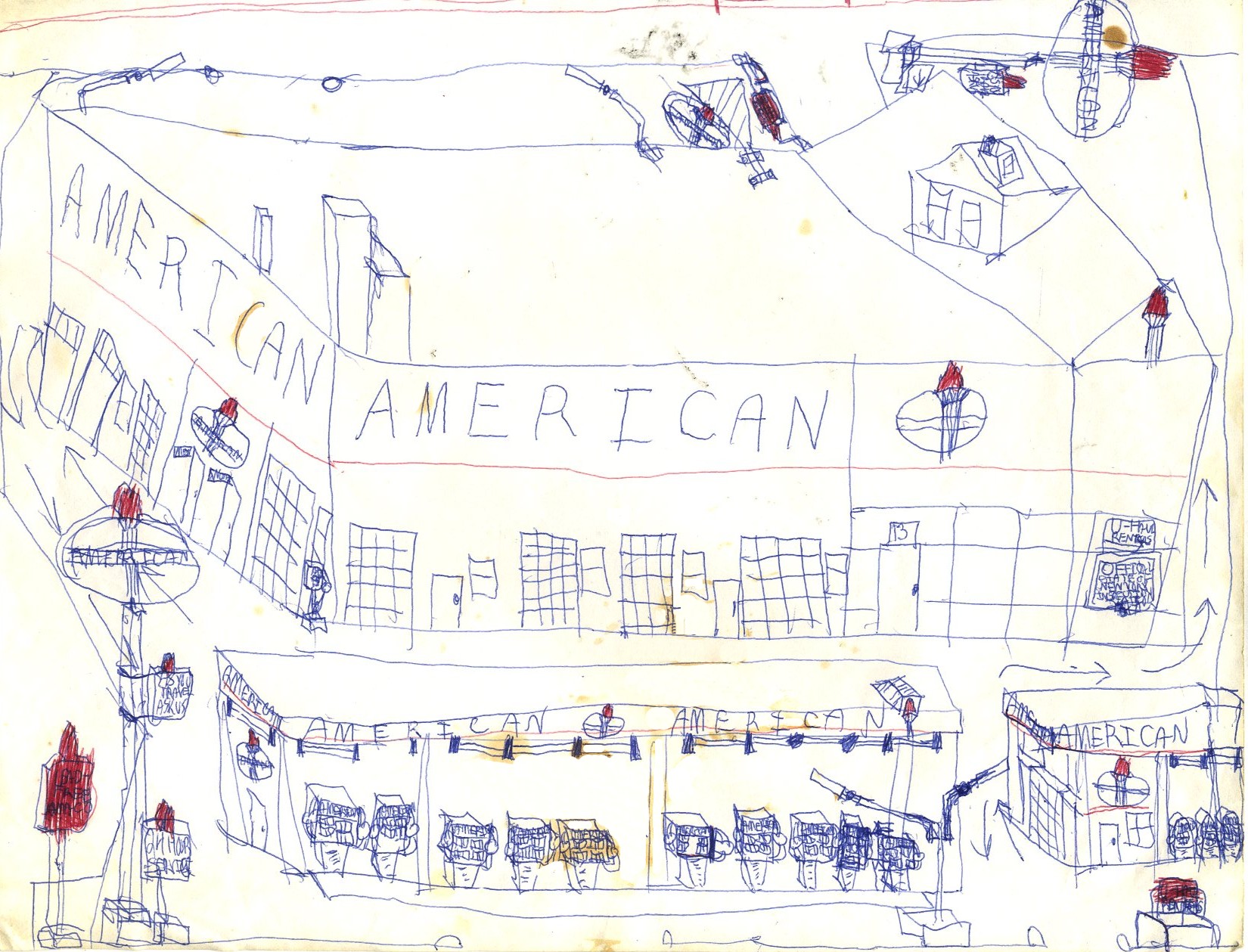
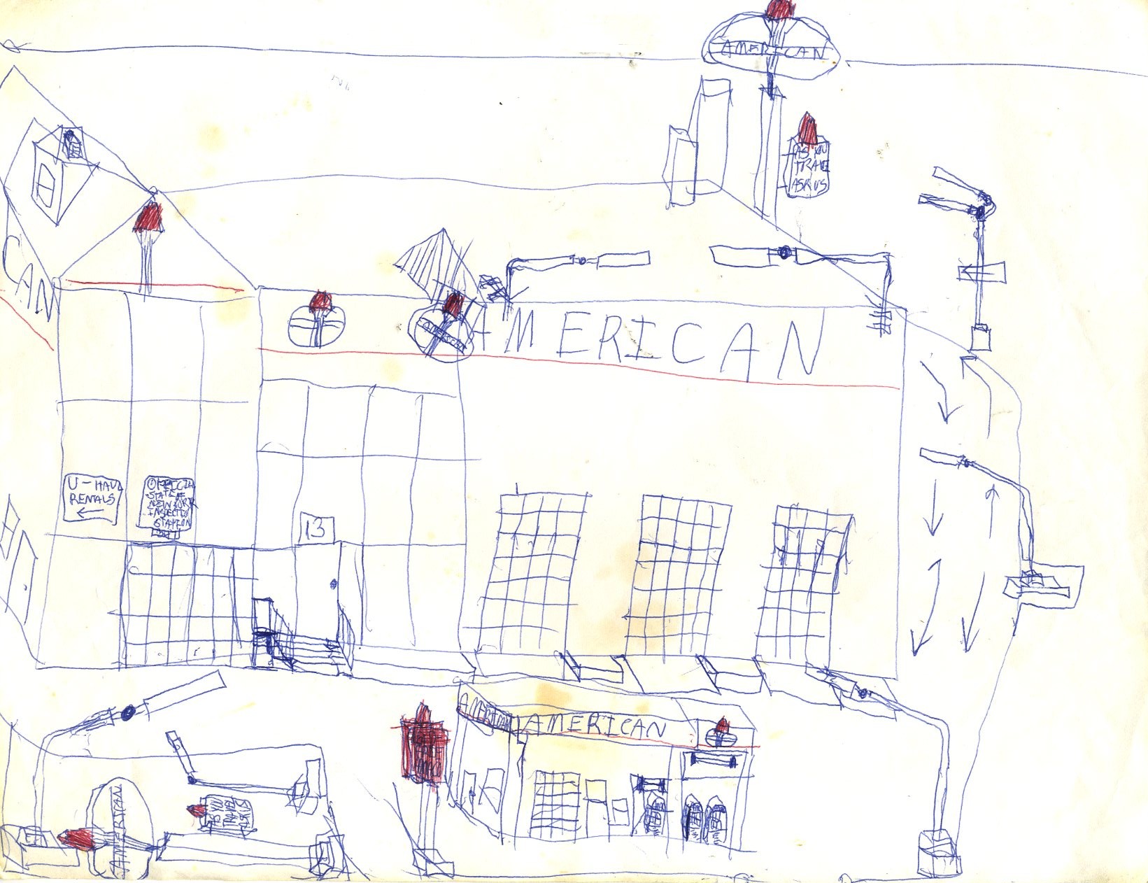
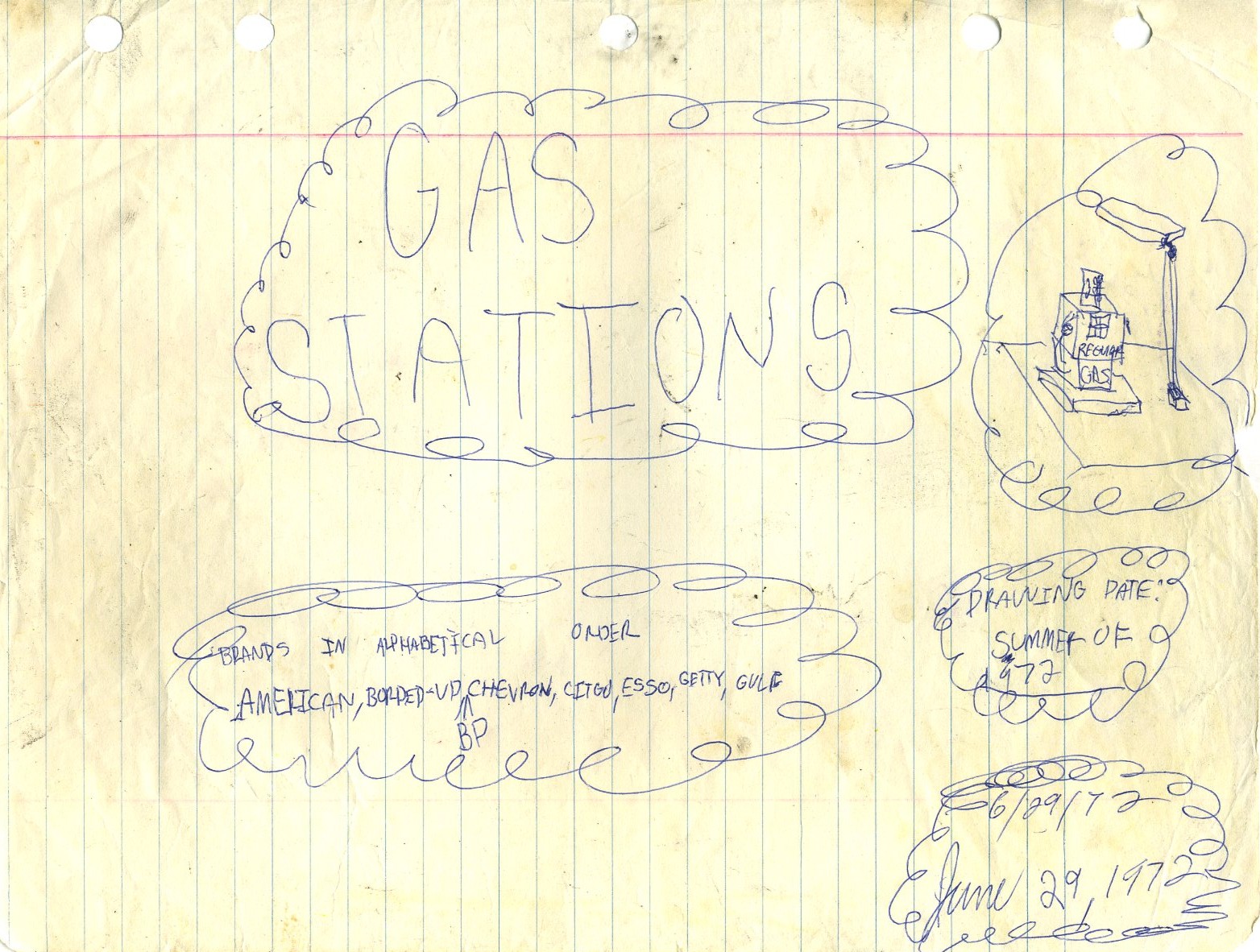
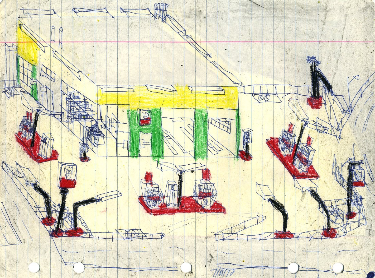
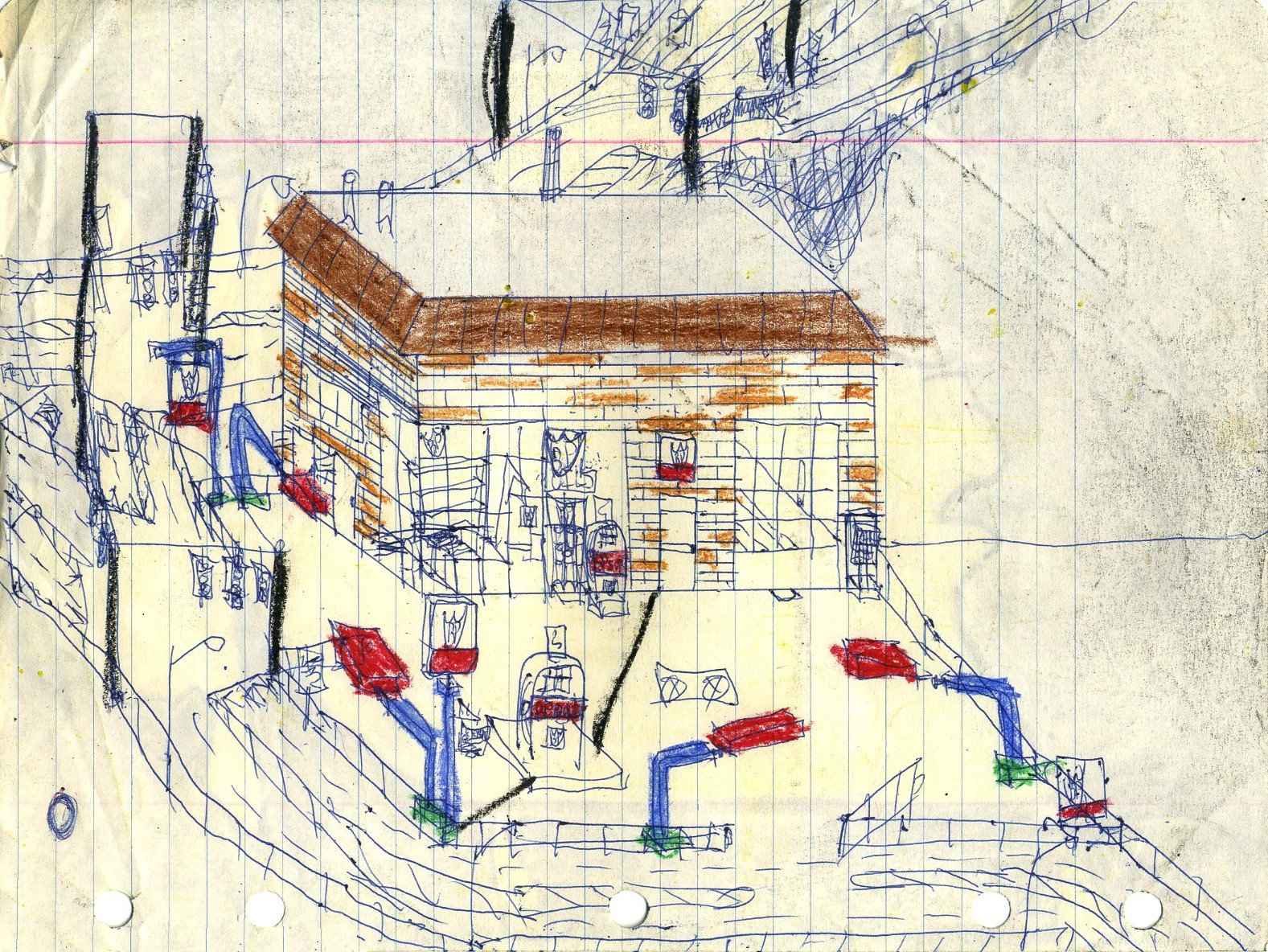
The next group is interesting insamuch as it has a main title card, and each brand has its own sub-title card, as if something really important were happening here.
The title card for the American Oil group.
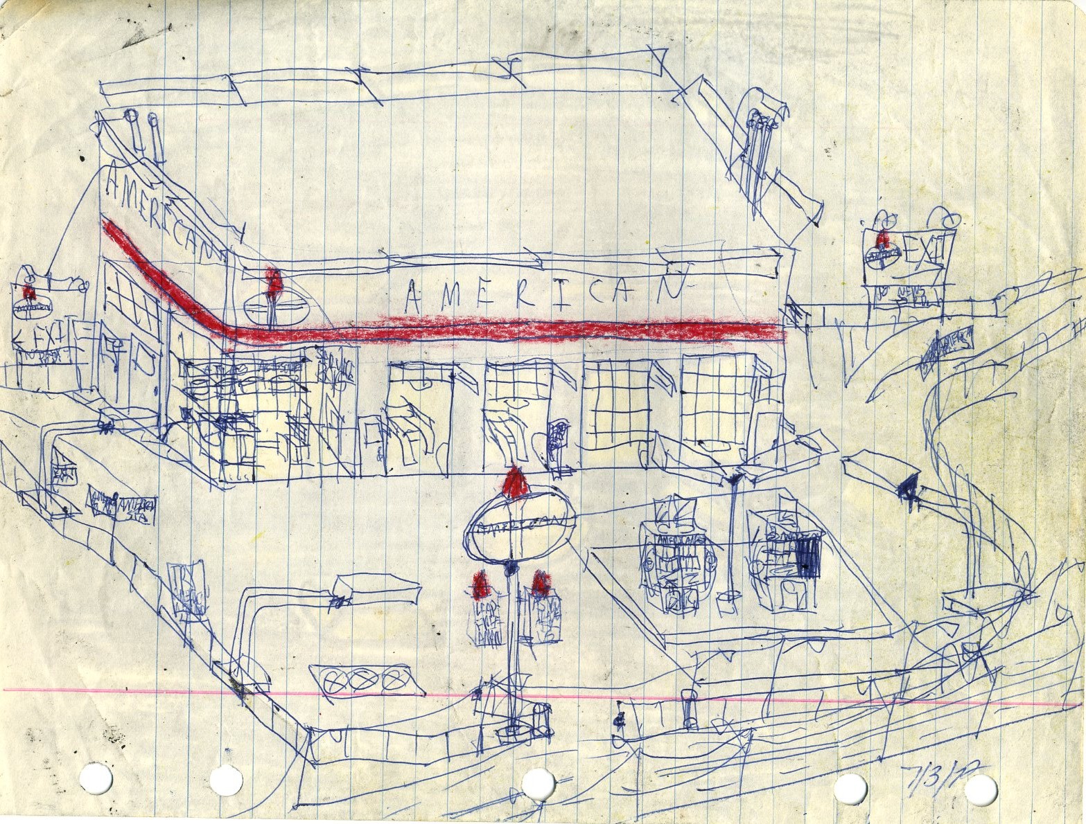
This is not bad for something sketched on looseleaf paper, and we see the crayon on the reverse showing through.
The artist needs to learn how to spell "Amoco," but otherwise, this is simple and well-executed.
The pump arrangement at the lower left is oddly impractical, but otherwise this American Oil station is okay.
Simple and and workman-like is often the best approach.
The title card for the BP group.

Once again, simple and workman-like works best. Note the ghost lettering for "Sinclair." The Sinclair stations in the artist's part of the country had only recently been converted to BP-branded outlets.

Curiously, this somewhat large BP station has only one gasoline pump. Again, we see ghost Sinclair lettering.
This is a more modern BP look, possibly after a cosmetic renovation.

Here we have a similarly-modern BP building style with very old pumps. Also appearing are some rudimentary traffic signals before their distinguishing characteristics were better-defined by the artist.
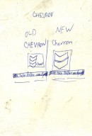
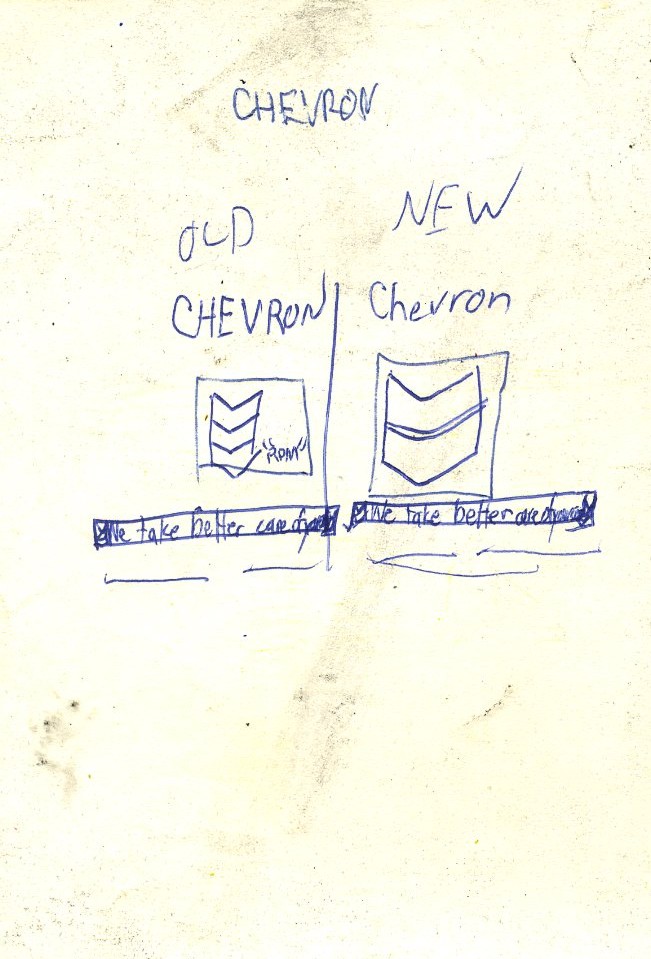
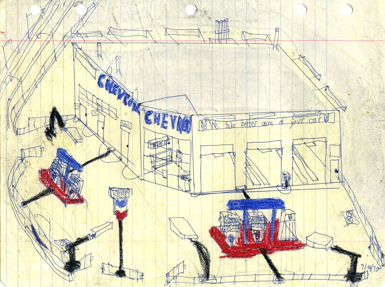
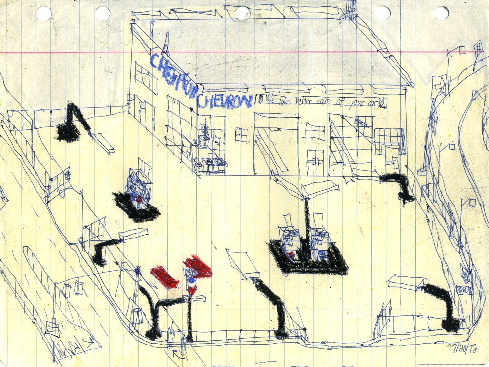
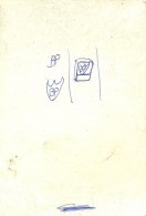
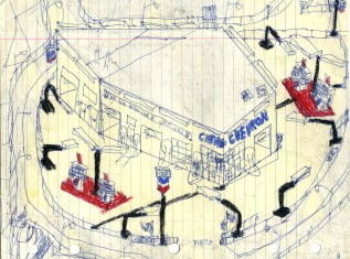
The title card for the Chevron group. (That is "Standard Oil of California" or "Socal," for you Westerners.)
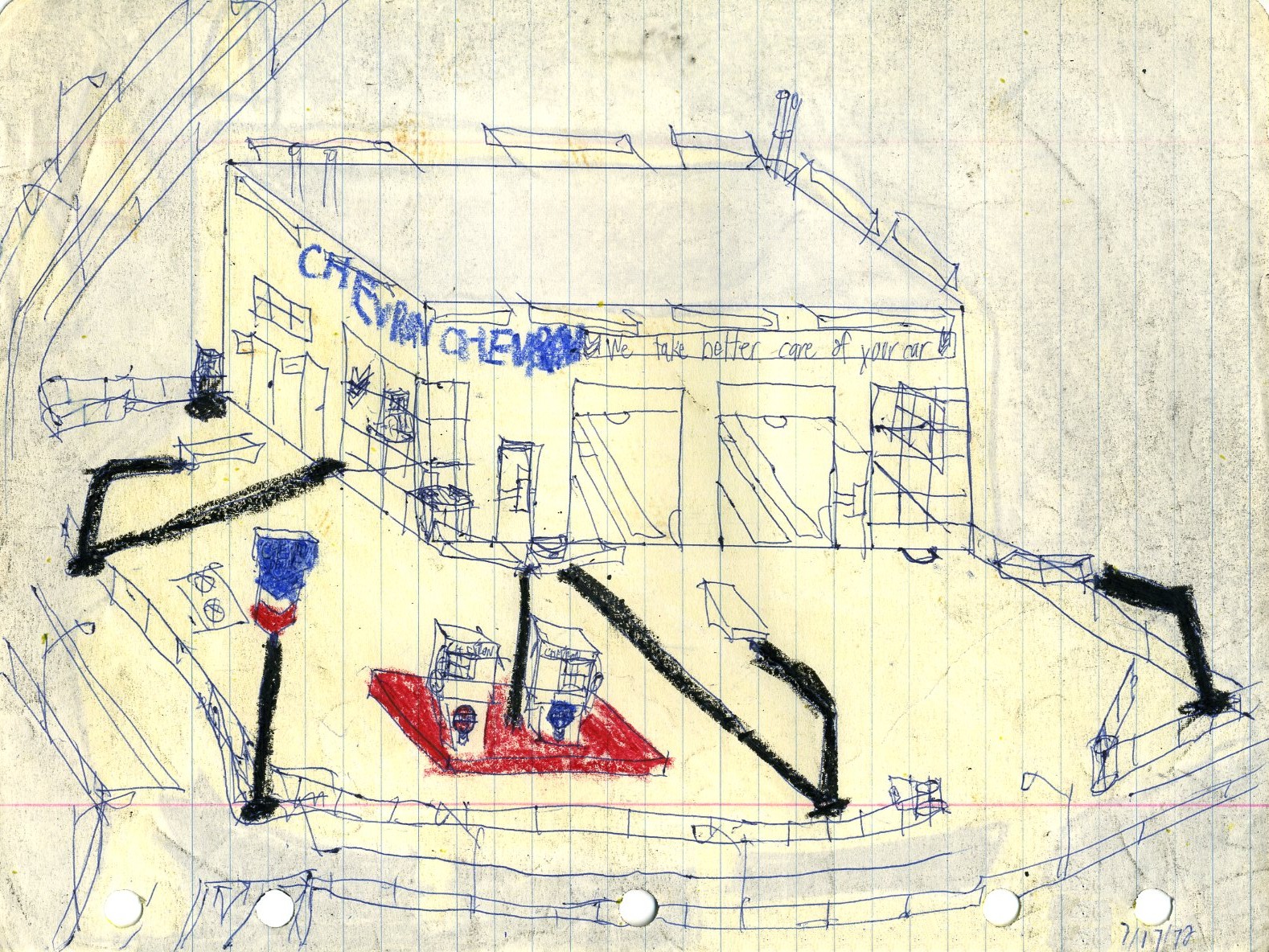
This is simple enough and works well, but the crayon just cheapens an otherwise good drawing.
Colored markers would have worked much better than the crayons here. If only the artist had a patron to sponsor the acquisition of such tools-- a good capitalist to underwrite his work... sigh.
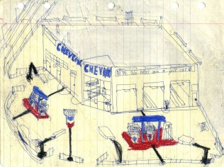
Drawing the main elements with a ruler does make a big difference.
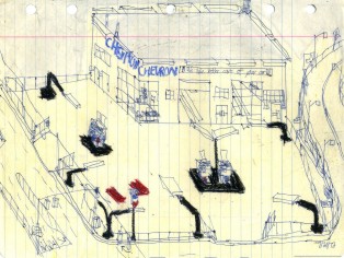
Yet another straightforward sketch works well apart from the crayons.
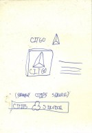
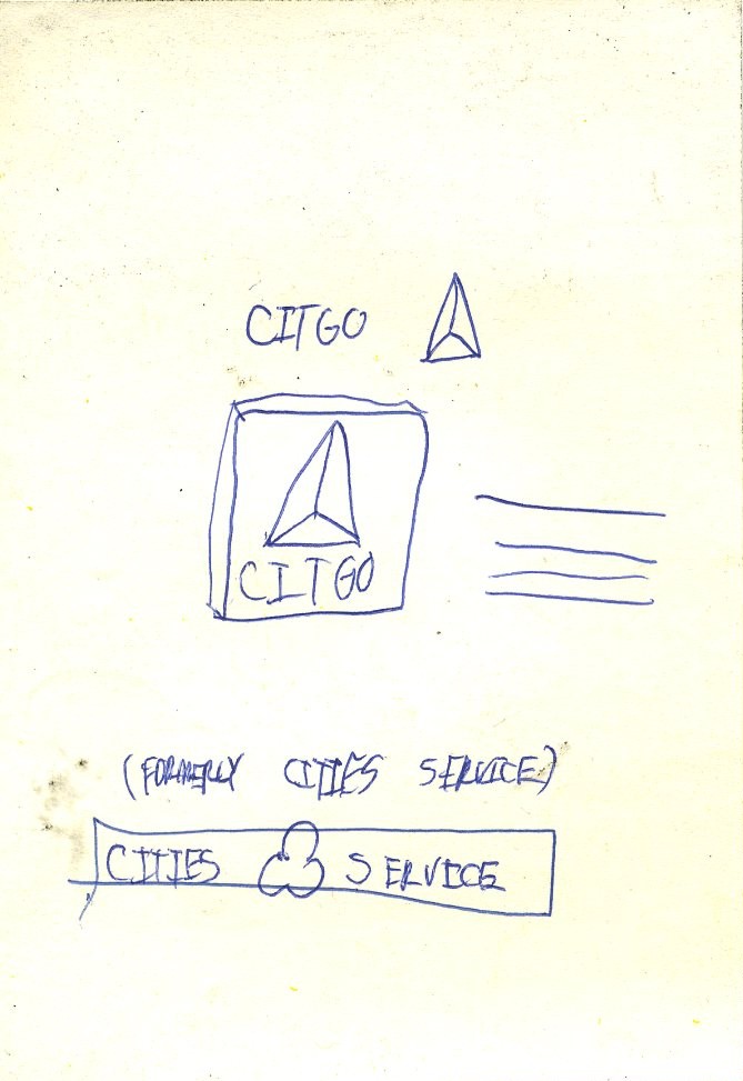
The Citgo/ Cities Service title card.
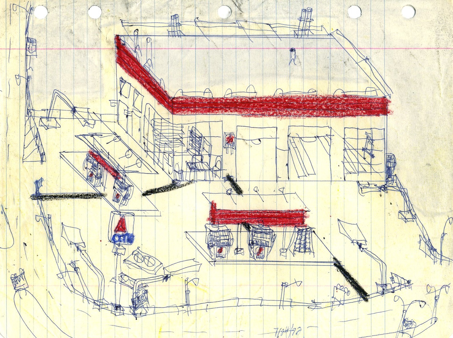
A straightforward, no-nonsense Citgo station.
Another straightforward Citgo station with ghost Cities Service lettering, which in this design was part of the decorative tiles and was simply painted over after the conversion to Citgo.

This Citgo had a more elaborate decorative motif and curiously has only two pumps to one side.
This is basically the same design as in sketch number 55. The person who hung the sign on the pole that reads "Truck Stop" obviously never saw one.
The Esso/Humble title card.
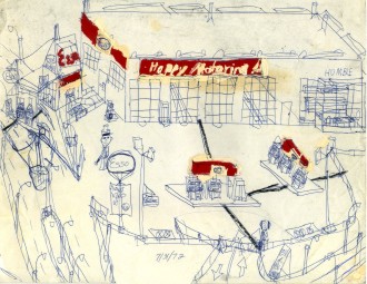
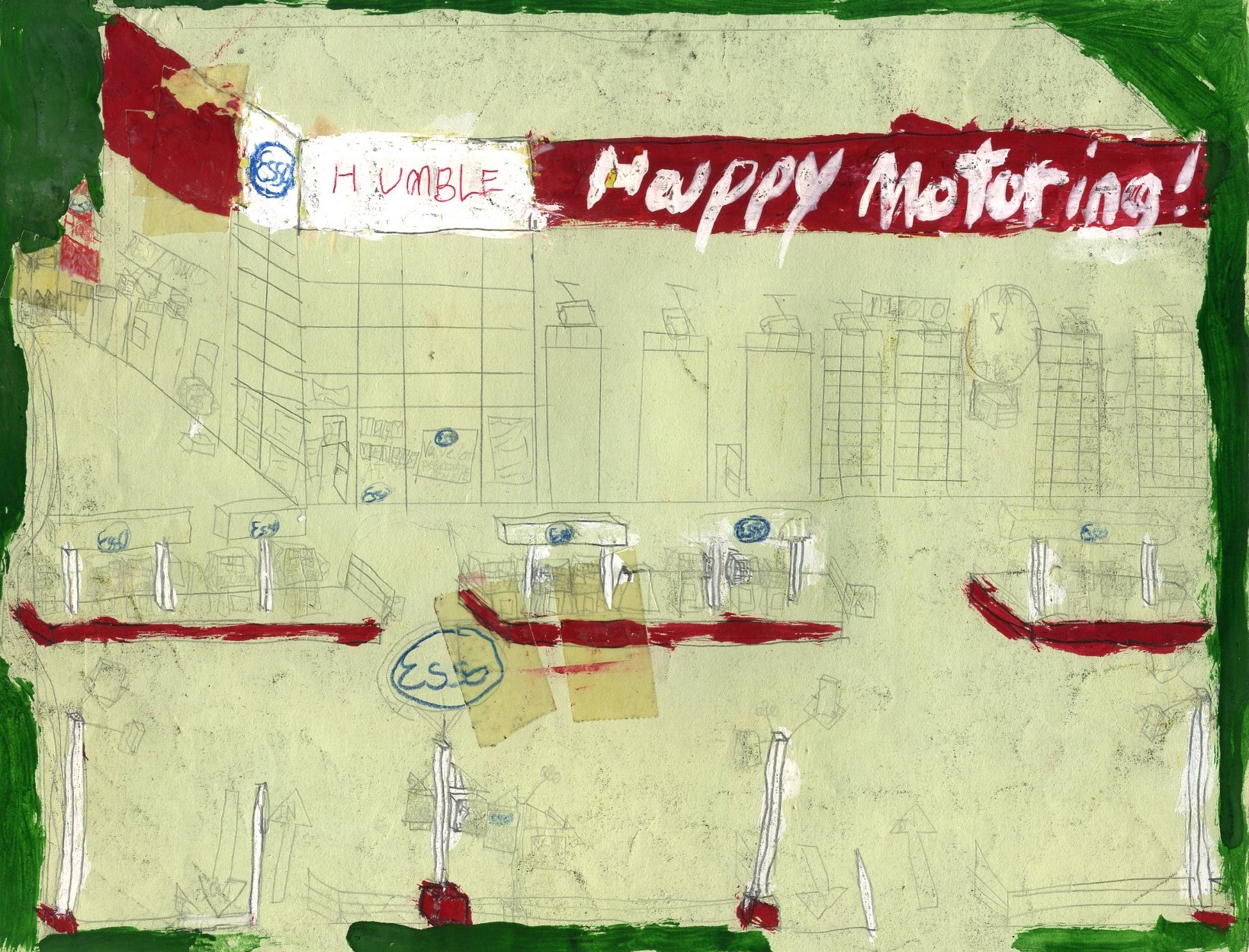
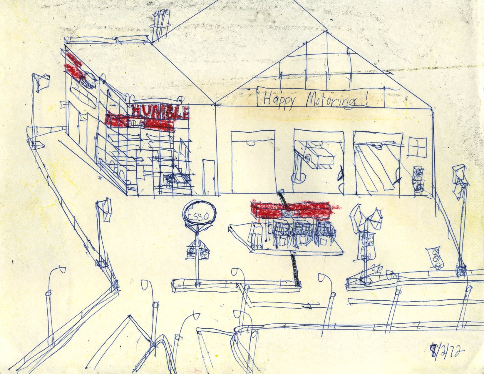
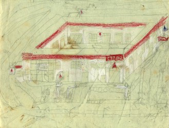
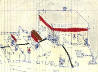
Two human beings liven an otherwise standard Esso station apparently constructed alongside an older building. Once again, the painted "Happy Motoring!" doesn't work too well.
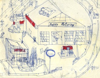
This actually resembles an Esso station of the time quite closely, and the artist was wise to stop before trying to paint "Happy Motoring!" on the red background. He could always claim that the lettering had fallen off and was in the process of being replaced. This sketch is notable as the lane stripes have developed width instead of merely being single lines (compare to the previous sketches). Note the dual dates at the lower right. Apparently, the artist had a quota of one per day, and if he missed a day, he had to make it up, so while the official date is 8/1/1972, it helpfully notes that the actual drawing date was 8/2/1972.
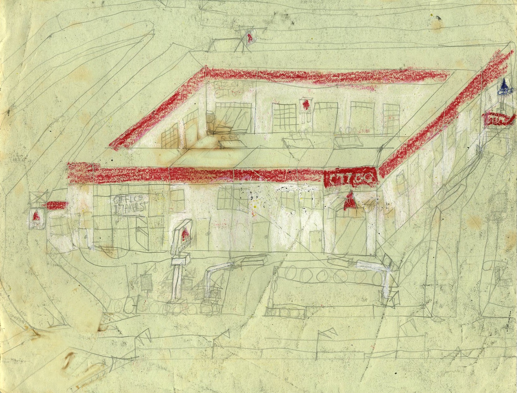
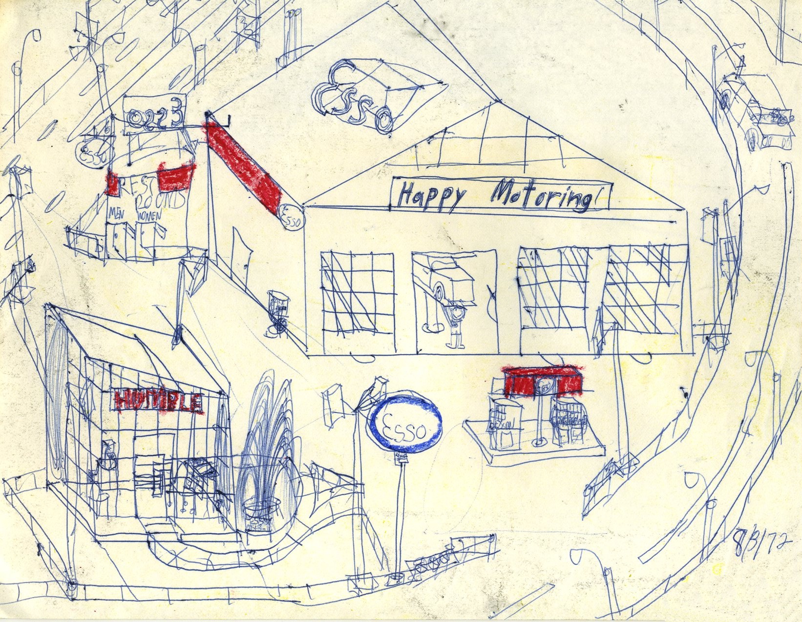
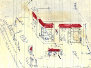
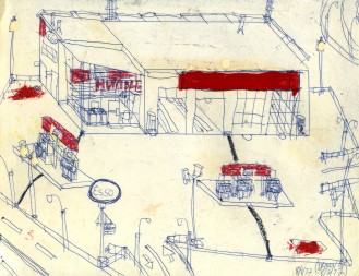
This is a slightly newer style. The empty shelves in the office seem to be a constant. Also note that on this sketch, a very close look reveals that the pumps are labelled "Exxon." This was about the time that Esso, Enco, and Humble were converting to Exxon, and the pumps were the first to change, before the main signs.
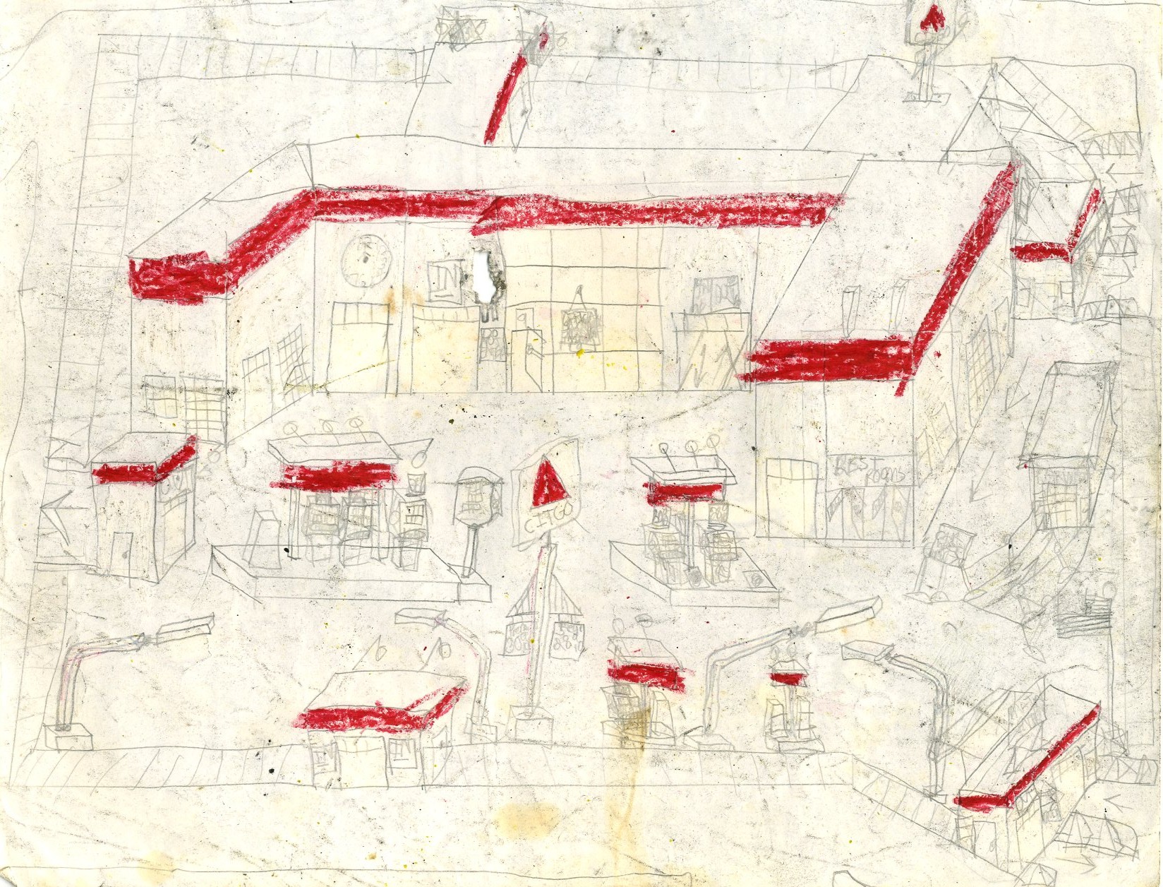
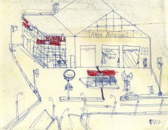
This is a fanciful detachment of the office from the service bays, and a detachment of the rest rooms from both of the other elements. Once again, the pumps are clearly labelled "Exxon," and a rare human being and two rare cars grace the sketch.
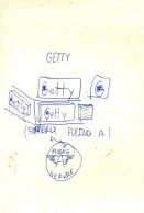
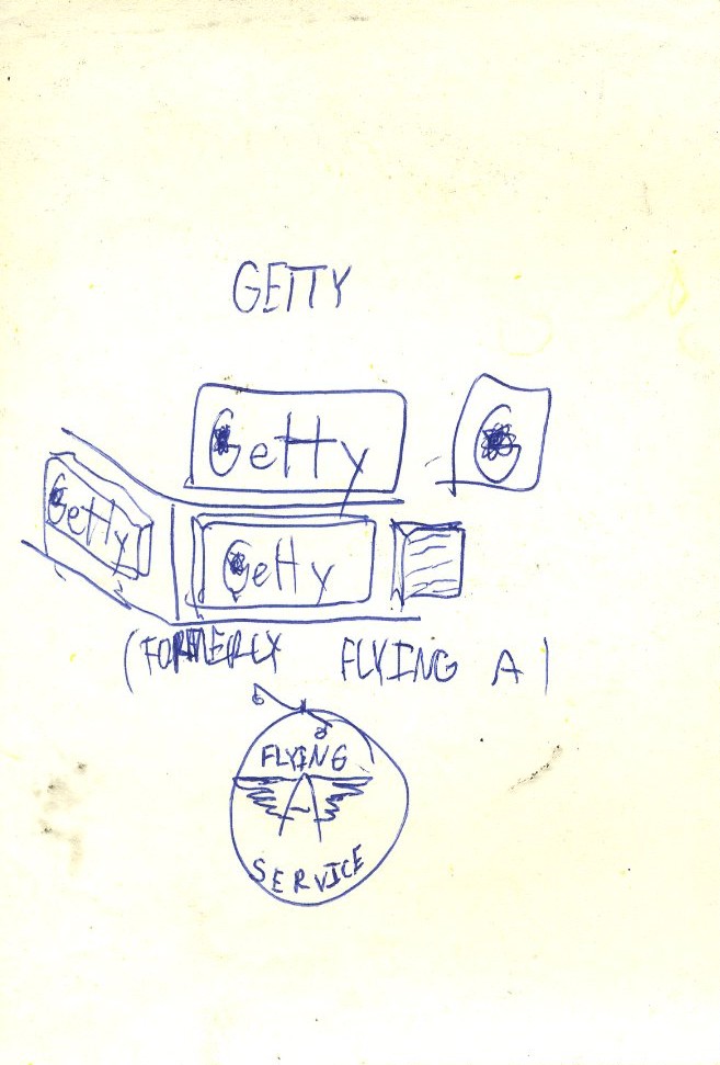
The Getty/Flying "A" title card.
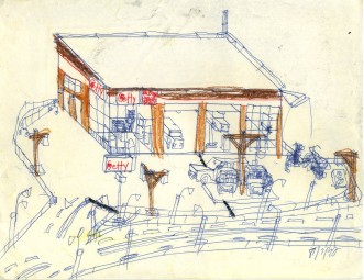
Here we have a fairly straight Getty station, with a human being putting air into his bicycle as a bonus.
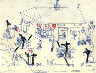
Five human beings produce a buzz of activity at this Getty station. Another bicycle needs air as well.
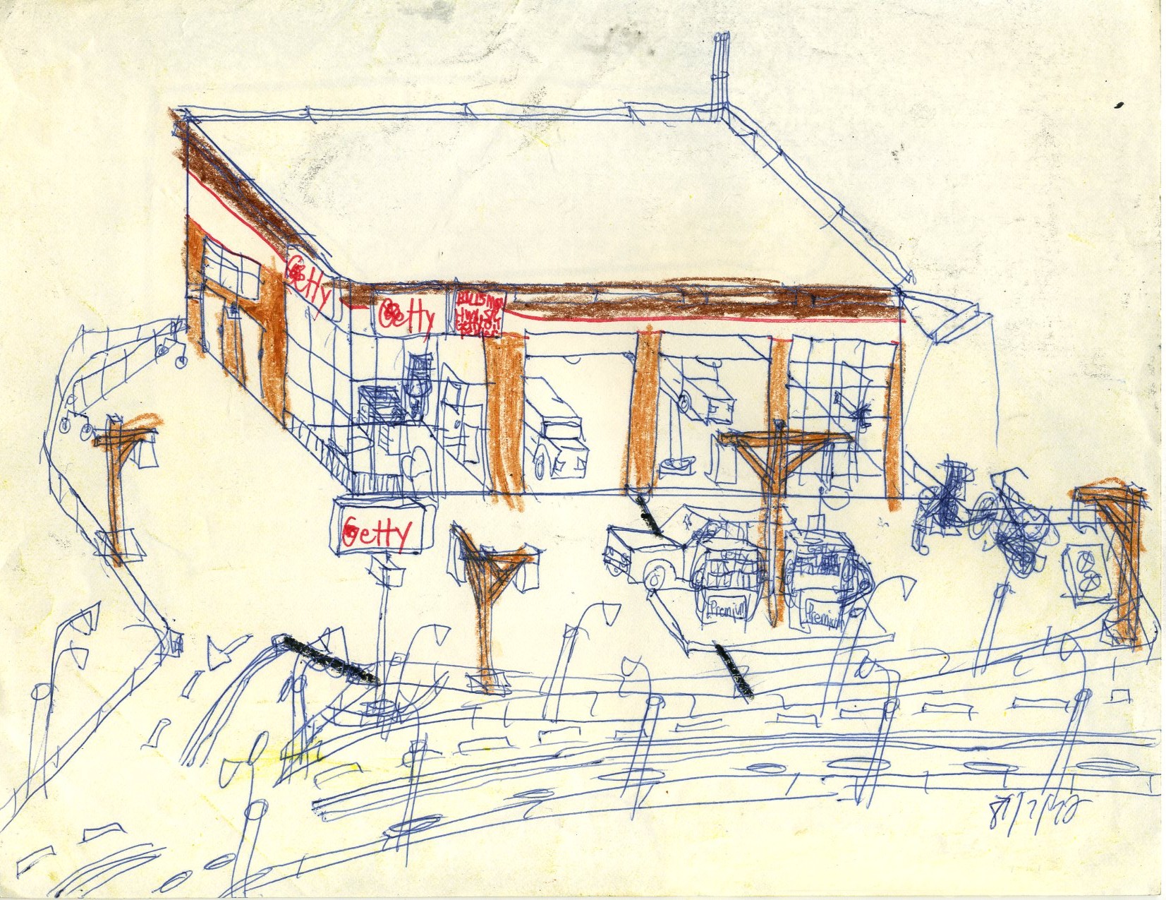
Fortunately, the car on the left is going into the station for servicing; that black smoke polluting the atmosphere is awful. They must have missed the Flying "A" sign at the right when they rebranded the station as Getty.
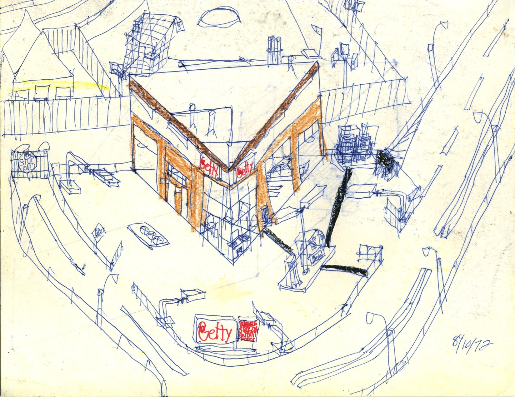
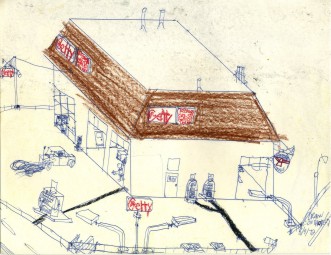
A triangular Getty station brings a bit of variety to this pile of sketches.
The Gulf title card.

Many Gulf stations had only their main sign replaced when the friendlier, mixed-case orange disc logo replaced the older, all upper-case logo. The "icebox" itself here reflects a 1950's Gulf style.
This is a fairly standard 1960's Gulf style, though the front rest rooms are rather unusual.
For some reason, the artist liked to terminate public highways on private property, such as we see here with this Gulf station. Otherwise, this is fairly straight.
Once again, we have a simple, competent rendition of a 1960's-style Gulf station.
Even boarded-up stations got their own title card.
A boarded-up Shell station.

This boarded-up Mobil station is notable for the detail over the office that identifies it as an old Mobil station even without ghost lettering or the obvious blue color.
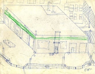
The green stripes are the hallmark of a 1940's-1950's Texaco station.
This boarded-up Sunoco station has one of the elements common to many closed gasoline stations: the single pump left behind for no obvious reason.
The lone pump left behind is often covered with a plywood box, as in this abandoned Shell station.
A new highway possibly rendered this Mobil station obsolete.
It appears as though giant snakes attacked this closed Texaco station and started devouring it-- a gasoline station owner's worst nightmare.
Hardly anything remains of this old Sunoco station after the snakes got to it.
Someone should re-secure this abandoned Shell station while it could possibly still be used again, and hopefully before the snakes get to it. Once again, one pump was left behind.
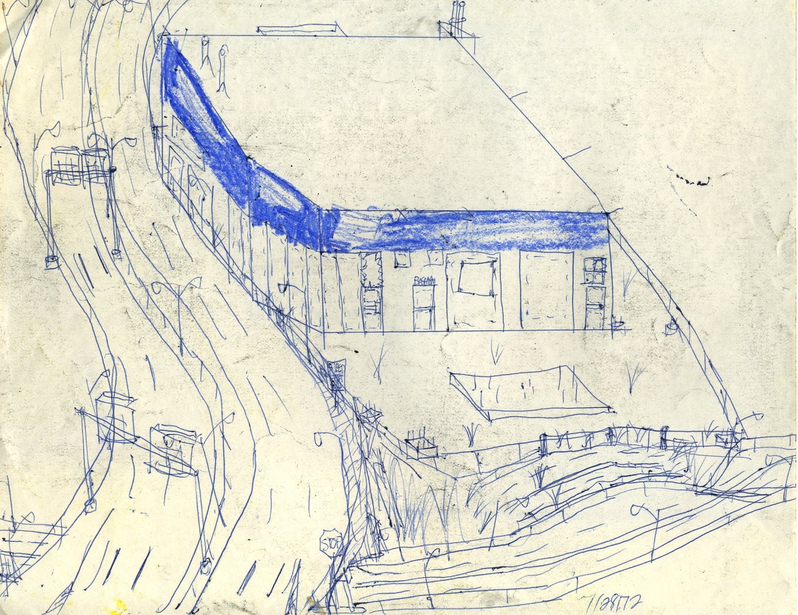
We see another dual-dated sketch of an old Mobil station with its 1950's sign intact but with weeds growing through the pavement.
This is a very simple, closed Texaco station.
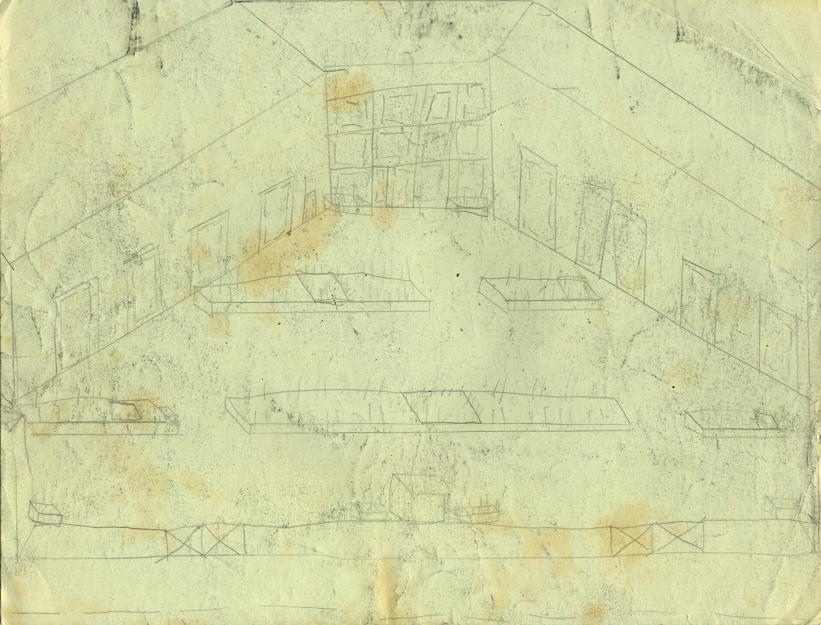
To close this sad group of stations is an odd dual-level Sunoco station that couldn't make it despite its unique layout.
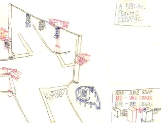
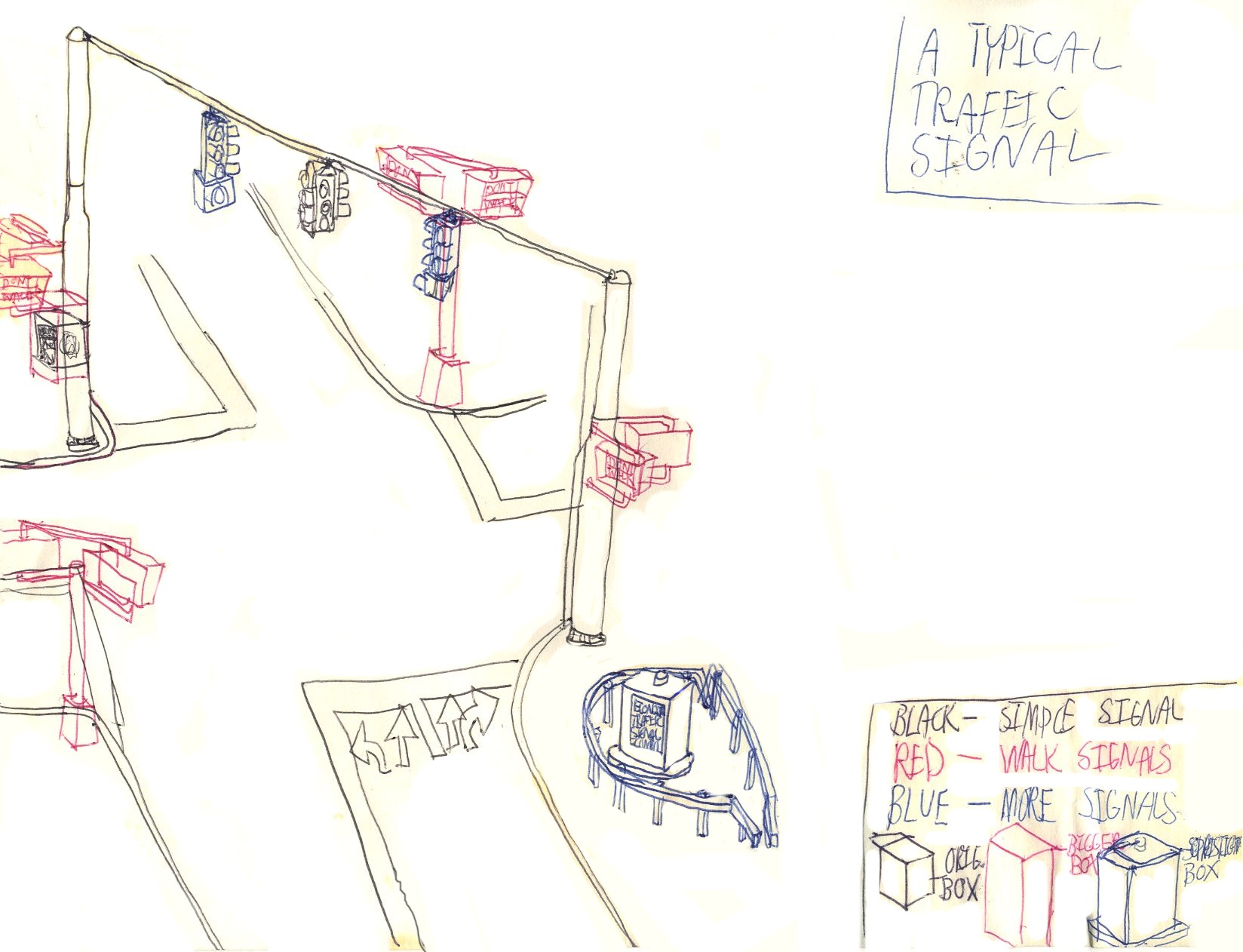
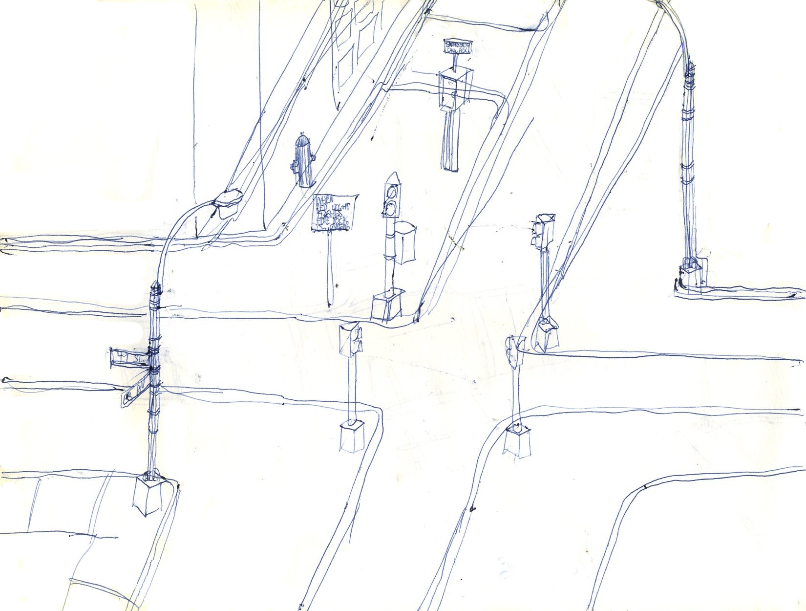
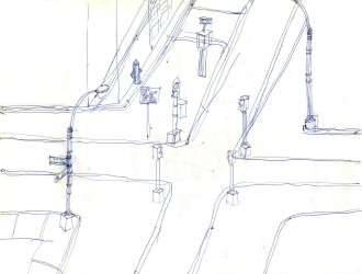
This didactic sketch illustrates a typical traffic signal. The original had severe water stains on it, and this reproduction has been heavily restored using modern digital techniques. The style of the signals would evolve in time; this was an intermediate approach. Note the complete lack of curvature in the wire, which is obvious even to an economics professor.
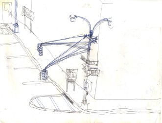
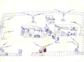
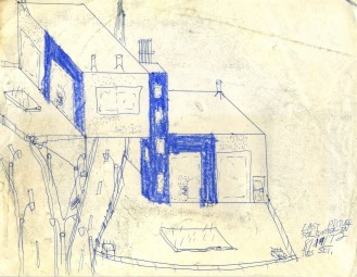
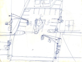
The next group of sketches illustrates the artist's plan for closing almost all of the streets in Manhattan, New York. Ironically, while in 1972 such a scheme would have been considered preposterous even by the liberals of the day, today it seems much less so and, in fact, its implementation has already begun, except that Broadway, which is listed later as an open street, has been severed or narrowed in many places. Here we see that Madison Avenue has been severed and converted to parking lots, with places for bicycle rentals.
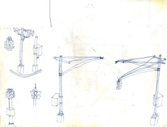
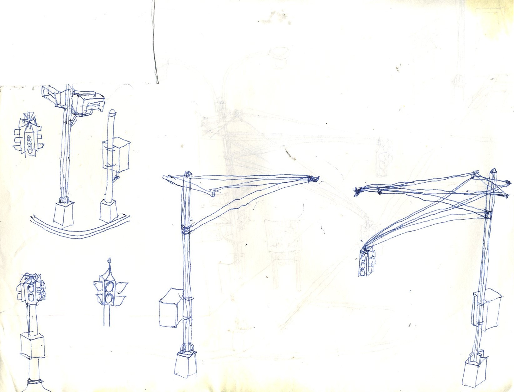
These are doodles of New York City traffic signals.

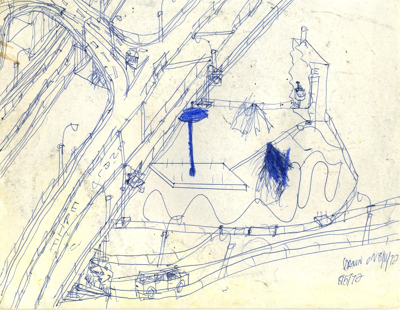
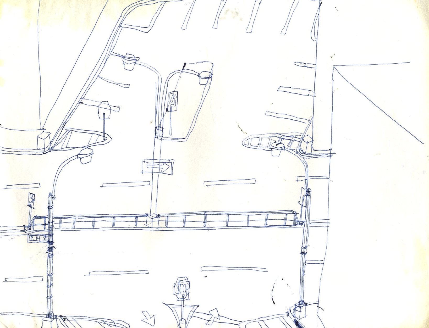
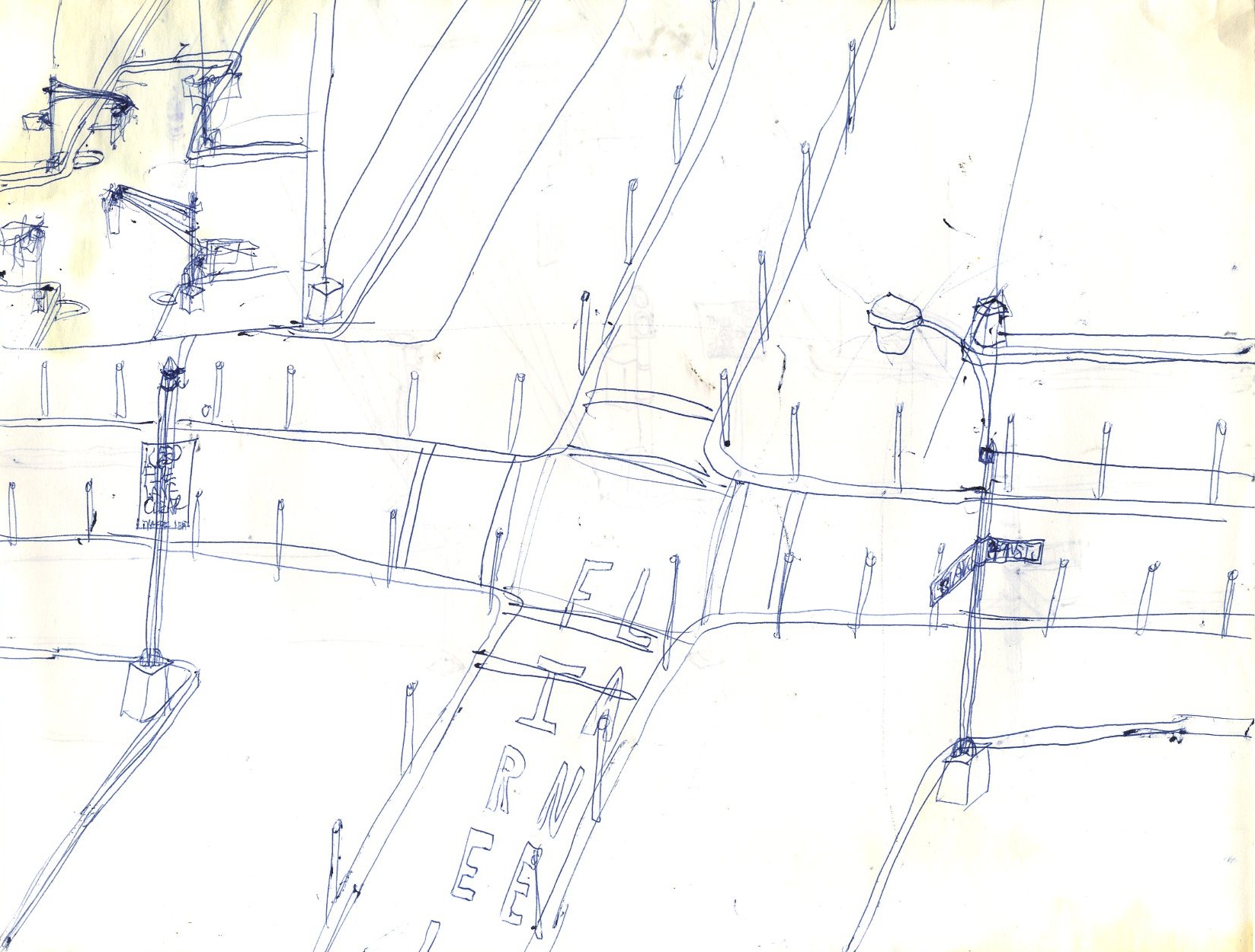
East 14 Street at an unidentified closed intersection; we can see that the traffic signal has been removed.
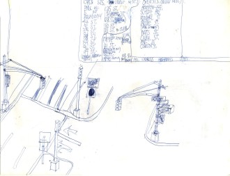
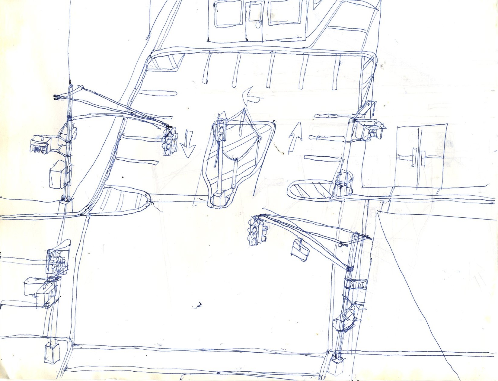
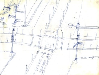
This looks like 37 Street and Park Avenue. Above is a complete list of streets that would remain open. Everything else would be closed.
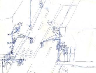
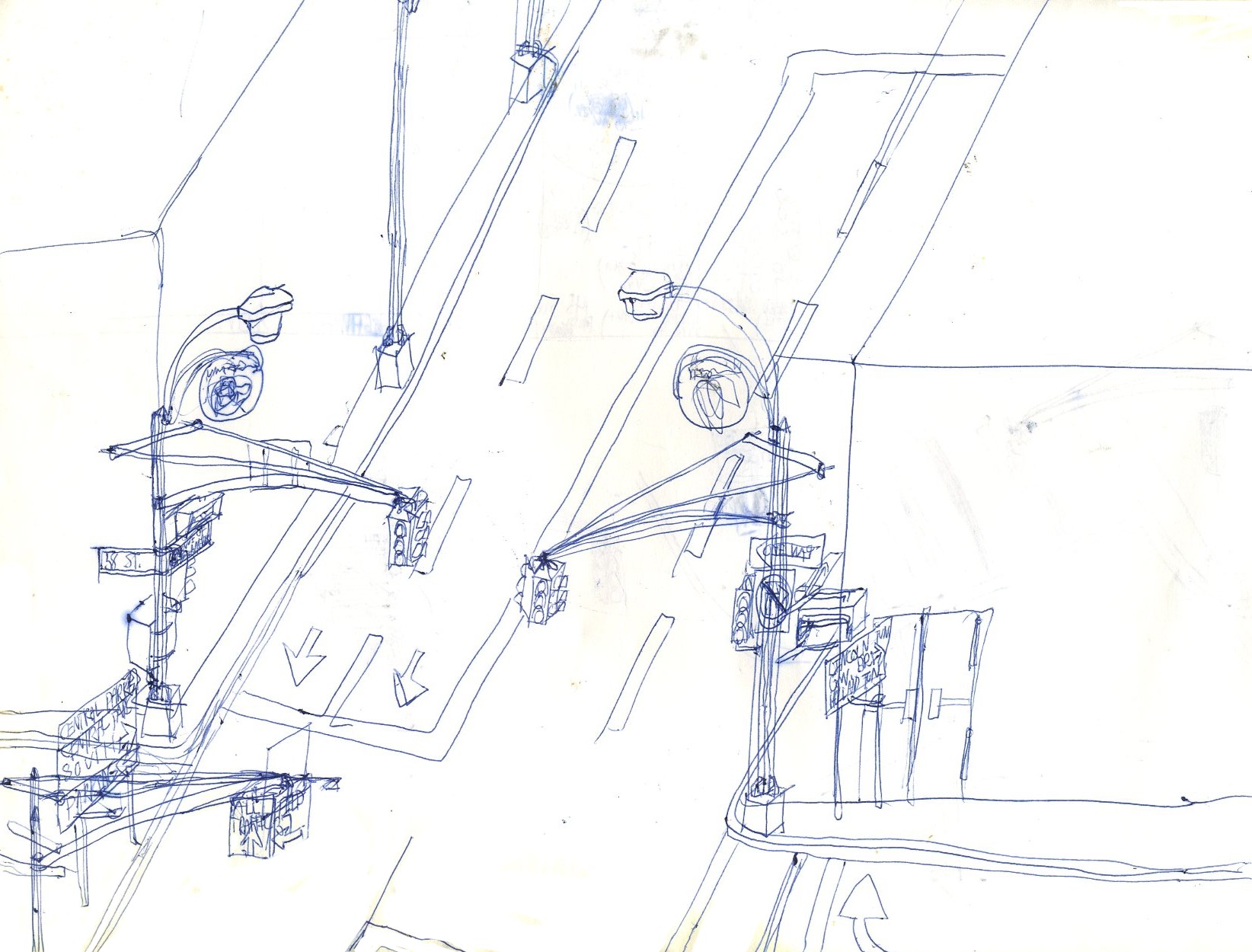
58 Street and the Avenue of the Americas (note the national emblems on the lamp posts).
59 Street at an unidentified crossroads.
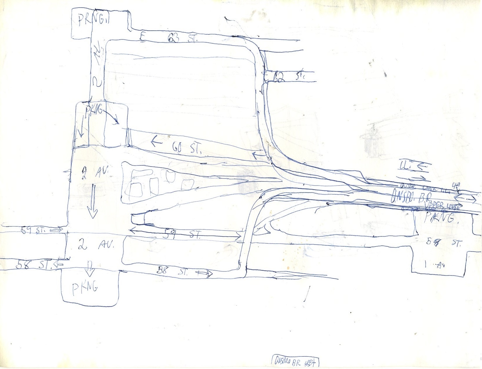
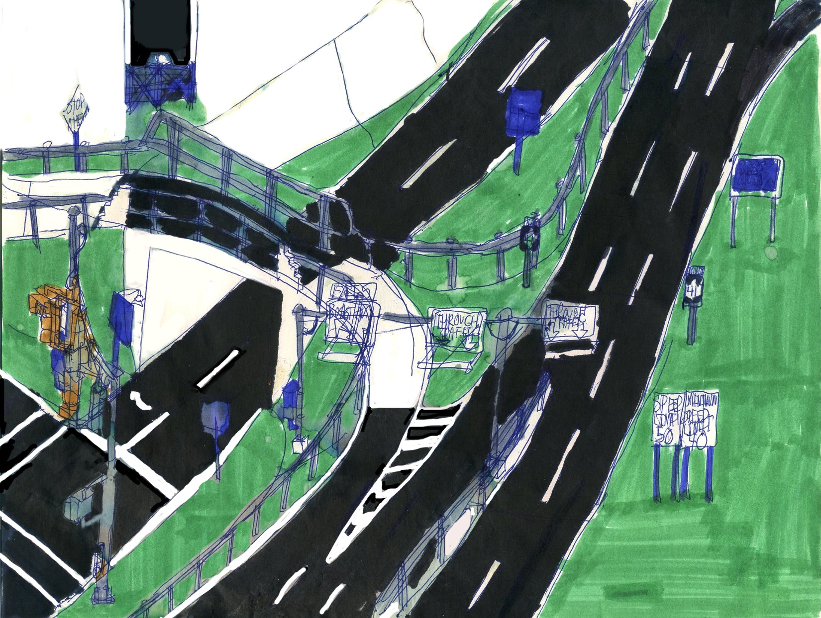
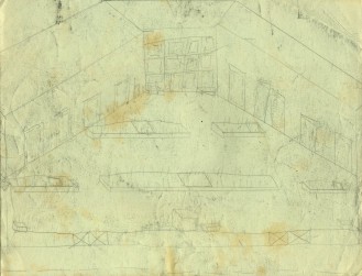
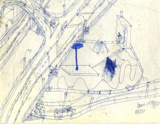
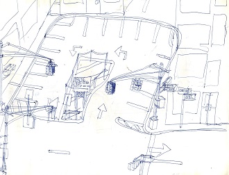
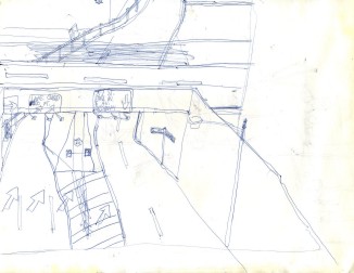
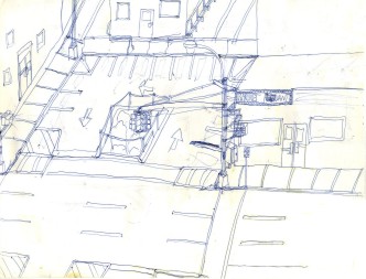
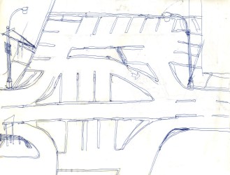
The proposed layout of the western end of the Queensboro Bridge, which looks like a recipe for gridlock.
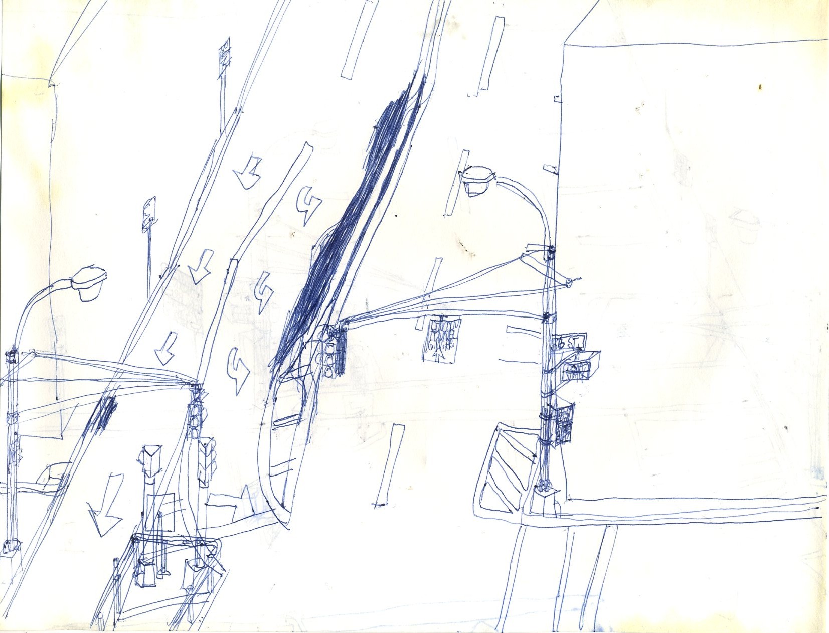
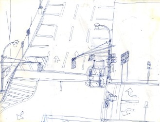
36 Street, possibly near the Queens-Midtown Tunnel.
37 Street, again possibly near the Midtown Tunnel.
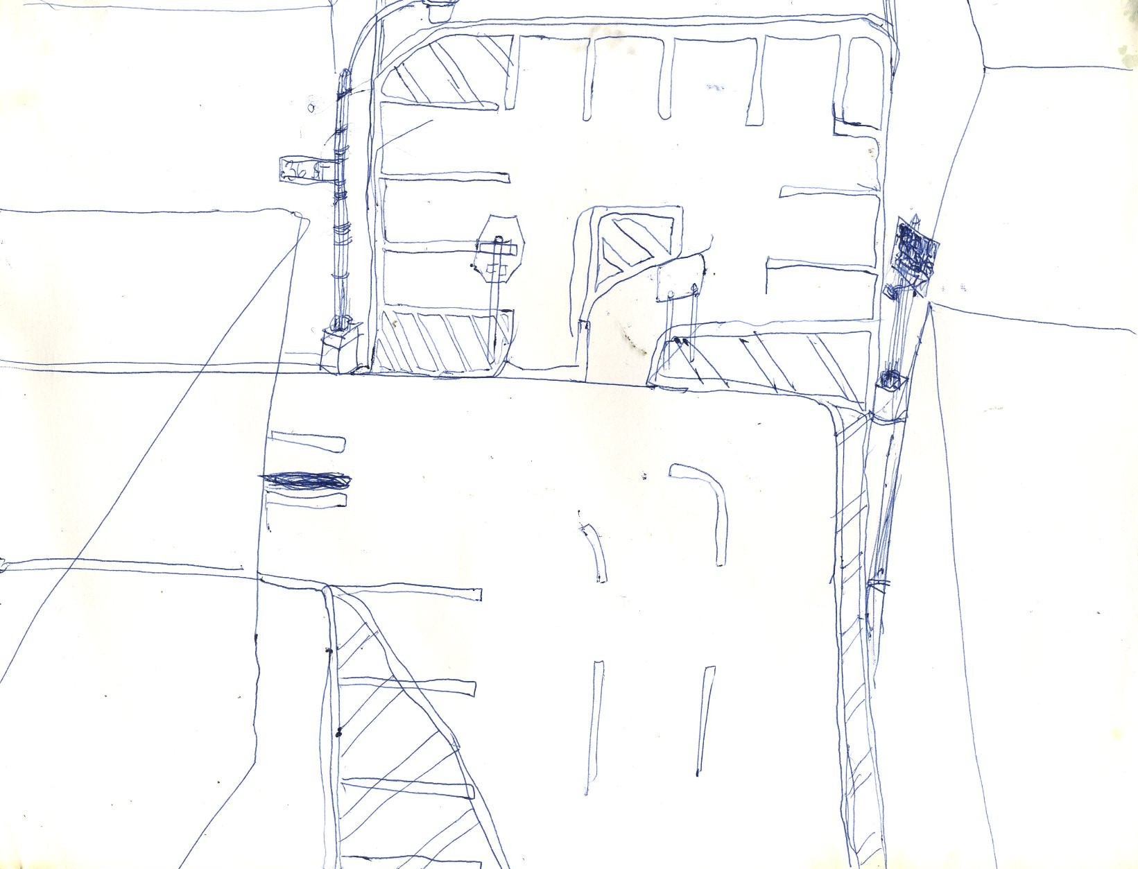
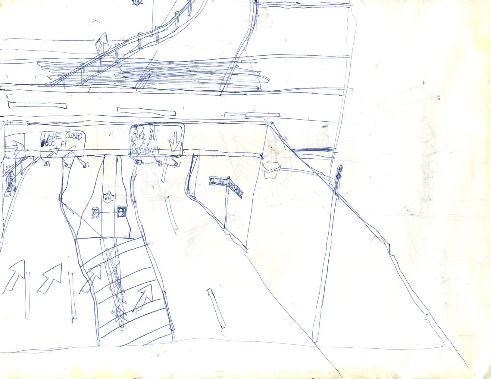
This looks like the westbound exit from the Midtown Tunnel; note how the left turn that is there even today is blocked off. Also note that old-style NY 24 shields remained there even into the early 1970's, which is why they are depicted here.
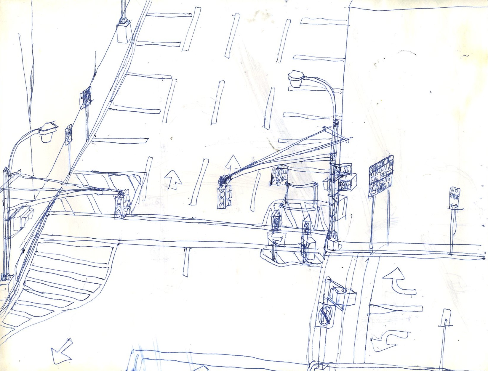
36 Street again at another unidentified crossroads.
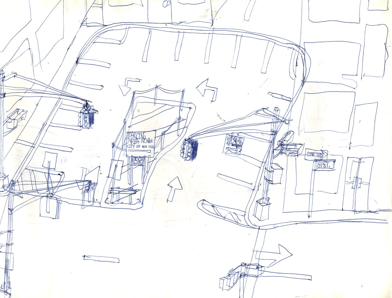
37 Street, at yet another unidentified cross street that apparently would be allowed to stay open.
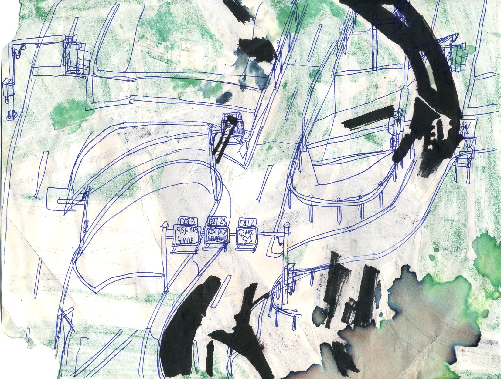
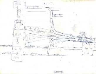
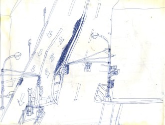
3 Avenue and 49 Street, both of which would be closed except to emergency vehicles. An interesting inset is at the upper left, possibly as an alternate plan.
3 Avenue and 41 Street, where even the emergency vehicles need a way to make sure that they don't collide. Note the remnants of removed traffic signals on the lamp posts.
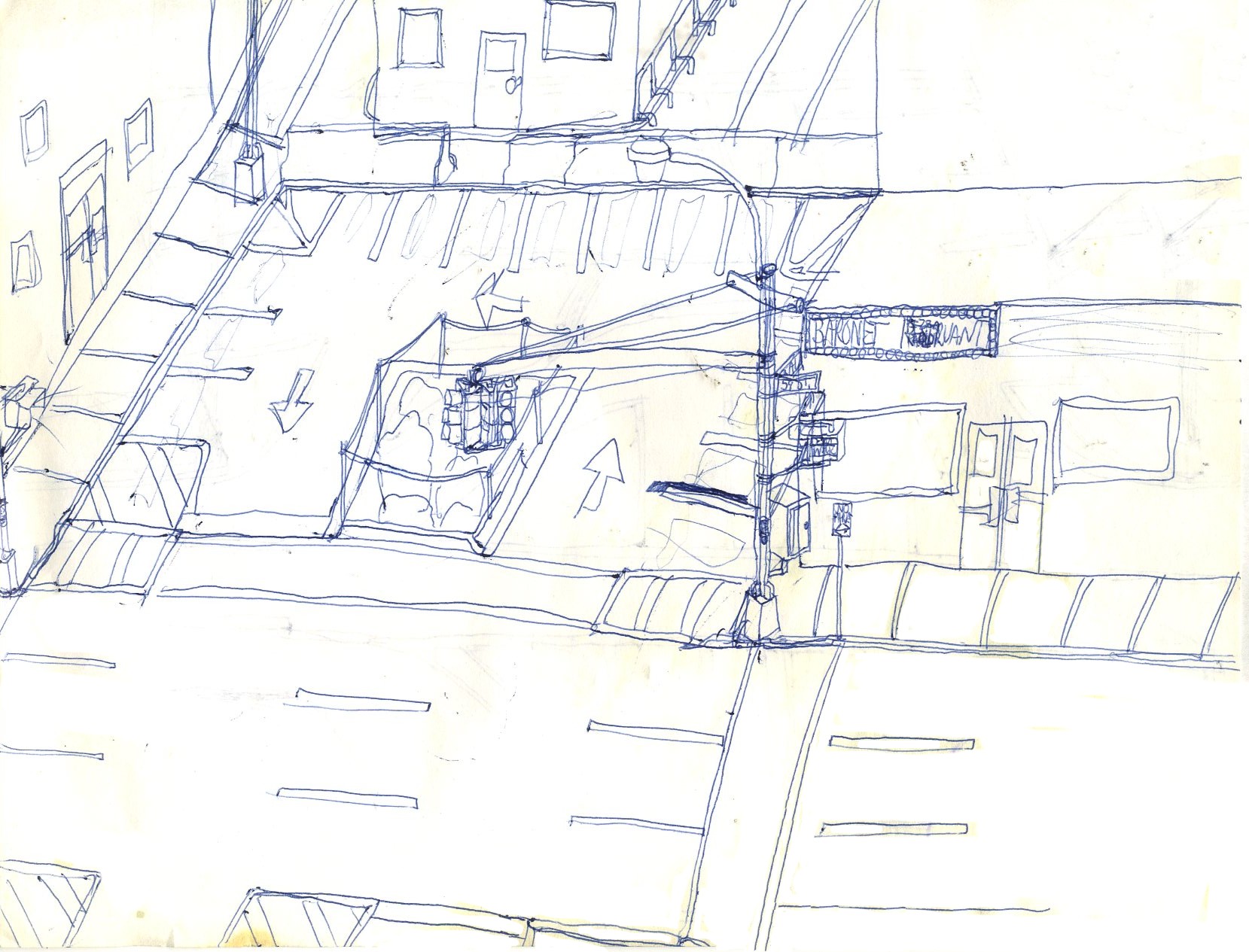
3 Avenue and 59 Street, where the Baronet and Coronet theaters were once landmarks.
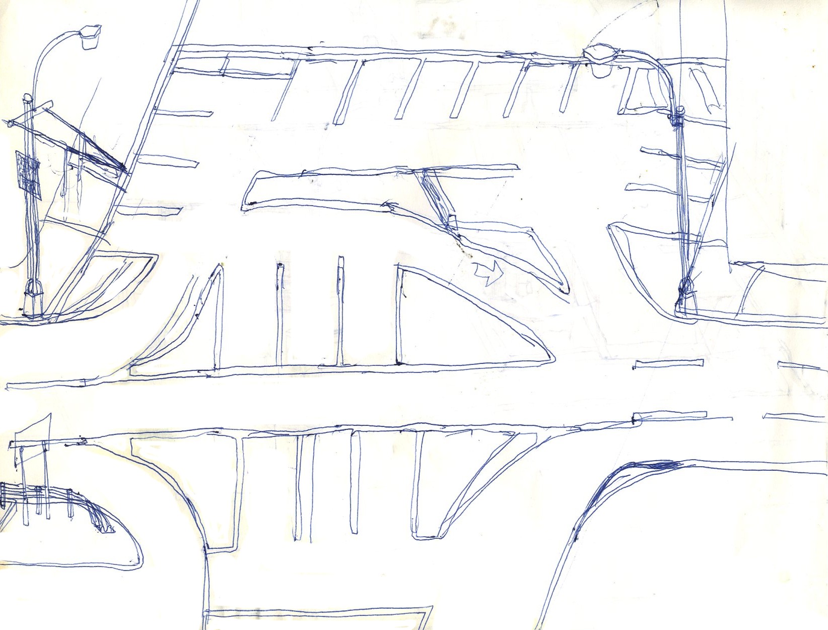
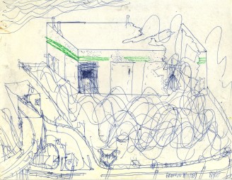
Another imaginative example of Manhattan without cars.

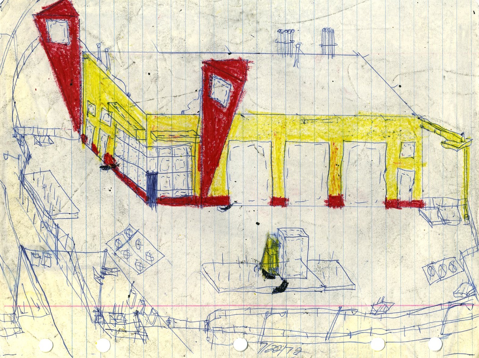
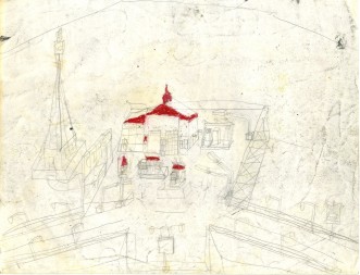
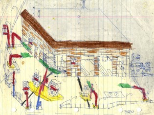
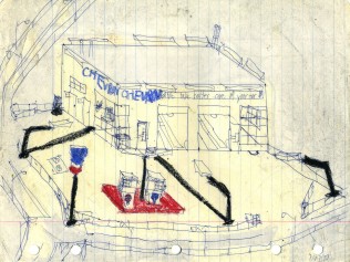
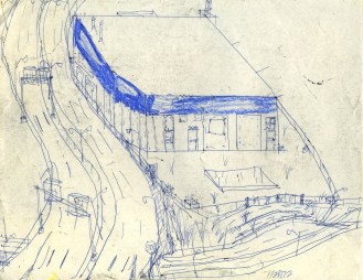
Moving away from Manhattan, we find a much later sketch that was mixed into the green box. This was also damaged by water and digitally restored, and actually looks fairly nice.
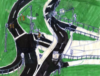
This later color sketch was also water-damaged and required digital restoration by an expert in the field; it appears to have been worth the effort.
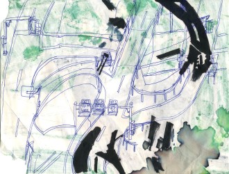
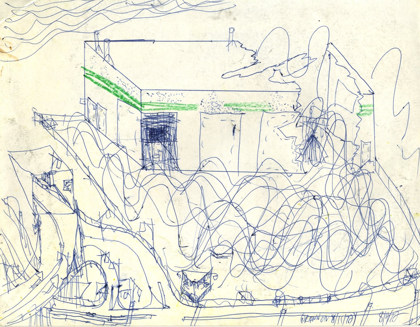
This is the back of sketch number 104 and has not been restored at all; in fact, the coloring of number 104 is partly the cause of 105's damage. Hooray, I'm free! I'm coming home, I've done my time...