The Louis and Jean Brecher Gallery
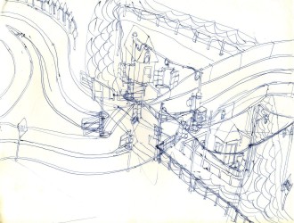
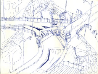
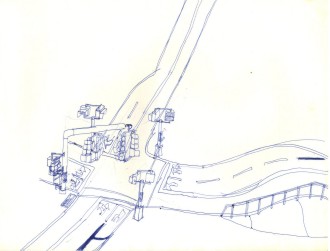
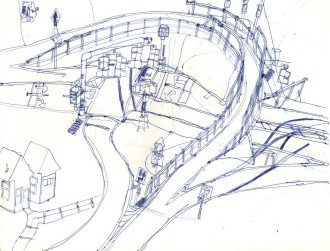
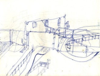
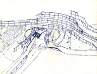
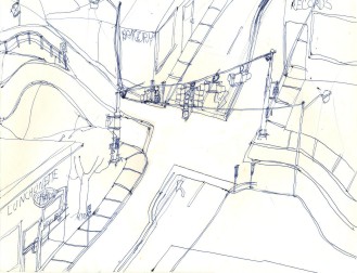
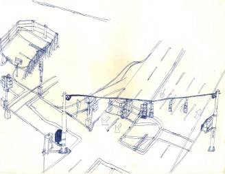
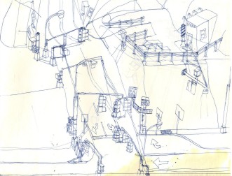
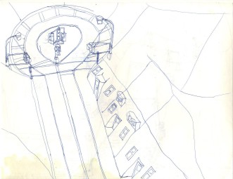
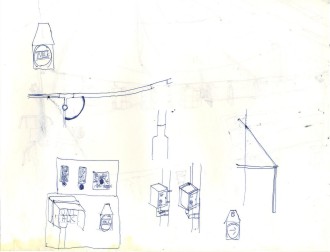
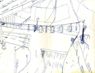
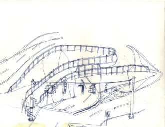
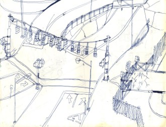
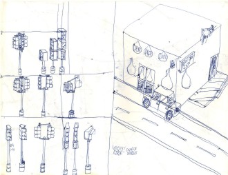
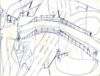
Named for my father's uncle and aunt, who took a special interest in me many moons ago, this gallery consists of an additional 92 sketches, mostly from the same era, but minus the "FUEL" stations and with slightly different themes... oh, all right, it's a bunch more roadways, traffic signals, and lamp posts-- but very few gasoline stations for some reason. The bottom line here is that those of you who liked the first gallery will like this one too. Those who found the first gallery dull, repetitious, and boring will find this one just as much so. Those who find unfinished work fascinating will have more to ponder here. These are in slightly better condition on account of having been stored in a more favorable environment. This time I have invited a senior art critic to produce the associated commentary as well as the following introduction:
I'd like to thank the proprietor of this art gallery for the opportunity to make a name for myself by commenting on these great works of fine art. I'd also like to apologize for the behavior of my colleague in the field of artistic criticism who wrote the comments for the first gallery. He was needlessly dismissive of the masterpieces that were presented there, and I fear that he simply does not appreciate the true beauty of a well-drawn lamp post, "big green sign," or intricately-executed traffic signal. I can assure you that I will not repeat the low-brow sort of remarks that he made, and I can also assure you that his extremist views do not represent those of the art world in general.

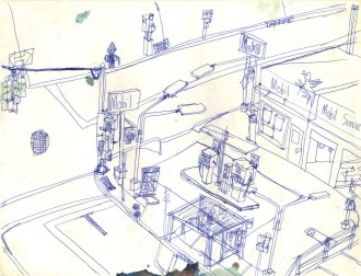
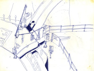
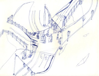
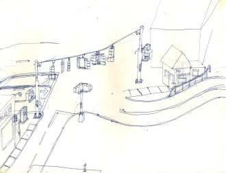
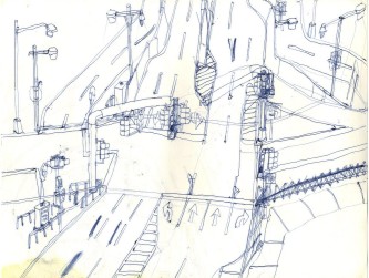
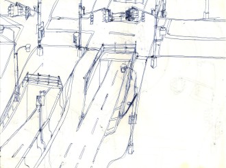
The prices on those pumps may provide a clue as to when this sketch was produced. Not sure if the 714 on the control box has anything to do with Sgt. Joe Friday or not. Not a bad leadoff sketch, actually.

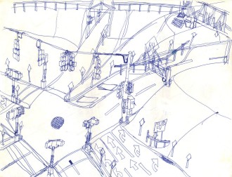
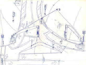
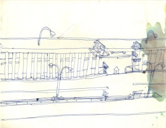
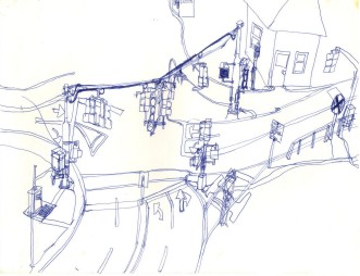
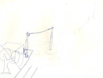
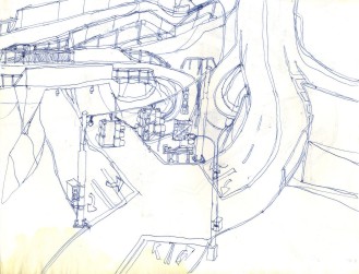
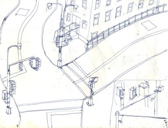
This looks like a run-of-the-mill sketch. The left post of the traffic signal appears as though it will land in the middle of the road, which is always possible but not likely.

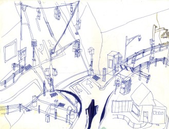
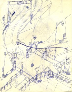
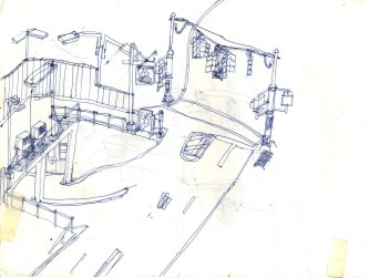
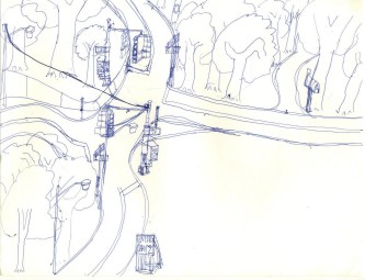
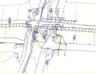
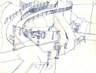
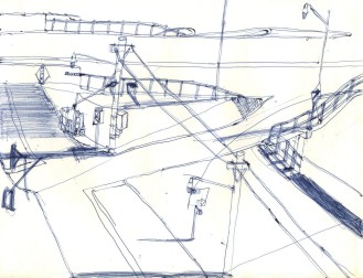
Here we see the artist's heavy reliance on blackouts as a crutch to express his change of mind after the sketch had started, but otherwise, not too bad. Presumably beyond the main signal is a fire house to go with the fire house signal. We also see the first appearance of construction barrels in this gallery. Also note the W-beam galvanized steel guardrails used in this sketch; the first gallery relied mainly on box-beam guardrails.

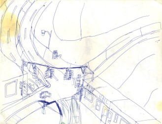
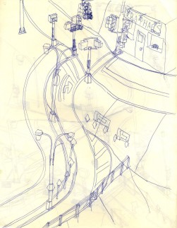
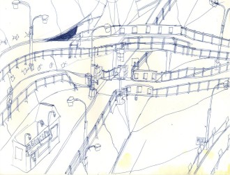
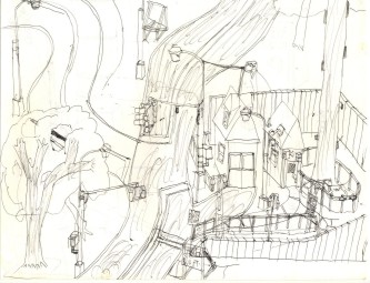
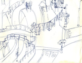
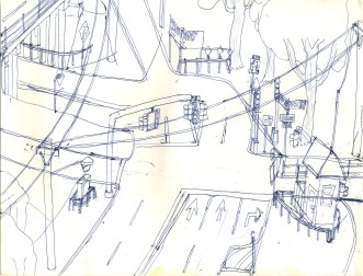
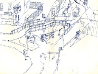
The posts on the tops of the buildings are unusual, to say the least. Many people might shy away from making the right turn at the left of the intersection, given that a building may or may not be occupying the space where the right turn lane is placed.

More blackouts, but otherwise passable.

The artist is said to have had a model layout in his basement when this was drawn, and this is a sketch of an intersection in the model layout-- art imitating art?

The right side of the signal's wire isn't quite right, but otherwise this is fairly good.

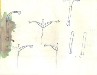
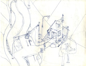
More Deskey lamp posts in a rare portrait orientation.

An unfinished entry that is reasonable as far as it goes, apart from the stain at the right possibly caused by an errant cat.

Miscellaneous doodles with another view of the stain at the left.

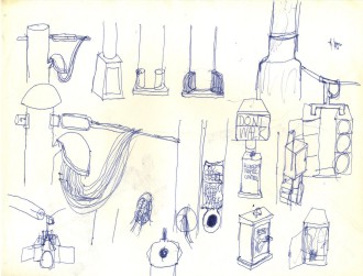
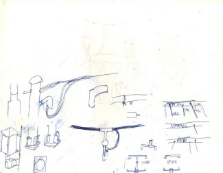
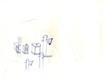
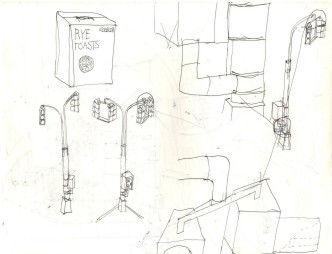
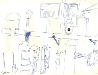
Some interesting close-ups of various components of traffic signals.

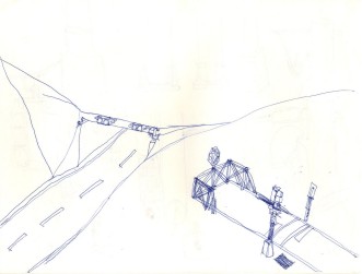
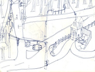
This sketch may or may not be finished, but the absurdist dead-end street with a useless traffic signal and crosswalk most certainly is complete.

A traffic signal is in the process of being replaced as the poles are reused. Why this sketch is unfinished is unclear when with a bit more effort it could have been a contender.

This sketch has a somewhat different take on a railroad passing through town. The Gulf pumps almost look like 1950's Gulf pumps.

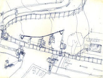
Not bad, not too many corrections, and it even has a tree. At 99% off, though, one wonders if any more than a few threads would be left after a trip to that cleaner.

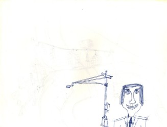
Great balls of fire! A human being! Who would have thought it could happen-- and he even has a particle of brain as he pushes the button for the pedestrian signal. After all, these streets are so busy with cars, buses, motorcycles-- you name it. He wouldn't want to get killed. Besides, he already looks as though he may have been in an accident; clearly, this artist's talent lies elsewhere.

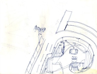
And another human being! Two in a row. In any case, the doodle of the New York City overhead sensor is clearly superior.

This seems to have been going okay and ought to have been finished despite the indecision about the height of the pedestrian signals.

Here we see a signal being upgraded from a flasher to a full three-aspect signal.

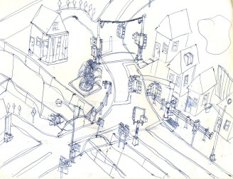
Beach looks like a nice place to live, though the sign indicates that it is near the Atlantic Ocean, which may render it susceptible to storm surge. Four homes and a fountain distinguish this well-executed entry.

Another group of doodles that look as though they could have come from a traffic signal parts catalog.

More absurdist humor; most folks won't push the button when it is at ground level much less climb a bunch of steps to push it, and some discrimination is evident depending upon which way one desires to cross.

In this sketch, getting there is all the fun.

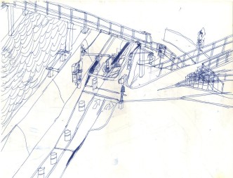
This is another that should have been finished. It looks okay apart from the signals that look not like 8's, not like 12's, but more like 24's or maybe even 36's, though they may have worked if the poles were taller and beefier. The narrowing perspective of the underpass is somewhat exaggerated as well.

A little busy, but it has its moments.

This entry is fairly straight, with some trees and water to add color, though the lamp posts must have been delayed in shipping and were installed after the rest of the sketch.

Nothing unusual here, so this is another sketch that could have been finished with some effort and inspiration.

A nice little overpass with only a few blackouts.

What is really fascinating is why the artist failed to complete so many of these sketches that seem to have lots going for them and no obvious problems before work ground to a halt.

Okay, so the house at the right was drawn after the roadway edge. Didn't the artist know that twenty years later photo editors would be common and those errors and oversights could be wiped away? A small error wasn't reason to issue a stop work order!

Another small doodle; the signal at right is designed to keep someone at a small offset from seeing the signal's state.

This one isn't too bad, but the layout isn't entirely practical, either.

Fair enough, but the result is another unfinished work.

Yet another unfinished work... sigh.

An early draft of the Michigan left?

Cantz has about the lushest greenery we've seen in these sketches, and it's well-executed at the bargain.

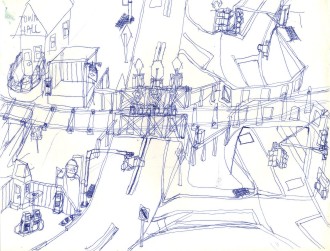
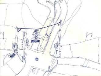
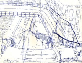
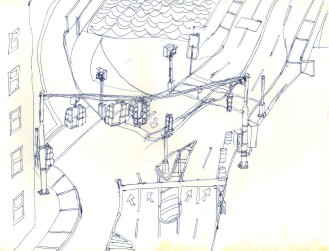
This is an interesting scene, but the electrical wires on the traffic signal are greatly exaggerated, and the warning signals on the ramp to the bridge could have had their own control box instead of being hung off the box at the intersection. Note that the windows on Town Hall are more carefully drawn than usual.

Not bad-- it just needs some finishing touches.

Much more detailed in many ways, and some construction barrels make an appearance, but the water looks to be about to overflow that wall.

This must be up the road from the previous sketch, but clearly this artist needs to hire a relief artist to draw the eighth and ninth innings if he wants to win the sketch.

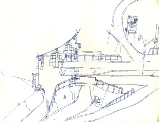
It looks as though the intersection is about to be moved to make the exit ramp from the bridge somewhat easier to navigate. I'm starting to wonder if the artist worked with an egg timer and only drew as much as he could before the sand was gone from the top of the glass.

Not sure if this one made it to the fifth inning so that it could be considered official.

This promising effort could have been completed with a bit more discipline and fortitude. The house at the lower left appears to be missing its roof.

And this is Uncle Ted on the side of the house...

More indecision; was the artist thinking of a bridge there or not? Two artists sharing the same sheet of paper, perhaps? A psychiatrist would have a field day with this one.

Yet another valiant effort on the same theme ends in a no decision.

This one is fairly straightforward; the ghost lines near the street lights are an interesting touch.

Why the control box on this signal was upgraded mid-drawing is yet another mystery of the universe. Despite that, the drawing still could not be completed.

Another promising sketch, another sudden ending.

Two more interesting doodles.

This, at least made it through the fourth quarter, and depicts an interesting way to construct highways. The implied Michigan lefts are out of the bounds of the sketch.

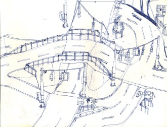
Another entry in the dual-level highway genre, and, like the previous sketch, this one is pretty workman-like all-around.

Countin is distinguished by having an actual car in its sketch; usually, they tow all the parked vehicles before the artist begins to draw. Also, we see some interesting uses for the spare slot in a Deskey pole. Note that the cost of a traffic signal at a private driveway usually has to be borne by the owner of the driveway.

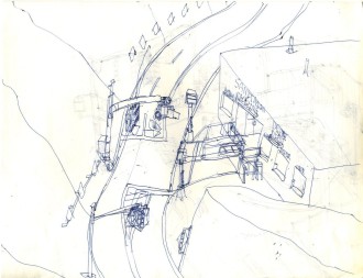
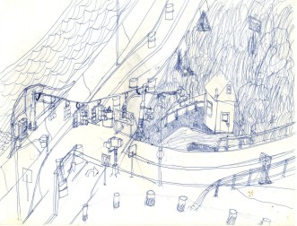
Stores built into the side of a mountain can work, depending upon what direction they are facing and what time of year it is.

More batting practice warming up for the big sketch.

The right pole must have really short-circuited the artist's brain. What to do with the road at top right apparently was a real poser as well.

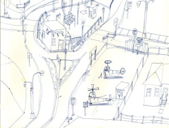
Daxn has a heliport and an actual working helicopter to boot. This is one of the better drawings in this gallery. It even has a bit of shadow underneath the helicopters.

Another decent sketch, though the weather heads on those signals look a bit odd; this may have been an earlier attempt at drawing those. With practice, those eventually became spot on.

This is good as far as it goes and could have been a contender if finished.

Another abandoned sketch that perhaps could have been worked into something appealing with some finishing effort.

Once again, this wasn't going any worse than many other of the artist's sketches that were completed, so the big question is always, "Why?"

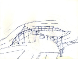
An interesting, well-executed layout. Note the thin stabilizing wire across the top of the signals.

Some more doodles on the left, and something other than a traffic signal as the star attraction at the right. At least we know how the establishment acquired its name.

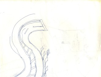
Yet another one-way freeway, but at least the sketch is finished.

Another straightforward, well-executed interchange with only one crossout and no mid-drawing changes of philosophy.

What isn't clear here is how the two left turn lanes can alternate between being marked for left turns and being striped off depending upon how the roadway at left is reversed, but otherwise this halfway decent entry is well-executed.

Perhaps one day they'll build the other half of this one-way freeway, and perhaps one day the artist will learn how to draw the number "2" the way it appears on highway signs.

Once again, good as far as it goes, but it really should have been completed, the way a baseball game called on account of rain can be completed the following day or the next time the teams meet. Why not finish some of these before starting the next sketch?

Another good sketch, but why not draw a tree in the upper right corner, finish the pavement markings, and stamp it "finished!"

This one was drawn with a higher level of care than most, and it shows. The hole in the tree at the lower left is an interesting touch.

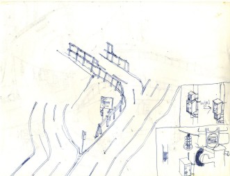
What doodle clearly does not belong here? The traffic signals hung off Deskey poles are a fanciful figment of the artist's imagination. Note the dotted lines on the signal enlargement at the lower left.

No! No! No! Those aren't blackouts; they are shadows. That's why the curator had a proper art critic here to review these; otherwise, Internet yahoos would have concluded-- erroneously-- that these are blackouts and more evidence of indecision. It doesn't work too well, though, and sort of mars an otherwise decent drawing.

The "keep it simple" principle works well here.

The trees here give this sort of a quaint touch.

Another simple drawing. The fire truck appears ill-suited to quench any but the smallest fires, though.

YAAA (Yet Another Abandoned Attempt).

More indecision about the traffic signal, but otherwise okay.

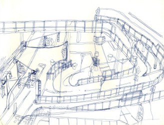
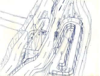
The curves and grades in the middle ramps are tight, but otherwise this works.

This one is quite good, but between the sign in the middle of the road and the signal pole right at the edge of the road with its signal sticking out into the middle of the road, that right turn looks rather tight.

If a traffic signal ever went on trial for a crime, this artist would be the man to cover the trial and produce artist's sketches.

Nothing fancy here, though the double exit ramp is somewhat unusual.

One way to round out a page is to add some bonus doodles in otherwise empty space.

Another attempt at shadows that might work if the shadows were not as fierce, or if a different drawing implement (a pencil, maybe) were used.

Another simple scene-- not bad.

This signal is in the process of being replaced, which makes it interesting, and the water is well-drawn.

The hairpin curves depicted here would be a pain to drive, but they give this well-executed drawing some character.

He struck out one batter on three pitches and they pulled him from the game. If only we could know what happened here.

This at least is a finished game with only some small errors and some indecision about the traffic signal, but still worthwhile.

Here we are presented with a likeable sketch showing what appears to be the end of a highway as it approaches a bus and train terminal (we know this from the sign as opposed to any artistic depiction of buses, trains, or their terminals). It is hurt only by the multiple changes to the cloverleaf ramp in the foreground.

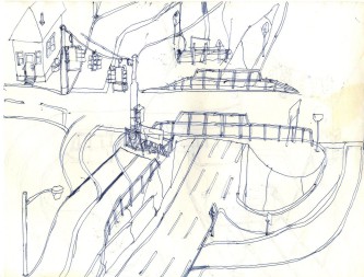
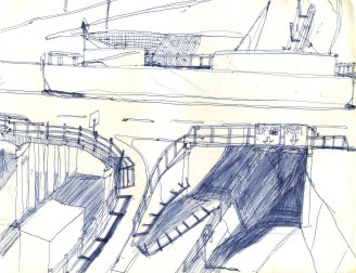
A quaint, well-drawn pair of drawbridges make this an appealing sketch.

Those rooftop chairs look like fun places to be, perhaps with some anti-sunburn lotion.

This is reminiscent of the Edison Bridge alongside the Driscoll Bridge in New Jersey inasmuch as the height of the taller bridge is useless if the bridge right alongside it is lower, which is probably why this was abandoned, a fitting end to a gallery where at least a quarter of the works in the exhibit were unfinished.

