Andrew's Sketches
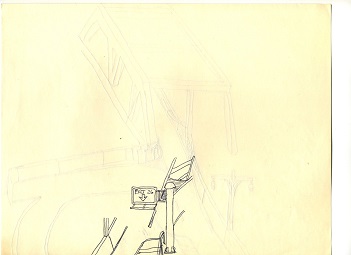
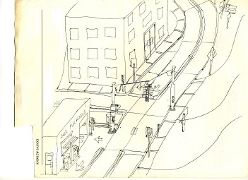
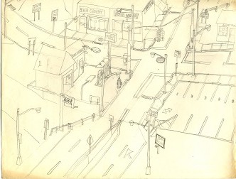
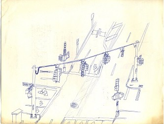
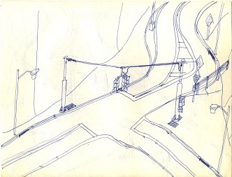
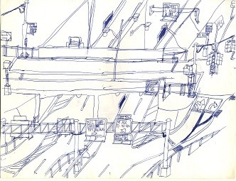
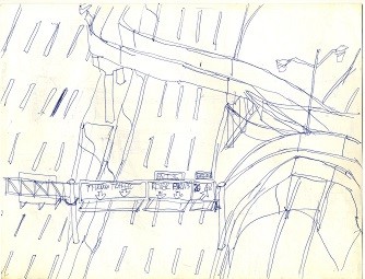
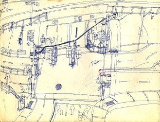
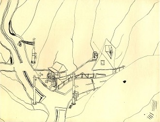
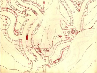
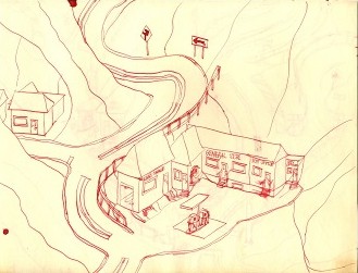
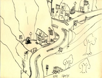
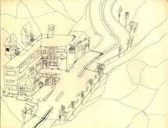
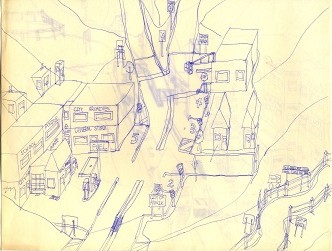
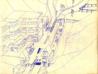
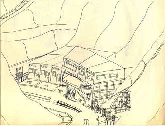
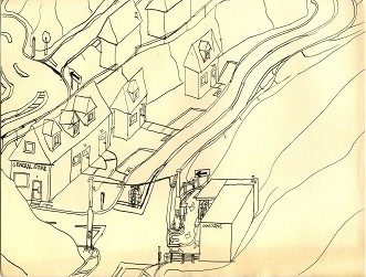
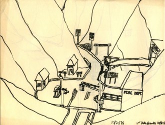
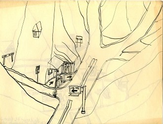
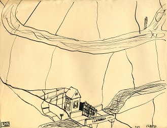
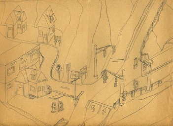
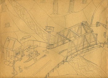
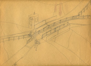
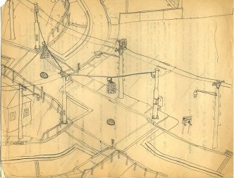
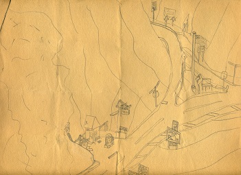
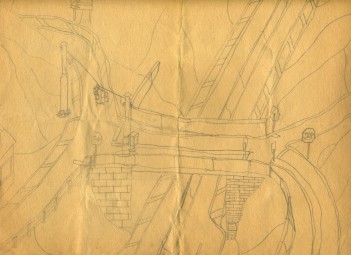
This group of sketches was found in an eave of my attic, which was not too kind to them over the last thirty years. I still enjoy looking at them, though. They were drawn between 1975 and 1980, if I recall correctly, when I was 13-18 years old. Drawing these little sketches was what I enjoyed doing when I had nothing else to do, especially in the summer. The astute critic will notice a few things: first, I covered a very narrow range of subjects, namely, roads, intersections, gasoline pumps, traffic signals, and lamp posts. This particular group seems focused on small-town America... well, okay, tiny-town America... yes, be fair, micro-town America. You'll see lots of bleeding from the reverse side as I was often thrifty and would either use the back of the sheet after finishing the first side, or maybe I started and abandoned something on one side to start on the other. You'll also see the disadvantages of using a modern ball-point pen, and finally, by the time you pore through these 120 or so works of fine art, you will wish you never have to look at another traffic signal, lamp post, or gasoline pump again. You can click on each thumbnail below to view a larger version. I've invited an expert art critic to write suitable captions for each sketch.

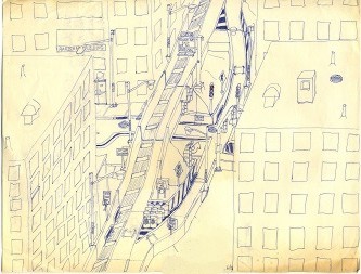
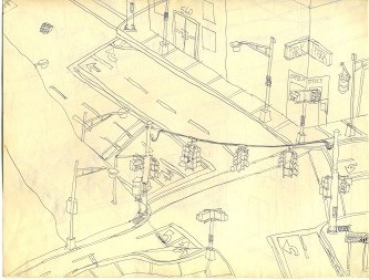
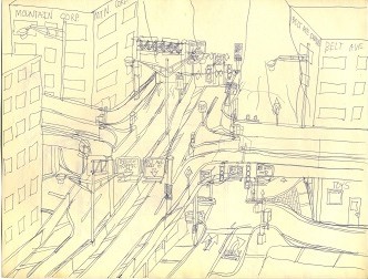
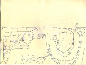
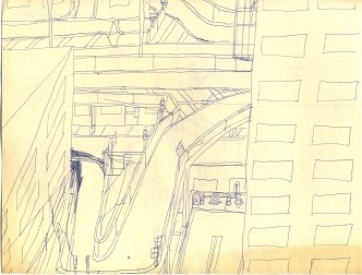
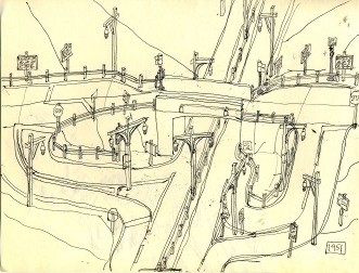
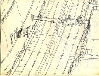
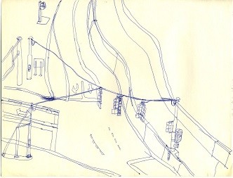
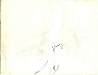
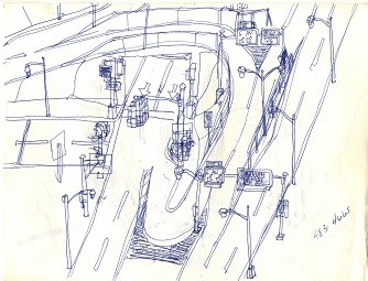
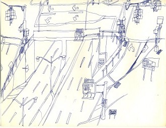
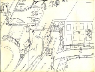
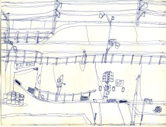
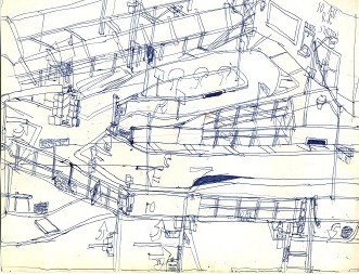
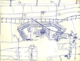
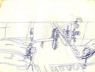
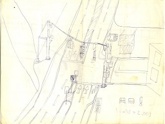
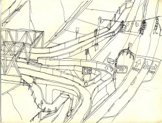
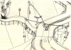
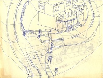
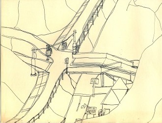
This depiction of half of an expressway (One might call it a "super-1") was on top of the pile, and it's actually one of the better ones. It seems to be more carefully planned than most of the others, missing the blackout corrections and drawing over top of other elements that characterize many of the other sketches. It even sports actual red on the red signal. Presumably the other half of the expressway goes down the next block.

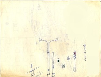
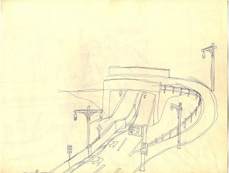
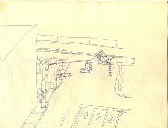
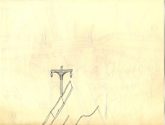
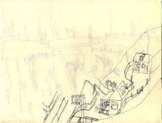
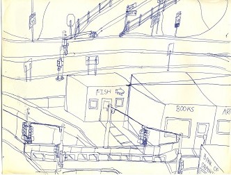
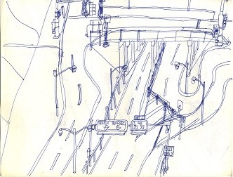
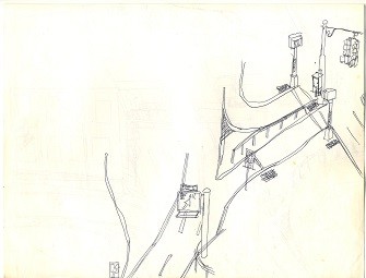
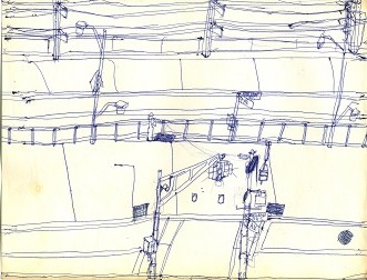
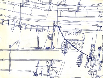
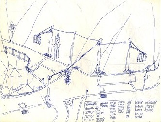
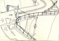
These are a couple of doodles on the back of the previous sketch. One has to come from New York or have watched a TV show filmed in New York to recognize the 1960 and 1970-era Deskey twin lamp post that was the standard practically everywhere in New York City back then. They have largely disappeared by now, replaced by a hodgepodge of whatever the lowest bidder supplies.

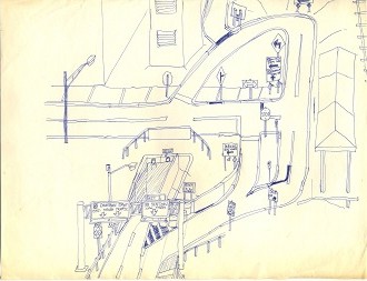
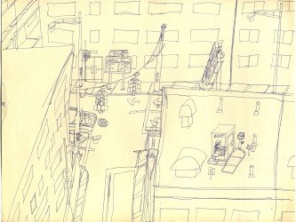
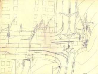
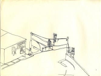
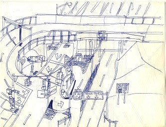
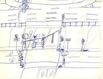
Why this is slightly unfinished is unclear; maybe it was dinner time or time to watch the hour of English comedy that used to be on WNET at 10 PM Sunday nights. It has only a few blackouts, which is fairly good.

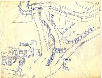
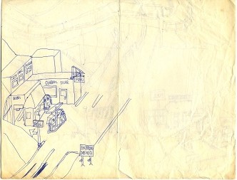
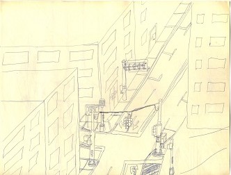
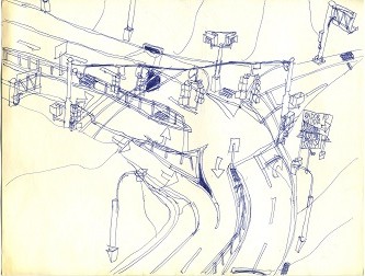
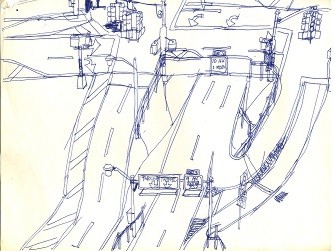
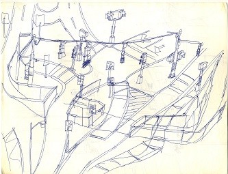
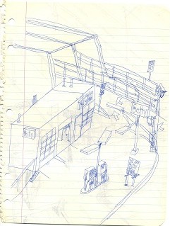
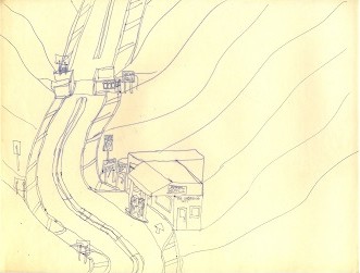
This marks the first appearance of one of the stock elements in this series: the "FUEL" station with grades of gasoline marked "A," "B," "C," and "D." That forms the basis for some sardonic artistic observations to follow. Note that you will never see a sign for "GAS," because that is plain wrong. It's "gasoline," which would not fit on the modest signs usually depicted, so the artist chose to use "FUEL" instead. Earlier, still unscanned sketches by the artist were more likely to depict actual brand names, but this appears to signal a change in the artist's attitudes toward corporate America as he progressed toward a recognition of the value of subsidiarity and a clear distaste for what Chesterton termed "Hudge" and "Gudge." Also note the considerable expense apparently incurred to construct the reverse movement in this rural fork in the road, which was probably least likely to be used.

By this sketch, we see that grade "D" gasoline had fallen out of favor, or just never caught on in this area. It may have been foggy the day this sketch was drawn, which would account for the road tailing off into nowhere.

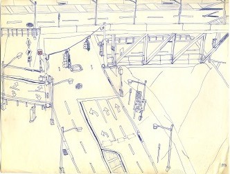
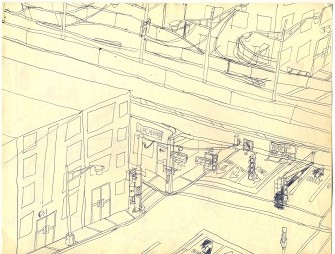
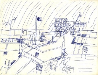
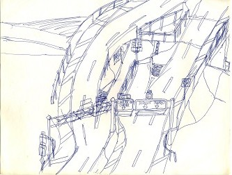
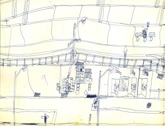
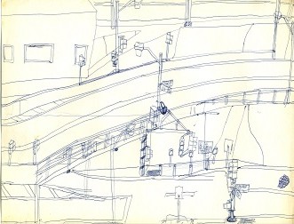
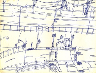
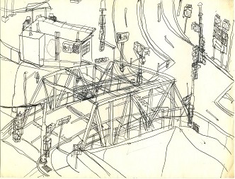
This one is pretty good, with only some of the lamp posts appearing to have been added after the rest of the drawing, and one small blackout on the bridge trusswork to make room for another road at the upper right. It also shows a couple of spots of green for good measure. A four-color ball-point pen probably had red and green ink that rarely got used. Why the shoulder on the upper-level highway shifts from the left of the carriageway to the right towards the upper right is a mystery, but the artist apparently felt it important enough to use another blackout.

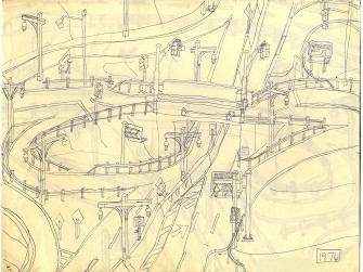
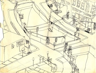
This is another good drawing, with only a wooden lamp post drawn in extra innings. Once again, you have to come from Long Island to recognize the style of lamp post that was common on Long Island parkways in the 1960s and early 1970s. Today, they are relegated to the parkways south of Merrick Road. "1976" is not necessarily the year it was drawn, but the year depicted, as will be evident in some of the following drawings, some of the same scene. Also evident here is a tendency toward absurdist art, notably the four-lane highway that narrows to two lanes just for the one-lane bridge and immediately goes back to two lanes. We'll see additional references to "Anberville" ahead.

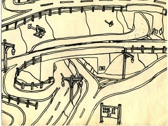
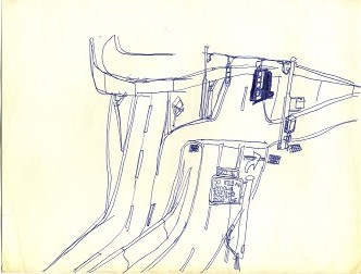
At some point, the artist acquired a proper set of pens, which was a little harder to use but produced some interesting drawings. This sketch is considerably less detailed than most of the others but is better executed, probably on account of that.

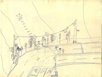
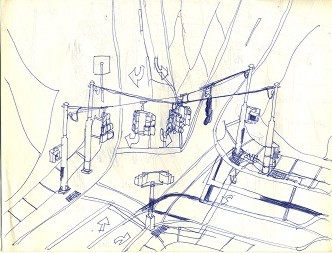
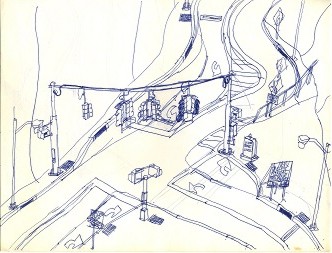
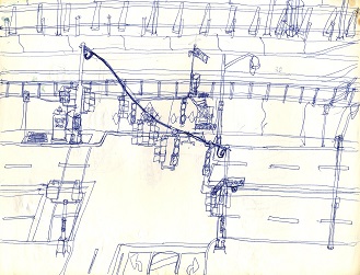
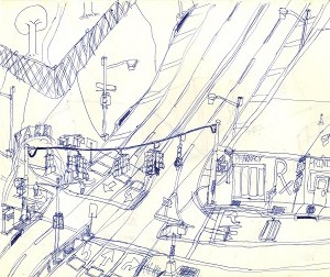
This entry is quite good, and the curvature of the wire holding the traffic signals is mostly right (unlike many of the others). The sneaky appearance of a Chevron sign almost out of the frame probably has to do with the artist's favorite gasoline dealer being a Chevron outlet back in a time when people actually knew the man who sold them gasoline instead of it being purchased at a nameless, faceless convenience store or fancy delicatessen. This one is mostly straight shooting apart from the narrowness of the road at the lower left.

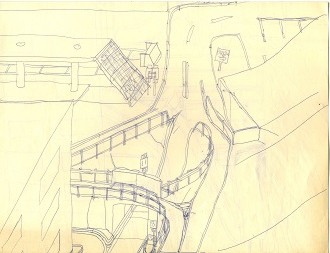
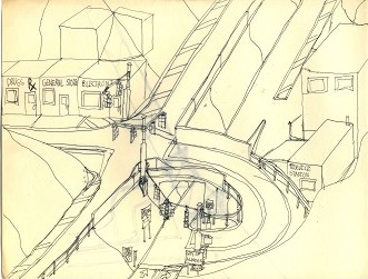
At some point during the construction of the viaduct, the design of the entrance/exit ramp must have been changed so that the building at number 33 would not have to be condemned and bulldozed. This drawing has a couple of other late changes to lane striping; keep in mind that lane markings often have to be sanded off the roadway when they are changed, almost as they are depicted here. The Anberville Expressway, route 11, is one of many super-2 roadways shown going through cities, probably on account of a lack of space to construct more ambitious projects.

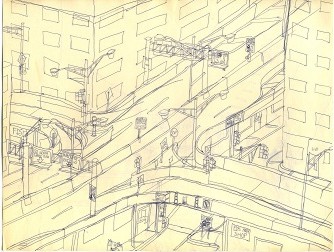
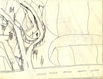
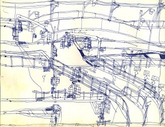
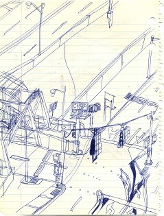
This was probably inspired by some ramps on the Brooklyn-Queens Expressway in Brooklyn, which is a similar sort of viaduct. Several things were drawn on top of other things, indicating a lack of planning on the part of the artist, but overall, another passable entry in this cavalcade of sketches.

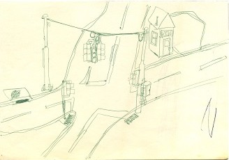
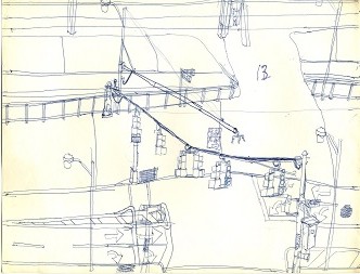
This is a particularly absurdist sketch: a full traffic signal-- with pedestrian signals-- at a non-intersection with an unbuilt, numbered highway, 310. It's mostly well-executed apart from the obvious change to the position of the right signal pole. The small home at what appears to be number 113 looks like an inviting place to live if one doesn't mind leaving his car elsewhere.

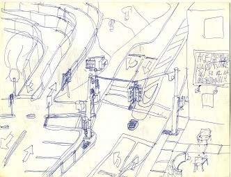
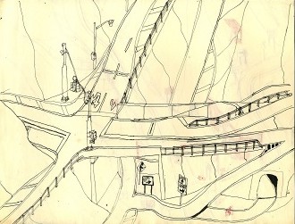
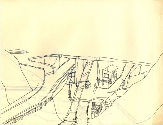
It's back to the Anberville Expressway for this one, which ends rather suddenly without even any barriers to prevent drivers from passing the last constructed exit. While the signs facing the mountainside appear to be ridiculous, things such as this were actually constructed in some places before funding evaporated and the roads were never finished. (See the Arden Avenue sign on the Korean War Veterans Parkway in Staten Island, New York as well as the signals facing toward the wall before the controversial 76 Street subway station in Queens, New York.) Apart from that, it is fairly well executed with only a few obvious changes and the usual generic store signed "TOYS."

Okay, it's another four-lane highway narrowing to two to go underneath the overpass to the "Correction Mall," which doesn't sound too inviting... you really didn't need to see the rest of the sketch.

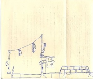
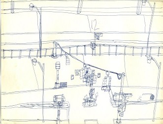
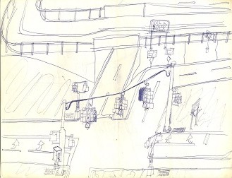
This one looks as though it was drawn almost completely front to back, which probably accounts for its relatively good execution. I suspect that the artist never caught on that the right way to draw traffic signals of this sort is to draw the poles first and then the wire between them. This one appears to have been drawn left pole, wire, right pole. Also note the absurdist rooftop pay phone. Okay, so all pay phones are absurdist today, but remember, this was the 1970s, when pay phones were everywhere, except perhaps roofs.

This minor work speaks for itself, or doesn't.

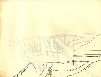
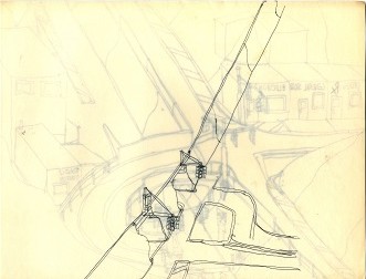
This unfinished work got off to a good start; why it was not finished is a mystery.

Another unfinished work that looks good as far as it goes; perhaps the pen ran out of ink and not even a refill was at hand.

This is the other end of the Anberville Expressway, which apparently was constructed by the same firm that constructed the first end that we saw earlier. The missing windows in the building at the upper left are a curious detail.

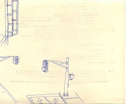
Here the traffic signal hangs properly, but the road had to be tightened by a lane to make it happen. Again, draw the poles first, then the wire, then the aspects.

This one is fairly simple and straightforward, without too many corrections.

This looks like a railroad terminal with a somewhat involved overpass at its exit.

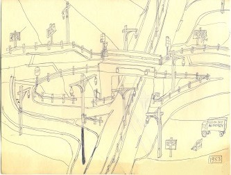
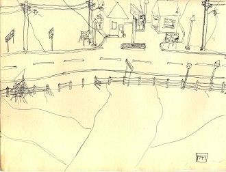
Depicted here is the 1953 version of the Eogan Parkway, before it was widened. This was most likely drawn after the 1976 version, so it appears to be better planned and executed.

Another wooden lamp post inside of a concrete "Jersey" barrier.

What makes this 1951 version of the Eogan Parkway different and worth another sketch is not apparent, although we see a change from two-aspect signals to three-aspect signals at the one-lane bridge.

This is a rudimentary highway service area, nothing like the ones one might see on the Jersey Turnpike. After that, the inspiration must have evaporated.

This is the right-of-way for the Eogan Parkway before it was constructed. The sign at the far left, which is not readable from the sketch's perspective, no doubt announces the impending construction of the new parkway; the signs in the gasoline station hint at this as well as do the breaks in the old-style wire guardrail where construction vehicles no doubt had already entered to start preparations.

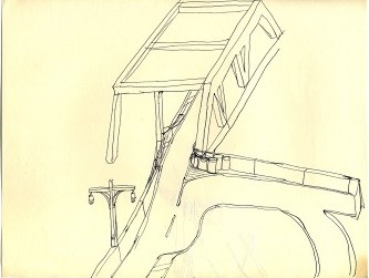
The truss bridge with an absurdist chute at the right wasn't enough to provide fodder to complete this sketch.

After five jugs of whiskey, the artist's head just fell on the paper and this sketch could not be completed.

Any piece of paper can become the home of a sketch. This isn't too bad, except that the right pole of the traffic signal appears a bit short-- again, the work of an inexpeienced artist who should have drawn his poles first.

Pencil sketches are more forgiving as pencils come standard with erasers, so errors and poorly-planned objects can be corrected and rearranged. This actually isn't too far from the mark, as I have seen after passing through any number of small towns in Middle America.

This is a rendition of a real intersection, or at least how the artist thought it would be constructed. What is labelled "Santini Road" is now called "Glenn Curtiss Boulevard," and the two right turn lanes were separated to point them away from the residential street at right, but otherwise it's pretty much the way it was built. Note the faint outline of the center striping on Merrick Avenue that was originally removed for the intersection. The wire lacks curvature, and the right pole is too short, so it isn't all that good in that sense, and it is unfinished.

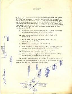
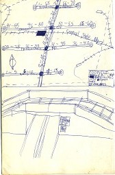
Some interesting doodles and an overhead diagram of the intersection from the preceding sketch make an otherwise boring notice from the police department worth reading.

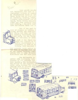
What happened to the rest of this sheet of paper is a mystery, but here we see a ray of diversification as some doodles of school buses appear in the midst of this celebration of small towns and rural scenery.

This one looks as though it could have been finished properly if only a competent artist had been holding the ballpoint pen.

This was on the same legal-sized sheet of paper as the previous one, so it was scanned separately, and it wasn't a bad start either.

A lone "A" gasoline pump saved this piece of paper from the waste basket.

The City of Dranville straddles a deep river, deep enough so that the artist wouldn't have to learn how to draw it. Otherwise, this is fairly well-planned and executed.

Okay, it's a four-lane highway. Next!

This is to the right of the previous sketch. The mountains are probably there as a quick way to finish off a sketch that was otherwise going nowhere.

This is alongside another deep river, but the wire is plain ridiculous, which is probably why the sketch was abandoned.

The wires in this drawing are good, but the flashing red/yellow signal on the road at the top of the drawing is clearly an afterthought, as is the Dranville Bypass.

Another take on the earlier, completed view of Dranville.

Another decent scene is marred by a wire that almost does the exact opposite of what it should do.

What on Earth could have caused the artist to stop this drawing right in the middle of the arm of the lamp post? What was he thinking?

Mushtown, with what appears to be the artist's rendition of farmland in the background.

This looks more like downtown Mushtown, drawn in sort of a hurried style as if in a timed contest of some sort.

Finally, a new wrinkle on the traffic signal: a sketch of a signal in the middle of being replaced as the intersection is being widened.

This is the beginning of a brief series, starting with the 6 Avenue exit with a short collector/distributor road. The lamp posts were clearly a late addition to the drawing.

7 Avenue. Notable here is the rather simple style of the sign supports, much like the original ones on the Connecticut Turnpike. Hastily conceived and executed, this still works a bit.

8 Avenue, where some confusion is evident, especially near the top, and the collector/distributor road appears even less practical than the one at 6 Avenue. The right pole of the traffic signal is way out of proportion to the left.

9 Avenue. This makes much more sense apart from the hairpin curve on the entrance ramp at the right, and it is much better executed than its three predecessors.

A different freeway, built by much better contractors than many of the others we have seen, except for the weak lamp posts on the bridge probably added on the advice of an incompetent art critic.

Another entry in the one-way freeway/one-way traffic signal genre, but this one is pretty workman-like all-around.

Here we have another reverse movement that was so expensive that it exhausted the drawing's budget and caused it not to be finished.

This looks like half of a precursor to the more modern SPUI.

Apart from the overhead signs that were an afterthought, this isn't too bad a depiction of where an expressway splits into two "super-1" carriageways.

Another drawing that showed some promise before the fog rolled in.

This was drawn on a smaller piece of paper, and the basics are solid, but the basics are all it has.

The signal in this sketch is also in the process of being replaced, though in this concept the poles are being reused.

This is the same intersection as was shown in the previous drawing, but before the signal replacement and road widening had started. Simple yet workman-like.

Of course, the toll tunnel leads to "Paytown." That was a cheap toll even back then. Notice how the artist wiggles out of drawing a properly curved signal wire, not once, but twice, by drawing only half of a signal. Cheater!

The ramp leading to the center of the highway looks elaborate, but HOV lanes are often constructed this way.

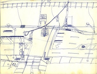
This and the following fifteen drawings comprise a series. They were drawn by laying the pages alongside one another; if one were to stitch them together with a photo editor they would form a continuous sketch of a railroad and a two-lane highway on an embankment alongside a parallel surface road. The first entry is not too bad, though we see several afterthoughts and, for some reason, an "Esso" logo that somehow found its way onto the top of the sketch. Well, as long as it isn't "Target." Note the different types of guard rails.

This is just a basic traffic signal, with what appears to be an old-style "WALK" aspect in the middle from the days when all traffic stopped while someone crossed the street.

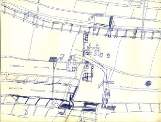
They had only just started installing mast arm poles in the early 1970's on Long Island, so few of them appear in these sketches, though it would have been another way to escape the nemesis of the wire.

The railroad appears in earnest here, and we see that the left signal pole stands directly in the path of the new turn lane, so it will need to be moved.

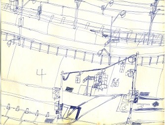
Particularly interesting here is that we get a peek at yet a second parallel road on the other side of the railroad tracks. The flare between the railroad tracks and the upper road towards the right is perplexing.

An interesting effect here are the ghost lines that show where the wire will hang off the new signal poles, and oddly enough, the new signal will probably land right where the existing signal is drawn! Also note the ghost control box. Only the barrels and lamp posts appear to be afterthoughts.

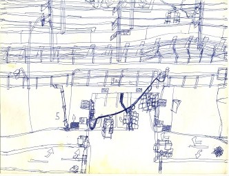
This looks as though it was drawn hastily just to pad out the series, the way American TV series are made. In addition to more ghost lines, we see something new: a tangle of wire hanging from the new pole.

8 Avenue is much busier, with two intersections stacked atop one another and the lower signal in the midst of replacement. I doubt that the railroad would tolerate such a marked jog in its right of way, though, just to accommodate some short turn lanes. The control box smack in the middle of the overpass hints of absurdist tendencies; pity the repair crew that needed to access that box.

Back to simplicity at 9 Avenue. Without a sidewalk or a shoulder, those three emergency call boxes look somewhat likely to cause an emergency in themselves, especially if someone has to stand there deciding whether his situation falls into the "fire," "police," or general "emergency" category.

The bottom of this sketch seems good, but the top looks hastily drawn before bed time and Jean Shepherd on WOR Radio at 11:15 PM, later at 9:15 PM. Shep was never worth missing just to finish another sketch of traffic signals or roadways. His verbal sketches were far superior to these ink sketches. In any case, the top seems to have everything drawn on top of everything else after the upper roadway goes out on a viaduct to make room for the railroad station.

Much less busy than the previous sketch, this one shows the upper roadway returning to the embankment. The earlier elements of the roll of wire for a new signal and an inconveniently-placed control box return for an encore.

The lower half of the new signal appears to have been drawn over top of the other elements, and the wire would have been right if the pole on the embankment were a little taller, but otherwise this fairly simple entry is pleasing on account of its lack of pretension.

This sample shows the intersection after the old signal was removed but before its simple pipe-style arm was dismantled. The short tunnel over the upper roadway is a curious touch. For some reason, the pedestrian signal at the lower left was drawn after that corner of the intersection was finished, which is a clear nod to the brutalist school of sketching.

The harshness of the staircase over the entrance to the parking garage at 14 Avenue contrasts well with the gentleness of the rest of this sketch. Once again, the pedestrian signal at the lower left is an afterthought, as is the left signal cluster on the wire, which is otherwise mostly correct.

15 Avenue is mostly straightforward, with only the late-drawn lamp posts and the slightly odd signal wire at its upper left to mar it. Of course, the pedestrian signal at the lower left is drawn over other things (though not too obviously), and its placement well behind the stop bar makes it impractical for the many pedestrians depicted here.

What is strange in this sketch is that the artist apparently drew the top of the signal arm before its background, but the bottom of its supporting pole was apparently drawn after the roadway. The sketchy lot at the bottom left appears to be a construction site of some sort.

This looks like 24 Street; whether several of these are missing or not is unclear. Clearly, something has happened in the interim as the lower roadway has blossomed from two lanes to four. Sadly, we see that the artist's talent has not made a similar advance as the right signal pole was drawn after what is behind it and the wire has an inexplicable vertical bulge as it nears the left pole, which could have been made taller to accommodate a higher wire.

This appears to be the end of the 1 Avenue- 25 Avenue series, and it goes down in flames as the artist made so many changes to the lower half of the drawing that he obviously became impatient with it and, while one can imagine a more highly skilled artist patiently taking another sheet of paper and starting over, this character must have simply thrown his empty ball-point pen into the air with an exasperated grunt and a cry of "I'll just never get this right!"

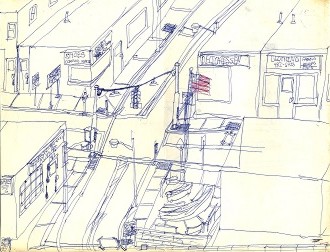
We return to the small town theme in this halfway decent sketch of "Cozyville," one of the more attractive-sounding names of hamlets and cities depicted in these drawings. Again, we see the generic, no-nonsense store labels and the simple traffic signal at the crossroads. Only the lamp posts appear to be an afterthought, and we even see a little red in the US flag.

And now for something completely different: a map of Cozyville and a bonus doodle of a railroad bridge.

Another fairly decent entry but once again containing the umpteenth pedestrian signal that was added after its background. You'd think he'd learn.

Apart from the cockeyed signal wire, this one is quite good. The faded billboard at the upper right appears to read, "The pen is mightier than the pencil." Well, if the artist really believes that... but the evidence so far has proven otherwise.

What is happening at the lower right of the page is somehwat unclear, but the sketch is fairly decent. A slight variation here is the pedestrian buttons minus the usual plate with instructions ("Press here for WALK light," as if no one would otherwise have a clue.).

The bottom half of this sketch of a Route 41 somewhere in the recesses of the artist's head is quite busy, while the upper half looks like mostly cheap, quick filler. The arch over the PARK entrance is a distinguishing characteristic of this particular sketch not generally seen elsewhere.

As usual, the reason for drawing this on a sheet of notebook paper instead of proper blank white paper is not clear, but apart from the blackouts, it's not bad, although once again the river has been made low enough for the artist to escape having to learn how to draw it, and like the preceding sketch, the bottom is much busier than the top.

Another sheet of notebook paper, another steel truss bridge. The Getty station here is notable for being "the only Getty with Regular in this county!" Those with long memories will recall that for a time, Getty sold only premium gasoline; how this dealer managed to sell regular is not obvious from the sketch. Presumably, even if he did, he'd not be allowed to put it in a pump marked "Getty." Notice the atom inside the G in Getty as it was in the original logo; later versions of the logo replaced the symbol of the atom with a plain red dot after the atom's reputation had diminished somewhat. Slightly unfinished but still worthwhile.

Apart from the ridiculously tight uphill ramp at the lower left, this is not too bad, and we even see a hint of water way down deep in the gorge; this part of the sketch may have been subcontracted to another artist.

Another steel truss bridge, another Getty station. This time the artist gets out of drawing the signal wire on route 71 correctly by using a perspective unusual for this batch of sketches, but it does the trick. Also note the ghost outline of a "Flying A" sign on the back of the Getty station, which would make sense as "Flying A" was the trademark of the Getty Oil Corporation through the 1960's. A decent sketch is hurt by multiple overdrawn elements on one side of the bridge and loses a star on account of that.

This sketch started well at the bottom, but by the time it pulled up to the signal, it had run its course and had no energy left for the weak signal at exit 36 that has no curvature at all in the wire as it heads toward a scrawny left pole. It just petered out after that. The blackout and redraw of the right signal cluster doesn't make sense if the traffic is coming out from the right. The artist probably took some medicine and went to bed after that.

This is not too bad except that the entire signal was clearly drawn at the end. Another Chevron station peeks into the frame from the far left. The blank sign is another puzzle; perhaps it was meant to symbolize man's search for deeper meaning in a life full of faded, illegible signs-- or perhaps the artist simply couldn't be bothered to finish the sketch.

This would be almost perfect if the signal pole hadn't been drawn over the guard rail.

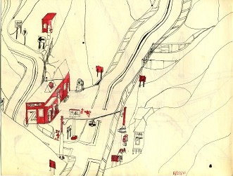
Who wouldn't want to live in "Crab?" After all, it has everything, if police, gasoline, and an auto repair garage are all one needs. The red coloring gives this entry a smattering of variety. It's also very-well executed with only one obvious overdraw. It should probably have a couple of folding STOP signs at the flashing red signal that also can flash yellow, though folding signs are not popular these days.

This sketch is not bad except for the very obvious discontinuity between the lower half of the lower roadway and where it emerges on the other side of the underpass. The weak artist, who obviously realized later in the sketch that he had drawn himself into a corner, tried to fix it with a "curve ahead" sign, but no amount of last-minute signage will make that make sense. An interesting touch is the black highlight on the right side of the arched tunnel at the lower right. The signal is notable for not having aspects facing the viewer, and apart from being drawn after its background, it looks reasonable.

In this scene, we see a "GASOLINE" station instead of the usual "FUEL," so we have to presume that the dealer lost the rights to the word "FUEL" somehow. The left signal post is a little too short, but at least the wire's curvature is more or less correct, and the drawing has only one blackout. Some jurisdictions use actual highways for their paint tests, but here they apparently do paint tests on the side of a mountain, though what that proves is not obvious. The flasher at the upper left is an afterthought, and the building at the right seems to have had larger aspirations, but mostly this one is competent.

This is busy for a country scene, and the red ink combined with the yellowing caused by age gives it a sort of wistful sepia tone. Even though the signal at the foreground looks more or less correct, the artist punts on the signal at the right by putting it behind a mountain so that he doesn't have to draw most of it.

We see a few more amenities in this place, though this gasoline station doesn't even announce itself at all apart from the label "Alan's Garage." It's mostly well-executed on the other side of the previous sketch.

Not one, not two, but THREE trees grow in this sketch; again, we have to wonder if the trees might not have been added by a ghost artist. The faded "FUEL" signs on two competing "FUEL" stations are an interesting touch; one wonders if perhaps a price war has put both of these outlets out of business. We even see what appears to be some grass in front of the upper FUEL building; the artist is either making a bold attempt to diversify here, or he got himself a really good, uncredited collaborator.

The city of Cebnol along route 45 begins another group of similarly-themed drawings. Presumably some other dwellings are nearby; otherwise, this infrastructure appears to be massive support for the two small homes on the side of the mountain at the left. One has to wonder if that huge garbage truck in the garage is necessary to collect what little garbage this city generates, while presumably the fire engine is out battling a wildfire nearby.

The city of Abnik is much like Cebnol but on route 31 instead of 45. Crime must be a problem here between the two residents at the right as Abnik has its own court so they don't have to trek to a much larger city to adjucate their differences. No doubt tickets for expired parking meters are common as well. The sketch is well-executed, however and is marred only by the bleeding from nearby Eanst.

Eanst has a three-story office complex with its own hospital! This is supported by the clever means of revenue-generation devised by the city fathers: a pair of entry and exit fees, combined with the two parking meters on space three. These fees apparently generate sufficient revenue to keep four toll collectors employed, one on each side of the road and one at each end of town. Presumably, route 70 is the only way to get around in that area. Another art critic remarked that this looks more like a border crossing than anything else. Artistically, this is well-executed, with only a couple of blackouts and a second thought about the roof of the garage alongside the FUEL pumps.

Frung is fairly simple on a bend in route 17, though one wonders why the high fence is necessary around the driveway to the right.

Do we take route 173 or 173A at the fork? We may as well take 173A; based on what we have seen so far, we'll have plenty of opportunities to get fuel up the road. The signal is distinguished by arrows on all six visible aspects, which would be quite uncommon today. Otherwise, a simple, well-executed drawing.

Yes, it's Bonci, "The undergound city!" No, no need to bother drawing it, don't you know-- it's almost all undergound, save for this sort of "headhouse" above ground. Someone, however, ought to identify some funding or create a revenue stream to finance the widening of the Entan Bridge.

Beagob is apparently another place where fog is common, and it must have been heavy the day the artist set out to draw this sketch.

Angnot had even heavier fog and the artist gave up even sooner.

What we find in Carntob is mostly good, but the signal is missing at least one wire coming from the weatherhead, and some indecision regarding the direction of the roadway at the right seems to have lead to the abandonment of the sketch.

Almogn is well-executed and sports a different style of traffic signal on the upper roadway, while the more conventional one on the lower roadway is more or less correct.

Not bad, but not finished, either.

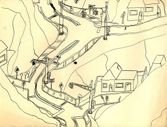
Another winding mountain road, mostly executed well as most of the pen and ink drawings are, but the upper signal is clearly a late addition.

In this unnamed hamlet, drawn reasonably well, we see four homeowners who defy social convention by having their homes numbered consecutively on the same side of the road, instead of using only odd or only even numbers. Next, we'll probably see a group of homes numbered in multiples of 17 or something.

For a first ink drawing, this is passable, but it looks more like a water color than anything else. Maybe the B-5 wasn't the right tool. Only one blackout mars this, and the signal doesn't look quite right.

This is a simple gasoline station apparently constructed into the side of a mountain.

Those must be dirt roads, but a $5.50 toll in 1920 would have been onerous.

The remaining sketches are drawn on art paper with a pencil and thus will be higher-quality. Leading off is Crauntoc, which is good except that the eraser must have broken off the artist's pencil before he could draw the signal pole at the center right.

Wow! Five trees, a tree stump, and water to boot! Even the steel truss bridge looks better than many of the others we have seen thus far. Late into the pile, the artist actually appears to be growing into his trade to a point at which the astute critic wonders if, perhaps with the right training, he may actually amount to something some day. We even see the debut of an oil rack at the FUEL station, which one might have expected to be more common. This entry is quite impressive.

This is a simple yet interesting draw bridge on account of the way the dual-level roadways converge on it and then diverge just as quickly, making it the clear focal point of the drawing. The lane descending from the upper left should have a traffic signal, though, unless the lives of those coming from that direction don't matter.

We have a rather busy drawing here, but unlike many of the other busy ones, this seems better-executed and works well. It clearly had some changes, but the eraser on the pencil makes them far less obvious. If only the artist hadn't been too proud to use a pencil and eraser; sigh.

Another isolated FUEL station on a mountainous, road, but this comes out better in pencil as well.

Almost all of the overpasses we have seen so far have been very sketchy, but this stone- or brick-faced overpass is much more detailed; it would have been much better if the same-sized block had been used on both sides, but it is still one of the best in the bunch.

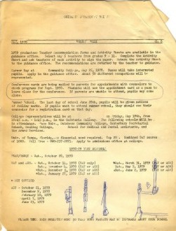
A few doodles liven a dull bulletin from the school guidance department and draw this series to a close.

