The Van Alt Gallery
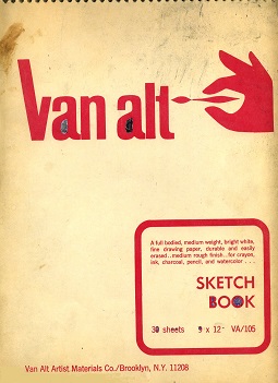
This gallery is named for the manufacturer of the spiral-bound sketch book in which the entries here were drawn. As with the other drawings in this museum, almost 50 years of storage has not been too kind to them. I believe these pages were originally more of a grayish color instead of the yellowish tint they now appear to be. The drawings themselves indicate a date of early 1972-- except for the last three, whose style clearly shows that they were drawn much later. In this group, gasoline stations enjoy more of a focus as opposed to traffic signals. As before, I have invited another expert art critic to write the descriptions of each sketch.
First, I'm kind of annoyed that I was invited here on my day off to write these reviews, but I owed the artist a favor and couldn't get out of it, and I need the $50 lunch money that he's paying me because, like so many other art critics in this tough economy, I'm having a hard time making ends meet with all the museums closed and people hiding under the covers afraid of some disease or other because deep down they really hate art and artists and culture in general-- I mean, I can't even get a few minutes on a TV show any more because all the news is devoted to this disease and hurricanes and wars and wildfires and floods and volcanic eruptions and they say they just don't have time for art shows, but they still have time to showcase morbidly obese people and people with cysts and tumors and whatnot and people such as Donald Trump and Joe Biden, who are just running for elected office even though they won't really change much for better in the end, and after all, this isn't really that hard and I should be thankful; at least that's what they say, so I'll do it anyway and try to do it justice.

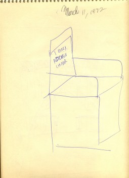
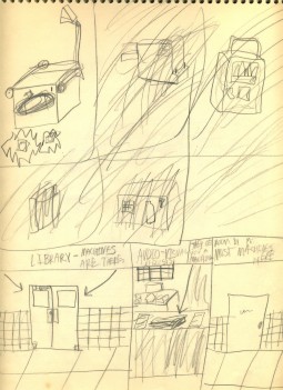
The cover seems to be a good place to start. Note the filled in centers on some of the letters and numbers; the artist is clearly chomping at the bit anxious to get into the sketch book and start doing some real sketching.

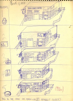
This sketch is actually rather prophetic. At the time it was drawn, gasoline stations had a distinct look and details that identified them as having been created by a particular gasoline company. Even the shape of the main sign and the style of the pumps was distinctive. Today, a station can be rebranded in probably an hour and no one would ever know what it was before, because they all use identical pumps and simply replace the standard rectangular sign. In the 1970's, the station was part of the brand, when they actually tried to convince people that one brand or another was better or different. Today, gasoline is considered a commodity, and the stations show it. Note the accumulating traces of the previous branding as the sketch progresses-- something that would not happen today.

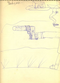
The idea of a coin-operated gun is supposed to be funny. The 100,000-pound weight may have been stolen from Monty Python's 16-ton weight.

This looks like the front of a boat or a shark.

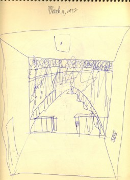
This sketch no doubt has a background that has been lost to history; apart from that, it is inexplicable.

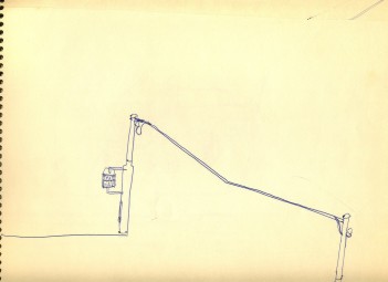
What we see here is an early look into the artist's mind; clearly it is cluttered with wooden Long Island parkway lamp posts. Later, we will see many more gasoline stations, highways, and interchanges and the like.

The tendency of the artist to produce unfinished works was evident in the first two galleries, and this small gallery prefigures that tradition. This sketch seems to have failed at the installation of the gasoline pumps.

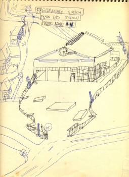
While we still see a "sketchy" style here, we are also starting to see the important details emerging, such as the fill caps for the station's storage tanks and what appears to be a squeegee tray at the pump island. Missing are traffic signals; they will come later.

This appears to be "A Day in the Life of an Overhead Projector." Why anyone would commission such a sketch, even in 1972, when overhead projectors were a common sight in classrooms around the world, is unfathomable.

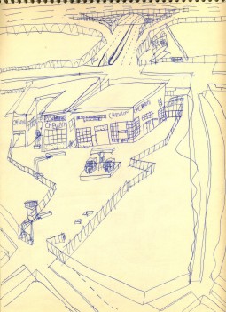
This could be considered a "retro" sketch for its time, as early in the history of gasoline, some stations did sell more than one brand. Why the large signs are apparently crossed out is clearly another mystery but consistent with this artist's consistent practice of using the wrong drawing implement and then attempting to make corrections on a per-drawing basis instead of switching to a pencil and taking advantage of its eraser.

"CEBEG Brand Air" is another concept that is no doubt supposed to be funny.

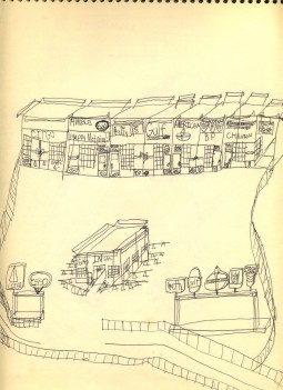
Here we see a refinement and development of the important concept originally introduced in sketch number ten of this gallery. It was so important that... that.. it hasn't been done since. What is interesting is that while all of these brands are sharing a common structure, they couldn't share a pair of rest rooms, which would be one of the economies of scale that such an arrangement would be expected to produce.

We are introduced to another revolutionary concept here: the generic station that could be branded with anyone's logo. It didn't quite happen the way it was depicted here, though it came close at the time with the introduction of "ranch"-style stations that looked quite a bit alike. We also see a quickie traffic signal sneaking into the sketch at the upper right.

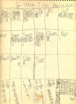
This non-sketch is a fairly obvious peek into the life of the average ten-year-old in 1972. No doubt any 60-year old today could go through his old papers and find a few sheets of paper that look just like this.

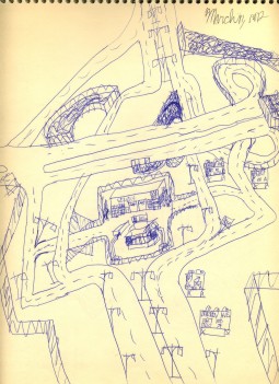
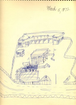
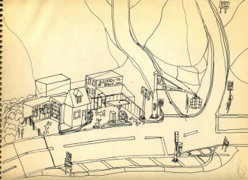
Caston is an interesting crossroads that has everything except residents and motor vehicles. The road at the left appears to lead into the property of the gasoline station, which is odd, and the intersection is begging for a traffic signal, but clearly the artist hadn't taken Drawing 105, where they taught how to draw traffic signals, so traffic is left to fend for itself there.

"This is the $10,000 Pyramid! Today's special guests are delayed and have not arrived yet, but we'll wait!"

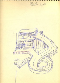
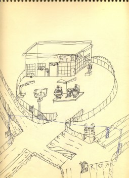
Here we see noticeably more care in the drawing of the Getty station. Both pumps are marked "Premium" which is the only grade that Getty sold in those days. The incomplete traffic signal is clearly a later addition with blue ink as opposed to the black ink used in the rest of the sketch.

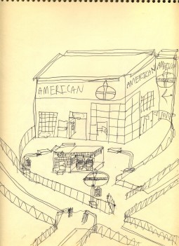
For some reason, the building is disproportionate to the elements in the rest of the sketch, but it is accurate. For those in the Midwest, a Standard of Indiana station would look almost identical except that it would say "STANDARD," instead of "AMERICAN;" both brands used the same familiar torch and oval logo.

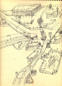
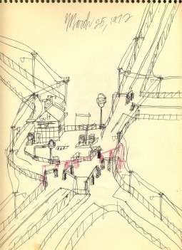
This complicated crossroads almost looks as though it might be better served by one giant traffic circle, with the Gulf station in the middle. This probably came in the first half hour of Drawing 105; presumably, by the end of the class, the traffic signals would be better-drawn. Once again, the signal drawn in red is clearly a later addition.

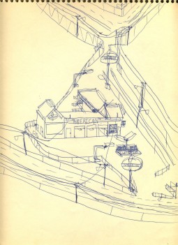
This entry is another competent, recognizable rendition of an American Oil Company station.

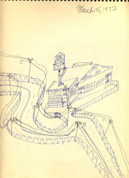
The eerie, winding roads combined with the abandoned gasoline station give this drawing a sad cast. The brand of the station is actually given to the viewer in the details of the station and the ghost lettering over the service bays

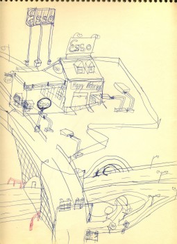
The main overpass in this sketch is starting to show some character and depth, and the Esso station looks convincing. The red box guardrails were obviously added after the rest of the sketch on account of improved safety requirements.

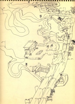
This and the next two sketches were clearly added to the book years later after the artist obtained his certification in highway sketching, but that didn't help get this sketch finished.

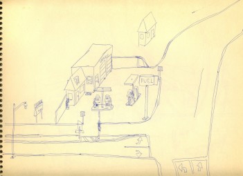
Stylistically, this and the following sketch fit better with the first gallery in this museum. We see the common "FUEL" station depicted in many other sketches of the later period, and the drawing is well-executed-- but it fell victim to the artist's chronic tendency not to finish sketches. If only each sketch had a reason for being incomplete written on the sketch so that people would know... rats.

Beasp is typical of many other tiny hamlets depicted elsewhere in this museum. The well-executed sketch appears to have been drawn with a fountain pen instead of a ball-point pen, and it helps to lead us to the exit from this exhibit.

